sticky 元件常用於導航列或工具列:當頁面捲到某一區域時,把元素固定在視窗頂部或底部,方便隨時操作;離開該區域就解除固定。本文說明它的實作思路,並提供一個同時支援頂部與底部固定的完整版本。這類元件在網站裡非常常見,值得掌握。
固定在頂部的效果(sticky-top.html):

固定在底部的效果(sticky-bottom.html):

一、實作思路
關鍵在於找到「何時該固定、何時該取消固定」的臨界點。先拆解 demo 的變化過程:頁面上有兩個角色,一個是我們要控制固定與否的元素,稱為 sticky 元素;另一個是承載內容的列表區塊,稱為 target 元素。sticky 能固定的捲動範圍,正是由 target 決定的。以下只講頂部固定的情況,底部的原理完全相通。
初始狀態:
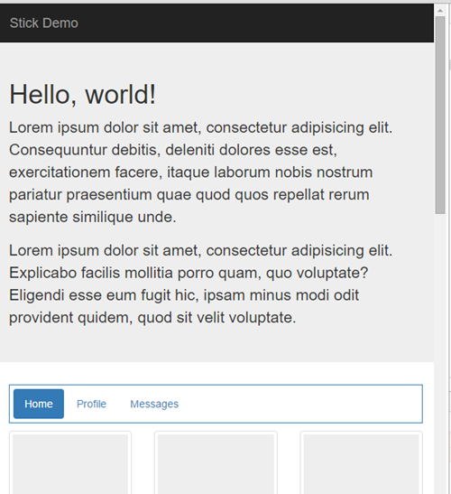
捲動條往下、頁面往上移動,在一段距離內兩者狀態不變,直到這個位置(捲動 573px):
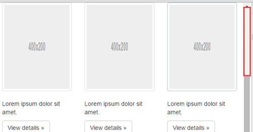
此時只要再往下 1px,sticky 元素就被固定在頂部(捲動 574px):
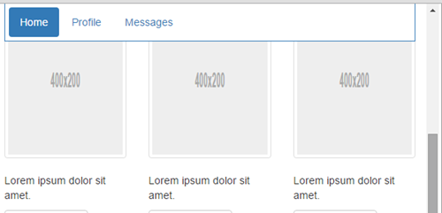
也就是說,當 target 元素頂部離瀏覽器頂部的距離小於 0(未超出頂部時視為大於 0),sticky 就會被固定。這是第一個臨界點。接著繼續往下捲,只要 target 還在可視區域內,sticky 就一直固定:
直到這個狀態(捲動 1861px):
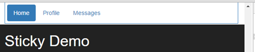
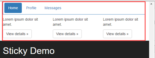
再往下 1px,sticky 就取消固定(捲動 1862px):
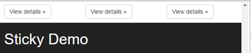
這是第二個臨界點,判斷條件是:當 target 元素底部離瀏覽器頂部的距離小於 sticky 元素的高度時,取消固定。這裡為什麼用 sticky 的高度而不是 0?因為若以 0 為界,會出現 target 幾乎已經滑出視窗、sticky 卻還掛在那裡的情況:
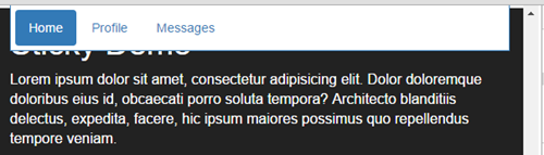
結果 sticky 反而蓋住了 footer,本來是為了方便操作,最後卻妨礙操作。把取消固定的時機提前到 sticky 高度,就剛好合適。
綜合兩點,往下捲時 sticky 被固定的條件是:target 頂部離瀏覽器頂部的距離小於 0,且 target 底部離瀏覽器頂部的距離大於 sticky 的高度。這個條件同樣適用於往上捲的情況(往上捲時的兩個臨界點,只是把同一件事反過來說)。
所以要的其實只有三個值:target 頂部離瀏覽器頂部的距離、target 底部離瀏覽器頂部的距離、sticky 元素的高度。第三個由設計稿決定,從製作一開始就是已知值,直接從外部傳入即可,不必多花一次 DOM 計算。前兩個則可以用 DOM 現成的方法取得:
 var target = document.getElementById('main-container');
 var rect = target.getBoundingClientRect();
 console.log(rect);
它回傳一個 ClientRect 物件,裡面存著元素框模型的資訊——寬高(width、height)、上下邊到瀏覽器頂部的距離(top、bottom)、左右邊到瀏覽器左緣的距離(left、right):
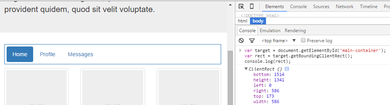
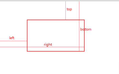
top 與 bottom 正好就是我們要的值,而且框的頂部或底部未超出瀏覽器頂部時,它們大於 0;一旦超出,就變成負值:
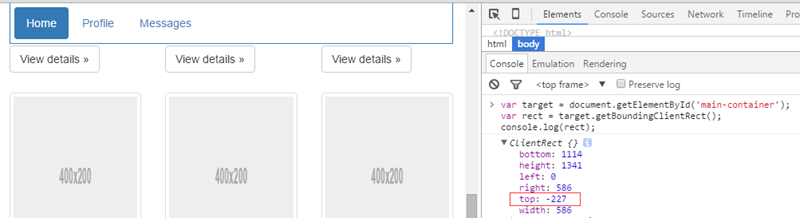
於是判斷條件可以寫成:
 rect.top < 0 && (rect.bottom - stickyHeight) > 0;
 // rect 是 target 呼叫 getBoundingClientRect() 的結果,stickyHeight 是 sticky 元素高度
底部固定的臨界點則是(以下為往下捲時):target 頂部離瀏覽器頂部的距離加上 sticky 高度小於可視區域高度時固定;target 底部離瀏覽器頂部的距離小於可視區域高度時取消固定。可視區域高度用 document.documentElement.clientHeight 取得,相容性也沒問題:
 var docClientWidth = document.documentElement.clientHeight;
 rect.bottom > docClientWidth && (rect.top + stickyHeight) < docClientWidth;
二、實作細節
1)HTML 結構
固定在頂部:
 <div class="container-fluid sticky-wrapper">
 <ul id="sticky" data-target="#main-container" class="sticky nav nav-pills">
 <li role="presentation" class="active"><a href="#">Home</a></li>
 <li role="presentation"><a href="#">Profile</a></li>
 <li role="presentation"><a href="#">Messages</a></li>
 </ul>
 </div>
 <div id="main-container" class="container-fluid">
 <div class="row"> ... </div>
 ...
 </div>
固定在底部:
 <div id="main-container" class="container-fluid">
 <div class="row"> ... </div>
 ...
 </div>
 <div class="container-fluid sticky-wrapper">
 <ul id="sticky" data-target="#main-container" class="sticky nav nav-pills">
 <li role="presentation" class="active"><a href="#">Home</a></li>
 <li role="presentation"><a href="#">Profile</a></li>
 <li role="presentation"><a href="#">Messages</a></li>
 </ul>
 </div>
其中 #main-container 是 target,#sticky 是 sticky。兩點要注意:一是兩種結構裡 target 與 sticky 父元素的順序是相反的;二是 sticky 外面必須包一層容器,並給它明確高度:
.sticky-wrapper { margin-bottom: 10px; height: 52px; }
因為 sticky 被固定後會脫離文件流,若不靠父元素把高度撐住,固定發生的瞬間 target 的內容就會跳一下。
2)固定效果
讓元素固定在瀏覽器某個位置,靠的是 position: fixed,所以用兩個 CSS 類就夠了:
 .sticky--in-top,.sticky--in-bottom {
   position: fixed;
   z-index: 1000;
 }
 .sticky--in-top { top: 0; }
 .sticky--in-bottom { bottom: 0; }
需要固定在頂部時加上 .sticky--in-top,需要固定在底部時加上 .sticky--in-bottom。
3)捲動回呼
控制邏輯寫在 window 的 scroll 事件裡。頂部固定的版本:
 $(window).scroll(function() {
   var rect = $target[0].getBoundingClientRect();
   if (rect.top < 0 && (rect.bottom - stickyHeight) > 0) {
     !$elem.hasClass('sticky--in-top') && $elem.addClass('sticky--in-top').css('width', stickyWidth + 'px');
   } else {
     $elem.hasClass('sticky--in-top') && $elem.removeClass('sticky--in-top').css('width', 'auto');
   }
 });
其中 $target 是 target 的 jQuery 物件,$elem 是 sticky 的 jQuery 物件,另有高度與寬度兩個變數。因為固定後脫離文件流,必須手動設定寬度才能維持原本的外觀。
底部固定的版本:
 $(window).scroll(function() {
   var rect = $target[0].getBoundingClientRect(),
       docClientWidth = document.documentElement.clientHeight;
   if (rect.bottom > docClientWidth && (rect.top + stickyHeight) < docClientWidth) {
     !$elem.hasClass('sticky--in-bottom') && $elem.addClass('sticky--in-bottom').css('width', stickyWidth + 'px');
   } else {
     $elem.hasClass('sticky--in-bottom') && $elem.removeClass('sticky--in-bottom').css('width', 'auto');
   }
 });
4)函數節流
scroll、resize、mousemove 這類事件觸發頻率極高,回呼裡又有 DOM 操作,連續呼叫會拖慢頁面,所以必須節流:
 function throttle(func, wait) {
   var timer = null;
   return function() {
     var self = this, args = arguments;
     if (timer) clearTimeout(timer);
     timer = setTimeout(function() {
       return typeof func === 'function' && func.apply(self, args);
     }, wait);
   }
 }
套用之後:
 $(window).scroll(throttle(function() {
   var rect = $target[0].getBoundingClientRect(),
       docClientWidth = document.documentElement.clientHeight;
   if (rect.bottom > docClientWidth && (rect.top + stickyHeight) < docClientWidth) {
     !$elem.hasClass('sticky--in-bottom') && $elem.addClass('sticky--in-bottom').css('width', stickyWidth + 'px');
   } else {
     $elem.hasClass('sticky--in-bottom') && $elem.removeClass('sticky--in-bottom').css('width', 'auto');
   }
 }, 50));
真正被連續呼叫的是 throttle 回傳的那層函式,它邏輯極輕、沒有 DOM 操作;而傳進去的回呼因為閉包的作用不會被連續執行,節流的目的就達到了。
5)resize 的問題
resize 幾乎每次都會在定義元件時添麻煩:視窗尺寸變了,sticky 父容器寬度可能也跟著變,而且 resize 不會觸發 scroll。所以必須在 resize 回呼裡重新計算寬度並重跑一次固定邏輯。這部分通常留到最後處理,性質上有點像修 bug。
三、整體實作
 /**
  * @param elem: jquery 選擇器,用來取得要被固定的元素
  * @param opts:
  * - target: jquery 選擇器,用來取得表示固定範圍的元素
  * - type: top|bottom,表示要固定的位置
  * - height: 要固定元素的高度,由於高度在製作時就已確定且幾乎不會被 DOM 操作改變,直接從外部傳入可省下取得高度的計算
  * - wait: 捲動事件回呼的節流時間
  * - getStickyWidth: 取得要固定元素的寬度,resize 或 DOM 操作會導致寬度變化,需要這個回呼來刷新
  */
 var Sticky = function (elem, opts) {
   var $elem = $(elem),
       $target = $(opts.target || $elem.data('target'));
   if (!$elem.length || !$target.length) return;

   var stickyWidth,
       $win = $(window),
       stickyHeight = opts.height || $elem[0].offsetHeight,
       rules = {
         top: function (rect) {
           return rect.top < 0 && (rect.bottom - stickyHeight) > 0;
         },
         bottom: function (rect) {
           var docClientWidth = document.documentElement.clientHeight;
           return rect.bottom > docClientWidth && (rect.top + stickyHeight) < docClientWidth;
         }
       },
       type = (opts.type in rules) && opts.type || 'top',
       className = 'sticky--in-' + type;

   refreshStickyWidth();
   $win.scroll(throttle(sticky, $.isNumeric(opts.wait) && parseInt(opts.wait) || 100));
   $win.resize(throttle(function () {
     refreshStickyWidth();
     sticky();
   }, 50));

   function refreshStickyWidth() {
     stickyWidth = typeof opts.getStickyWidth === 'function' && opts.getStickyWidth($elem) || $elem[0].offsetWidth;
     $elem.hasClass(className) && $elem.css('width', stickyWidth + 'px');
   }

   // 效果實現
   function sticky() {
     if (rules[type]($target[0].getBoundingClientRect())) {
       !$elem.hasClass(className) && $elem.addClass(className).css('width', stickyWidth + 'px');
     } else {
       $elem.hasClass(className) && $elem.removeClass(className).css('width', 'auto');
     }
   }

   // 函數節流
   function throttle(func, wait) {
     var timer = null;
     return function () {
       var self = this, args = arguments;
       if (timer) clearTimeout(timer);
       timer = setTimeout(function () {
         return typeof func === 'function' && func.apply(self, args);
       }, wait);
     }
   }
 };
呼叫方式,固定在頂部(type 預設為 top):
 <script>
 new Sticky('#sticky',{
   height: 52,
   getStickyWidth: function($elem){
     return ($elem.parent()[0].offsetWidth - 30);
   }
 });
 </script>
固定在底部:
 <script>
 new Sticky('#sticky',{
   height: 52,
   type: 'bottom',
   getStickyWidth: function($elem){
     return ($elem.parent()[0].offsetWidth - 30);
   }
 });
 </script>
最後說明 getStickyWidth 為什麼要對外開放:當 sticky 的外層容器是自適應寬度時,sticky 固定後的寬度並不由它自己決定,而是取決於外部容器,這個值只能在外部計算,元件內部抓 offsetWidth 並不準確。像上面範例減掉 30 這種規則,元件內部根本不可能知道。
四、總結
實作這個元件的關鍵是找到控制固定與否的臨界點,同時別忘了函數節流與 window resize 這兩個細節。
對於簡單元件,我一向認為掌握思路自己定義,比直接從 GitHub 找套件更實際:程式碼可控、量小、更貼合專案需求,也有助於提升自己的技術深度。有能力造輪子的時候,造一造是必要的。
文末雖然給了完整實作,但並不建議拿來就用——否則前面鋪陳思路就失去意義了,直接丟個網址即可。思路永遠比實作重要:思路是抽象的、通用的,理解之前它不是你的,理解之後它就留在腦中隨時可用。
補充:本文的實作仍有不完美之處,想了解更佳方案可延伸閱讀《sticky 元件的改良實作》。
相關文章
-
原生 JS 實作商品詳情頁的圖片放大鏡 JavaScript 取得 DOM 元素的位置與尺寸:屬性、座標與兼容性 用 JavaScript 做一個圖片爆炸動畫:boomJS 的實作思路 取得元素相對於文檔的座標:offsetParent 疊加 vs getBoundingClientRect 取得輸入框游標的頁面座標:跨瀏覽器相容的完整實作 取得滑鼠在 div 內的相對座標:offsetParent 累加與滾動補償 JavaScript 獲取元素當前高度的實例與兼容性處理 JavaScript 元素定位實例:用 getBoundingClientRect 移動方塊 JavaScript 獲取指定元素在頁面中的位置 KindEditor 點擊圖片捲軸上跳的 BUG 排查記錄