原生 JavaScript 實現瀑布流布局
編輯:關於JavaScript
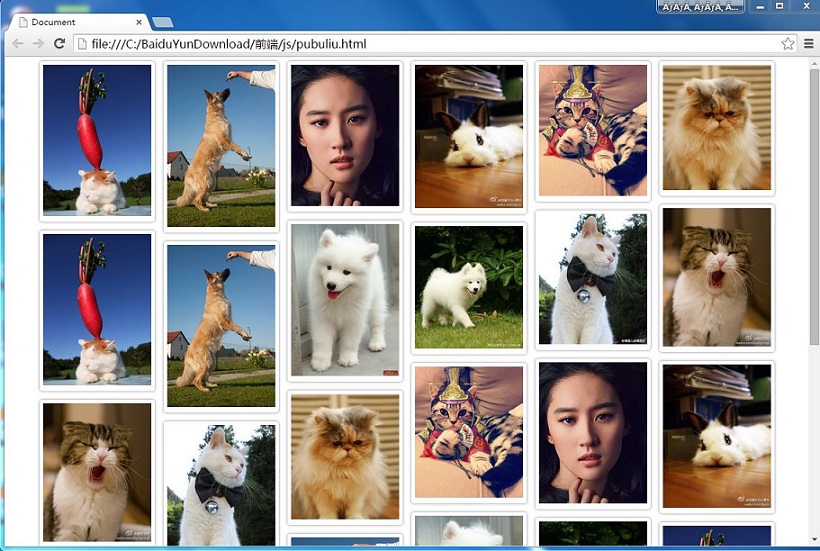
瀑布流布局讓不同高度的圖片依序填入最合適的位置。核心概念是計算容器可容納的欄數,再將每個區塊放到目前高度最短的欄位下方。
HTML 與 CSS
容器使用相對定位,每個 box 使用浮動或絕對定位。圖片寬度固定,高度依原圖比例自動調整,才能形成高低不一的瀑布流效果。
核心 JavaScript
function getChildren(parent, className) {
  return Array.prototype.slice.call(parent.getElementsByTagName('*')).filter(function (node) {
    return node.className === className;
  });
}

function imgLocation(parentId, childClass) {
  var parent = document.getElementById(parentId);
  var boxes = getChildren(parent, childClass);
  var boxWidth = boxes[0].offsetWidth;
  var cols = Math.floor(document.documentElement.clientWidth / boxWidth);

  parent.style.cssText = 'width:' + boxWidth * cols + 'px;margin:0 auto';

  var heights = [];

  boxes.forEach(function (box, i) {
    if (cols > i) {
      heights[i] = box.offsetHeight;
    } else {
      var minHeight = Math.min.apply(null, heights);
      var minIndex = heights.indexOf(minHeight);

      box.style.position = 'absolute';
      box.style.top = minHeight + 'px';
      box.style.left = boxes[minIndex].offsetLeft + 'px';

      heights[minIndex] = heights[minIndex] + box.offsetHeight;
    }
  });
}
滾動加載
可監聽 scroll 事件,判斷最後一個區塊是否進入視窗。若已進入,就動態建立新的 box 並插入容器,再重新執行布局。
function checkFlag() {
  var parent = document.getElementById('container');
  var boxes = getChildren(parent, 'box');
  var lastHeight = boxes[boxes.length - 1].offsetTop;
  var scrollTop = document.documentElement.scrollTop || document.body.scrollTop;
  var pageHeight = document.documentElement.clientHeight || document.body.clientHeight;

  if (scrollTop + pageHeight >= lastHeight) {
    return true;
  }

  return false;
}
實際應用時,圖片載入完成後可能會改變高度,因此可在 img 的 load 事件中再次呼叫布局函式。
- 上一篇文章: JavaScript 實現 TAB 選項卡效果
- 下一篇文章: JavaScript 圖片切換與滑鼠懸停預覽