這次要推薦一款相當實用的彈出層:仿微博風格、可自由收合,預設隱藏,點擊按鈕才展開。把它固定在頁面右側,點開顯示客服 QQ 或聯絡資訊,效果相當自然,比傳統的 alert 或燈箱框親和力高得多。
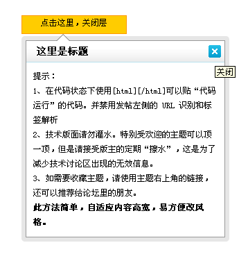
線上示範:https://demo.jb51.net/js/2015/js-f-weibo-close-able-alert-codes/
一個函式搞定開合
function openShutManager(oSourceObj, oTargetObj, shutAble, oOpenTip, oShutTip){
  var sourceObj = typeof oSourceObj == "string" ? document.getElementById(oSourceObj) : oSourceObj;
  var targetObj = typeof oTargetObj == "string" ? document.getElementById(oTargetObj) : oTargetObj;
  var openTip = oOpenTip || "";
  var shutTip = oShutTip || "";

  if (targetObj.style.display != "none"){
    if (shutAble) return;                    // shutAble=true 時禁止在此關閉
    targetObj.style.display = "none";
    if (openTip && shutTip) sourceObj.innerHTML = shutTip;
  } else {
    targetObj.style.display = "block";
    if (openTip && shutTip) sourceObj.innerHTML = openTip;
  }
}
這個函式的設計相當聰明,四個參數各有用途:sourceObj 是觸發元素、targetObj 是彈出層,兩者都同時接受 id 字串或元素物件(typeof == "string" 的判斷),呼叫起來很自由。shutAble 則是一個開關:設為 true 時,這個函式只能「開」不能「關」——正好拿給彈出層內部的關閉按鈕使用,避免它被誤觸把自己關掉又打開。
用 border 透明度做圓角
彈出層的外框用了九宮格拼貼:
.box{ border:1px #999999 solid; background:#FFF; }
.lt,.rt,.lb,.rb{ background-image:url(images/abg.png);
                 filter:alpha(opacity=10); -moz-opacity:.1; opacity:.1; line-height:0; }
.lt,.rt,.lb,.rb{ height:6px; width:6px; }
.t,.b,.l,.r{ background:#000000;
              filter:alpha(opacity=10); -moz-opacity:.1; opacity:.1; line-height:0; }
.l,.r{ width:6px; }  .t,.b{ height:6px; }
.lt{ background-position:0 0; }      .rt{ background-position:right 0; }
.lb{ background-position:0 bottom; } .rb{ background-position:right bottom; }
四角用半透明圓角圖、四边用半透明純色條,湊成柔和的陰影邊。三組 opacity 寫法(filter:alpha、-moz-opacity、opacity)是為了同時顧及 IE、老 Firefox 與標準瀏覽器。今天只要 box-shadow 一行就能取代,但這份寫法在需要相容 IE6/7 的專案裡仍然常見。
指向來源的小三角
s{ position:absolute; top:-13px; *top:-13px; left:50px;
   display:block; height:0; width:0; font-size:0; line-height:0;
   border-color:transparent transparent #666 transparent;
   border-style:dashed dashed solid dashed; border-width:10px; }
i{ position:absolute; top:-9px; *top:-9px; left:-10px;
   display:block; height:0; width:0; font-size:0; line-height:0;
   border-width:10px;
   border-color:transparent transparent #FFF transparent;
   border-style:dashed dashed solid dashed; }
這裡用了兩層三角形疊出「外框色 + 內底色」的效果:s 是深灰色的外三角,i 是白色的內三角,位置往上偏移 4px 蓋住中間,看起來就像一個帶描邊的箭頭。*top 是 IE6/7 專用的星號 hack。
HTML 結構
<div class="open">
 <span onclick="openShutManager(this,'box',false,'點擊這裡,關閉層','點擊這裡,彈出層')">
 點擊這裡,彈出層</span>
 <div class="odiv" id="box" style="display:none">
 <table border="0" cellpadding="0" cellspacing="0">
 <tr><td class="lt"></td><td class="t"></td><td class="rt"></td></tr>
 <tr><td class="l"></td>
 <td class="box">
 <h3 class="tit"><b>這裡是標題</b>
 <a class="cls" href="javascript:;"
    onclick="openShutManager(this,'box',false)" title="關閉">關閉</a></h3>
 <div class="nr"> ... 內容 ... </div>
 </td><td class="r"></td></tr>
 <tr><td class="lb"></td><td class="b"></td><td class="rb"></td></tr>
 </table>
 <s><i></i></s>
 </div>
</div>
注意關閉按鈕的 onclick 只傳了 (this,'box',false),沒有傳提示文字,所以點關閉時按鈕文字不會改變——這是刻意的,因為它關的是彈出層,不是那顆觸發鈕。這種「同一函式、依參數決定行為」的彈性,是這個小工具最值得學的地方。
可再加強的部分
若要更完善,建議加上「點擊彈出層外部自動關閉」(在 document 上掛 click 並用 stopPropagation 隔絕內部),以及 aria-expanded 與 role="dialog" 等無障礙屬性。另外,內容高度自適應的部分目前靠 table 撐開,改用 div + box-shadow + border-radius 可以省掉大量標籤。
- 上一篇文章: JS + CSS 實作仿 QQ 好友與黑名單的樹型選單
- 下一篇文章: 用 jQuery 做網頁載入進度條,思路與極簡實作
相關文章
-
12 個經典的 Lightbox 彈出層方案比較:從 Thickbox 到 LITBox 網頁彈出層實作詳解:從最簡單到可拖曳對話框 用 Div + CSS + JavaScript 實作置中的半透明彈出層 DIV 層定位實例:讓彈出層不受分辨率影響 jQuery XYTipsWindow 彈出層 JavaScript 彈出層(模態遮罩)實作範例 點擊頁面其他處自動關閉彈出層:jQuery 事件冒泡的應用 模仿 EasyUI Dialog:用原生 JS 做背景置灰彈出層 原生 JavaScript 彈出層:顯示、隱藏與游標拖曳的實作 jQuery 彈出層類:自訂 PopupLayer 與覆寫 doEffects 做動畫