JS 動畫彈出層實作:用緩動函式讓展開更自然
編輯:關於JavaScript
本文實作一個動畫彈出層:點擊列表項,對應的內容層會從左上角以「先快後慢」的節奏展開,再點一次則收合。重點在於用時間差計算出非線性的變化量,讓動畫不至於死板。
視覺規劃
每個列表項包含一個觸發列與一個絕對定位的內容層。內容層預設 display:none,展開時先設為 block 並把寬高歸零,再用計時器逐步放大;收合時則先縮高度、再縮寬度並同時左移,看起來像被捲回去。
JavaScript
var zindex = 0;
function $id(id) { return document.getElementById(id); }

// 綁定 this 的輔助函式
var Bind = function(object, fun) {
  var args = Array.prototype.slice.call(arguments).slice(2);
  return function() { return fun.apply(object, args); };
};

function addEventHandler(oTarget, sEventType, fnHandler) {
  if (oTarget.addEventListener) {
    oTarget.addEventListener(sEventType, fnHandler, false);
  } else if (oTarget.attachEvent) {
    oTarget.attachEvent('on' + sEventType, fnHandler);
  } else {
    oTarget['on' + sEventType] = fnHandler;
  }
}

var Shower = function() {
  this.list    = null;
  this.comment = null;
  this.moveLeft = 80;
  this.moveTop  = 20;
  this.height   = 150;
  this.width    = 250;
  this.time     = 800;   // 動畫總長度(毫秒)

  this.init = function(lisObj, comObj) {
    this.list = lisObj;
    this.comment = comObj;
    var _this = this;
    this._fnMove = Bind(this, this.move);
    addEventHandler(this.list, "click", this._fnMove);
  };

  this.move = function() {
    var _this = this;
    var w = 0, h = 0, height = 0, width = 0;
    var startTime = new Date().getTime();

    if (!_this.comment.style.display || _this.comment.style.display == "none") {
      _this.comment.style.display = "block";
      _this.comment.style.height = "0px";
      _this.comment.style.width  = "0px";
      _this.list.style.zIndex = ++zindex;
      _this.list.className = "listShow";

      var comment = _this.comment.innerHTML;
      _this.comment.innerHTML = ""; // 動畫期間先清空內容

      var timer = setInterval(function() {
        var timestamp = new Date().getTime() - startTime;
        // 三次方緩出:起動快、收尾慢
        var change = Math.pow((timestamp / _this.time - 1), 3) + 1;

        w = _this.moveLeft * change;
        h = _this.moveTop  * change;
        height = _this.height * change;
        width  = _this.width  * change;

        _this.comment.style.left   = Math.ceil(w) + "px";
        _this.comment.style.top    = Math.ceil(h) + "px";
        _this.comment.style.height = height + "px";
        _this.comment.style.width  = width  + "px";

        if (w > _this.moveLeft) {
          clearInterval(timer);
          _this.comment.style.left   = _this.moveLeft + "px";
          _this.comment.style.top    = _this.moveTop  + "px";
          _this.comment.style.height = _this.height + "px";
          _this.comment.style.width  = _this.width  + "px";
          _this.comment.innerHTML = comment; // 動畫結束後還原內容
        }
      }, 1);
    } else {
      _this.hidden();
    }
  };

  this.hidden = function() {
    var _this = this, flag = 1;
    var hiddenTimer = setInterval(function() {
      if (flag == 1) {
        _this.comment.style.height = parseInt(_this.comment.style.height) - 10 + "px";
      } else {
        _this.comment.style.width = parseInt(_this.comment.style.width) - 15 + "px";
        _this.comment.style.left  = parseInt(_this.comment.style.left) + 5 + "px";
      }
      if (flag == 1 && parseInt(_this.comment.style.height) < 10) flag = -flag;

      if (parseInt(_this.comment.style.width) < 20) {
        clearInterval(hiddenTimer);
        _this.comment.style.left = "0px";
        _this.comment.style.top  = "0px";
        _this.comment.style.height = "0px";
        _this.comment.style.width  = "0px";
        _this.comment.style.display = "none";
        if (_this.list.style.zIndex == zindex) zindex--;
        _this.list.style.zIndex = 0;
        _this.list.className = "list";
      }
    }, 1);
  };
};

window.onload = function() {
  var shower1 = new Shower(); shower1.init($id("list1"), $id("comment1"));
  var shower2 = new Shower(); shower2.init($id("list2"), $id("comment2"));
  var shower3 = new Shower(); shower3.init($id("list3"), $id("comment3"));
};
效果預覽
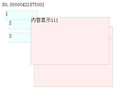
最值得學的一行
Math.pow((timestamp / this.time - 1), 3) + 1 是整個動畫的靈魂。它把「已經過的時間比例」代入一個三次方程式,產生的曲線就是所謂的 easeOutCubic——開始時變化劇烈,接近結尾時趨於平緩。用「時間」而非「次數」來計算,也能讓動畫在不同裝置上有一致的總時長。
另外注意 z-index 的管理:展開時遞增全域計數器,收合時若自己的值正好是最大值就遞減回去,避免數字無限膨胀。這是實作多層彈出時常被忽略的細節。
今天該怎麼寫
理解這套原理很有價值,但實務上已經不需要手寫 setInterval 動畫了。用 CSS transition 加上 transform 就能做出更流暢、且由合成器加速的效果:
.comment {
  transform: scale(0);
  transform-origin: top left;
  opacity: 0;
  transition: transform .3s cubic-bezier(0.33, 1, 0.68, 1), opacity .3s;
}
.comment.open { transform: scale(1); opacity: 1; }
另外,setInterval(fn, 1) 實際上會被瀏覽器限制到約 4~16 毫秒一次,寫成 1 並不會更快,反而增加不必要的開銷;改用 requestAnimationFrame 才能與螢幕刷新同步。
- 上一篇文章: JS 如何判斷字串是否包含某段文字
- 下一篇文章: JS 日期區間初始化:自動帶入「前一個月到今天」
相關文章
-
12 個經典的 Lightbox 彈出層方案比較:從 Thickbox 到 LITBox 點一下讓圖片「長」出來:用 setTimeout 逐格改高度的淡入小特效 純 JavaScript 打造下雨與下雪動畫:不用一行 Flash 跟著滑鼠跑的圖片,還拖一條橡皮筋似的線 網頁彈出層實作詳解:從最簡單到可拖曳對話框 用 Div + CSS + JavaScript 實作置中的半透明彈出層 HTML5 Canvas 效能優化技巧整理 HTML5 系列筆記:requestAnimationFrame 是什麼,又該怎麼用 DIV 層定位實例:讓彈出層不受分辨率影響 js 網頁煙花效果:從發射到爆炸的完整實作