在研究微網站(手機版網站)製作時會發現,關於這類側滑選單的教學並不多。先釐清一個常見誤解:所謂「微網站」並不是什麼新技術,本質上就是以手機瀏覽器為入口的行動版網站,需要相容 Android、iOS、WP 等系統。開發技術與一般網站完全相同,都是 HTML(含 HTML5)、CSS 與 JavaScript,因此有網站開發經驗的人完全能勝任。
同理,看到「微商城」「微客服」「微統計」這類以「微」開頭的名詞,直接把「微」理解成「基於手機/行動版的」即可,不必被名稱迷惑。
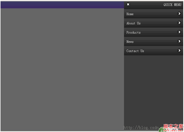
一、引入 jQuery
這裡使用 CDN 版本,省去自行託管的維護成本:
<script src="https://ajax.googleapis.com/ajax/libs/jquery/1.8.0/jquery.min.js"></script>
二、HTML 結構
<div class="quick"></div>

<div class="slideLeftMenu">
<div class="quick-toolbar">
<p class="toolbar-title">QUICK MENU</p>
<span class="toolbar-icon-delete"></span>
</div>
<div class="menuList">
<a class="list-item">
<p class="list-item-title">Home</p>
<span class="list-item-icon"></span>
</a>
<a class="list-item">
<p class="list-item-title">About Us</p>
<span class="list-item-icon"></span>
</a>
<a class="list-item">
<p class="list-item-title">Products</p>
<span class="list-item-icon"></span>
</a>
<a class="list-item">
<p class="list-item-title">News</p>
<span class="list-item-icon"></span>
</a>
<a class="list-item">
<p class="list-item-title">Contact Us</p>
<span class="list-item-icon"></span>
</a>
</div>
</div>

<div class="masklayer"></div>
這部分沒有技術難度,純粹是 div 堆疊。真正決定動畫效果的是 CSS。
三、CSS 樣式
*{ margin:0; padding:0;}
body{ font-size:1em; height:100%; margin:0; padding:0; }

/* 頂部快捷列,使用 CSS3 漸層 */
.quick{
  position:relative; left:0; top:0; width:100%; height:32px;
  background:-webkit-gradient(linear, left top, left bottom, from(#99f), to(#96f));
  background:-webkit-linear-gradient(#99f, #96f);
  background:-moz-linear-gradient(#99f, #96f);
  background:linear-gradient(#99f, #96f);
}

/* 側邊選單本體 */
.slideLeftMenu{
  display:none; width:272px; min-height:100%; background:#3d3d3d;
  position:absolute; right:0; top:0; z-index:3;
}
.slideLeftMenu .quick-toolbar,
.slideLeftMenu .list-item{
  display:block; width:100%; float:left; height:42px; line-height:42px;
  background:-webkit-gradient(linear, left top, left bottom, from(#444), to(#222));
  background:linear-gradient(#444, #222);
}
.quick-toolbar .toolbar-title{ float:right; color:#fff; margin-right:10px; }
.quick-toolbar .toolbar-icon-delete{
  float:left; width:18px; height:18px; margin:11px 0 0 10px;
  background:url(images/icons-18-white.png) -73px -1px #212121; border-radius:9px;
}
.menuList .list-item-title{
  float:left; font:bold 1.125em Arial, Helvetica, sans-serif; color:#fff;
  text-indent:0.75em; text-align:left;
}
.menuList .list-item-icon{
  float:right; width:18px; height:18px; margin:11px 10px 0 0;
  background:url(images/icons-18-white.png) -108px -1px #212121; border-radius:9px;
}

/* 遮罩層 */
.masklayer{
  display:none; width:100%; height:100%; position:absolute;
  left:0; top:0; background:#000; opacity:0.6; z-index:2;
}
遮罩與選單大量使用絕對定位,就是為了讓選單能從畫面右側平滑飛入。z-index 的層級安排(遮罩 2、選單 3)確保選單永遠浮在遮罩之上。
四、jQuery 動畫邏輯
window.QuickPanel = {
    'isOpened': false,
    'opened': function(){
        // 點擊遮罩或工具列都可關閉
        $masklayer.fadeIn().on("click", function(){
            window.QuickPanel.closed();
        });
        $quickpanel_toolbar.on("click", function(){
            window.QuickPanel.closed();
        });
        // 從右側 -272px 動畫到 0
        $panel.css({
            "width": "272px",
            "top": "-6px",
            "right": "-272px"
        }).show().animate({ "right": "0" }, function(){
            window.QuickPanel.isOpened = true;
        });
    },
    'closed': function(){
        $panel.css({ "right": "0" }).show().animate({
            "right": "-272px"
        }, function(){
            $masklayer.fadeOut();
            window.QuickPanel.isOpened = false;
            $panel.hide(); // 動畫結束後才隱藏,避免產生滾動條
        });
    }
};
把 open 與 close 封裝成一個物件,其他 DOM 元素要觸發時只需呼叫 window.QuickPanel.opened(),維運上比散落各處的匿名函數清楚得多。
一個實作時會遇到的問題
選單滑入過程中,因為元素短暫超出視窗範圍,瀏覽器會冒出橫向滾動條,視覺上相當突兀。常見解法有三:
一是在 body 上加 overflow-x: hidden,最直接但會影響整頁;二是把選單的父容器設為 overflow: hidden 並讓它填滿視窗,把溢出裁掉;三是改用 transform: translateX() 搭配 GPU 加速,除了避免滾動條,動畫也明顯比 animate 修改 right 順滑——後者在每一幀都觸發版面重排,在入門機上手機上容易掉幀。
若要在正式專案使用,建議直接評估成熟方案(如 slideout.js)或自行以 transform + transition 實作,程式碼量更少,效能也更好。
- 上一篇文章: 用 jQuery 解析 XML 字串的簡明範例
- 下一篇文章: jQuery 取得核取方塊選中值的兩種做法與批次操作