CSS3 實例教學:打造質感滿分的網頁進度條
編輯:CSS進階教程
進度條是少數「既有功能、又能當裝飾」的介面元素。以往要做出漸層、條紋、流光效果,得靠 GIF 動圖或 JavaScript 反覆切換背景;有了 CSS3 的漸層、偽元素與 keyframes 之後,這些效果都能用純樣式完成,而且解析度永遠銳利。
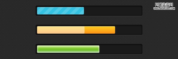
HTML 結構
<div class="progress-bar blue stripes">
  <span style="width: 40%"></span>
</div>
結構刻意做得很精簡,各元素的分工如下:
.progress-bar——進度槽的外框與基本尺寸。.blue——決定配色風格,這裡是藍色。.stripes——指定進度區塊的動畫紋理類型。span——真正代表進度的填充區塊,寬度以行內樣式控制(0%–100%)。
基礎樣式
.progress-bar {
  background-color: #1a1a1a;
  height: 25px;
  padding: 5px;
  width: 350px;
  margin: 50px 0;
  -moz-border-radius: 5px;
  -webkit-border-radius: 5px;
  border-radius: 5px;
  -moz-box-shadow: 0 1px 5px #000 inset, 0 1px 0 #444;
  -webkit-box-shadow: 0 1px 5px #000 inset, 0 1px 0 #444;
  box-shadow: 0 1px 5px #000 inset, 0 1px 0 #444;
}
.progress-bar span {
  display: inline-block;
  height: 25px;
  width: 200px;
  -moz-border-radius: 3px;
  -webkit-border-radius: 3px;
  border-radius: 3px;
  -moz-box-shadow: 0 1px 0 rgba(255, 255, 255, .5) inset;
  -webkit-box-shadow: 0 1px 0 rgba(255, 255, 255, .5) inset;
  box-shadow: 0 1px 0 rgba(255, 255, 255, .5) inset;
  -webkit-transition: width .4s ease-in-out;
  -moz-transition: width .4s ease-in-out;
  -ms-transition: width .4s ease-in-out;
  -o-transition: width .4s ease-in-out;
  transition: width .4s ease-in-out;
}

兩個設計值得注意:外槽用 inset 內陰影做出凹陷感,內填的 span 則用淺色內陰影做出上緣高光;而 transition: width 讓進度變化時是「滑」過去而非硬跳。
套用顏色
.blue span { background-color: #34c2e3; }
.orange span {
  background-color: #fecf23;
  background-image: -webkit-gradient(linear, left top, left bottom, from(#fecf23), to(#fd9215));
  background-image: -webkit-linear-gradient(top, #fecf23, #fd9215);
  background-image: -moz-linear-gradient(top, #fecf23, #fd9215);
  background-image: -ms-linear-gradient(top, #fecf23, #fd9215);
  background-image: -o-linear-gradient(top, #fecf23, #fd9215);
  background-image: linear-gradient(top, #fecf23, #fd9215);
}
.green span {
  background-color: #a5df41;
  background-image: -webkit-gradient(linear, left top, left bottom, from(#a5df41), to(#4ca916));
  background-image: -webkit-linear-gradient(top, #a5df41, #4ca916);
  background-image: -moz-linear-gradient(top, #a5df41, #4ca916);
  background-image: -ms-linear-gradient(top, #a5df41, #4ca916);
  background-image: -o-linear-gradient(top, #a5df41, #4ca916);
  background-image: linear-gradient(top, #a5df41, #4ca916);
}
動態條紋
斜向條紋的做法是用 135 度的漸層,把半透明白與透明交替排列,再透過 background-position 的位移關鍵幀讓它持續流動。
.stripes span {
  -webkit-background-size: 30px 30px;
  -moz-background-size: 30px 30px;
  background-size: 30px 30px;
  background-image: -webkit-gradient(linear, left top, right bottom, color-stop(.25, rgba(255,255,255,.15)), color-stop(.25, transparent), color-stop(.5, transparent), color-stop(.5, rgba(255,255,255,.15)), color-stop(.75, rgba(255,255,255,.15)), color-stop(.75, transparent), to(transparent));
  background-image: -webkit-linear-gradient(135deg, rgba(255,255,255,.15) 25%, transparent 25%, transparent 50%, rgba(255,255,255,.15) 50%, rgba(255,255,255,.15) 75%, transparent 75%, transparent);
  background-image: -moz-linear-gradient(135deg, rgba(255,255,255,.15) 25%, transparent 25%, transparent 50%, rgba(255,255,255,.15) 50%, rgba(255,255,255,.15) 75%, transparent 75%, transparent);
  background-image: -ms-linear-gradient(135deg, rgba(255,255,255,.15) 25%, transparent 25%, transparent 50%, rgba(255,255,255,.15) 50%, rgba(255,255,255,.15) 75%, transparent 75%, transparent);
  background-image: -o-linear-gradient(135deg, rgba(255,255,255,.15) 25%, transparent 25%, transparent 50%, rgba(255,255,255,.15) 50%, rgba(255,255,255,.15) 75%, transparent 75%, transparent);
  background-image: linear-gradient(135deg, rgba(255,255,255,.15) 25%, transparent 25%, transparent 50%, rgba(255,255,255,.15) 50%, rgba(255,255,255,.15) 75%, transparent 75%, transparent);
  -webkit-animation: animate-stripes 3s linear infinite;
  -moz-animation: animate-stripes 3s linear infinite;
}
@-webkit-keyframes animate-stripes {
  0%   { background-position: 0 0; }
  100% { background-position: 60px 0; }
}
@-moz-keyframes animate-stripes {
  0%   { background-position: 0 0; }
  100% { background-position: 60px 0; }
}
流光閃爍
利用 ::after 偽元素疊一層白色遮罩,讓它的寬度與透明度做循環變化,看起來就像一道光掃過進度條。
.shine span { position: relative; }
.shine span::after {
  content: '';
  opacity: 0;
  position: absolute;
  top: 0; right: 0; bottom: 0; left: 0;
  background: #fff;
  -moz-border-radius: 3px;
  -webkit-border-radius: 3px;
  border-radius: 3px;
  -webkit-animation: animate-shine 2s ease-out infinite;
  -moz-animation: animate-shine 2s ease-out infinite;
}
@-webkit-keyframes animate-shine {
  0%   { opacity: 0; width: 0; }
  50%  { opacity: .5; }
  100% { opacity: 0; width: 95%; }
}
@-moz-keyframes animate-shine {
  0%   { opacity: 0; width: 0; }
  50%  { opacity: .5; }
  100% { opacity: 0; width: 95%; }
}

呼吸發光
同一個概念換成內陰影的明暗變化,就成了呼吸燈效果。
.glow span {
  -moz-box-shadow: 0 5px 5px rgba(255,255,255,.7) inset, 0 -5px 5px rgba(255,255,255,.7) inset;
  -webkit-box-shadow: 0 5px 5px rgba(255,255,255,.7) inset, 0 -5px 5px rgba(255,255,255,.7) inset;
  box-shadow: 0 5px 5px rgba(255,255,255,.7) inset, 0 -5px 5px rgba(255,255,255,.7) inset;
  -webkit-animation: animate-glow 1s ease-out infinite;
  -moz-animation: animate-glow 1s ease-out infinite;
}
@-webkit-keyframes animate-glow {
  0%   { -webkit-box-shadow: 0 5px 5px rgba(255,255,255,.7) inset, 0 -5px 5px rgba(255,255,255,.7) inset; }
  50%  { -webkit-box-shadow: 0 5px 5px rgba(255,255,255,.3) inset, 0 -5px 5px rgba(255,255,255,.3) inset; }
  100% { -webkit-box-shadow: 0 5px 5px rgba(255,255,255,.7) inset, 0 -5px 5px rgba(255,255,255,.7) inset; }
}
@-moz-keyframes animate-glow {
  0%   { -moz-box-shadow: 0 5px 5px rgba(255,255,255,.7) inset, 0 -5px 5px rgba(255,255,255,.7) inset; }
  50%  { -moz-box-shadow: 0 5px 5px rgba(255,255,255,.3) inset, 0 -5px 5px rgba(255,255,255,.3) inset; }
  100% { -moz-box-shadow: 0 5px 5px rgba(255,255,255,.7) inset, 0 -5px 5px rgba(255,255,255,.7) inset; }
}
不支援 CSS3 的環境
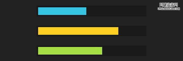
這正是「漸進增強」的教科書案例:在舊瀏覽器中,圓角、陰影、動畫全部失效,但因為寬度是靠行內樣式決定的,進度條依然呈現為一個能正確表達進度的實心色塊。功能不減,只是少了裝飾。
原文參考:https://www.red-team-design.com/stylish-css3-progress-bars
- 上一篇文章: 網頁設計技巧:依據連結目標自動套用不同樣式
- 下一篇文章: 前端常用 ClassName 命名參考表:收錄 100+ 個通用類名