CSS3 相容方案:用 PIE 讓圓角與陰影在 IE 裡生效
編輯:CSS進階教程
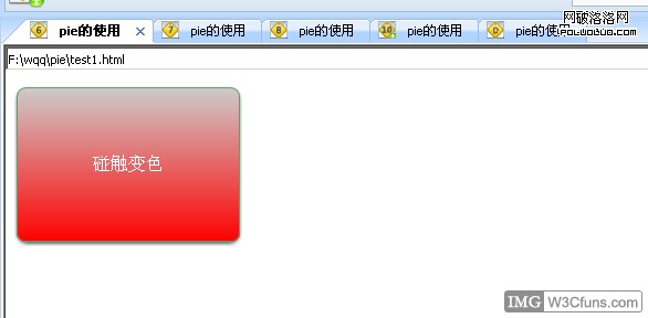
純 CSS3 寫出來的圓角,在舊版 IE 裡是不吃這一套的。PIE(Progressive Internet Explorer)就是為了解這個問題而生。
靈感來自社群朋友 gucong 的分享,重點整理如下:
· PIE 為 IE 帶來 CSS3 屬性的支援(圓角、陰影、漸層背景等)
· selectivizr 為 IE 帶來 CSS3 選擇器的支援
兩者分工不同,可以搭配使用。以下先記錄 PIE 的用法。
怎麼用
本質上就是透過 behavior 屬性掛上一個 htc 檔,讓 IE 自己把標準 CSS3 屬性翻譯成它看得懂的 VML 繪製:
behavior: url("PIE.htc");
另外,如果是漸層背景,還需要多寫一行 -pie-background 供 PIE 讀取。
範例程式碼
<!DOCTYPE html PUBLIC "-//W3C//DTD XHTML 1.0 Transitional//EN"
"https://www.w3.org/TR/xhtml1/DTD/xhtml1-transitional.dtd">
<html xmlns="https://www.w3.org/1999/xhtml">
<head>
<meta http-equiv="Content-Type" content="text/html; charset=utf-8" />
<title>PIE 的使用</title>
<style type="text/css">
body{behavior:url("csshover.htc");}
.test{
  color:#fff; border: 1px solid #696; padding: 60px 0;
  text-align: center; width: 200px;
  -webkit-border-radius: 8px;
  -moz-border-radius: 8px;
  border-radius: 8px;
  -webkit-box-shadow: #666 0px 2px 3px;
  -moz-box-shadow: #666 0px 2px 3px;
  box-shadow: #666 0px 2px 3px;
  background: #EEFF99;
  background: -webkit-gradient(linear, 0 0, 0 bottom, from(#EEFF99), to(#66EE33));
  background: -webkit-linear-gradient(#EEFF99, #66EE33);
  background: -moz-linear-gradient(#EEFF99, #66EE33);
  background: -ms-linear-gradient(#EEFF99, #66EE33);
  background: -o-linear-gradient(#EEFF99, #66EE33);
  background: linear-gradient(#EEFF99, #66EE33);
  -pie-background: linear-gradient(#EEFF99, #66EE33);
  behavior: url("PIE.htc");
}
.test:hover{
  cursor:pointer; border: 1px solid #696; padding: 60px 0;
  text-align: center; width: 200px;
  border-radius: 8px; box-shadow: #666 0px 2px 3px;
  background: #cccccc;
  background: linear-gradient(#cccccc, #ff0000);
  -pie-background: linear-gradient(#cccccc, #ff0000);
  behavior: url("PIE.htc");
}
</style>
</head>
<body>
<div class="test">碰觸變色</div>
</body>
</html>
注意 hover 樣式裡的 transition 在 IE 下不會有動畫,PIE 只負責把靜態外觀補回來。另外 htc 檔必須與頁面同網域,跨網域引用會被安全性限制擋掉。
參考資料:https://css3pie.com/