這個範例是我很喜歡的一類練習:完全不使用任何圖片,也不寫一行 JavaScript,就做出時針、分針、秒針都會走,還附帶一個跳動的數位時鐘。全部靠 CSS3 的 animation 與 transform 撐起來。
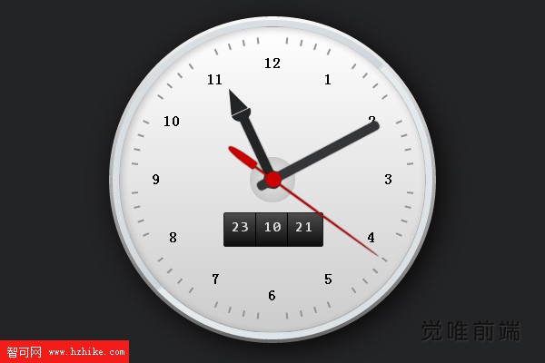
刻度、時標、金屬光澤的邊框、中央的軸心,樣樣俱全,指針還帶有陰影層次。在 CSS3 的渲染能力下,視覺精緻度真的可以做得相當高。
實作原理
拆開來看其實只有兩組技巧:
- 讓它動:用
@keyframes定義旋轉角度,再以animation指定每根指針的週期——秒針 60 秒、分針 3600 秒、時針 43200 秒,並搭配transform-origin把旋轉中心設在指針尾端。數位顯示則是讓一整條數字列表往上位移,用steps(60, end)做出逐格跳動的節奏。 - 讓它美:用
linear-gradient與radial-gradient疊出金屬質感,border-radius撐圓形,box-shadow加上外陰影與內陰影(inset)。
原理單純,只是細節堆疊得多。之前寫過的 CSS3 動態進度條用的也是同一套思路,可見「animation + transform」這組組合的通用性有多高。
HTML 結構
結構本身就是一個時鐘的分解圖:外框、60 個分鐘刻度、時/分/秒數字盤、12 個時標,最後是三根指針。由於原始碼太長(光是 60 個 li 刻度就佔掉大半),這裡只列出骨架:
<div id="watch">
  <div class="frame-face"></div>

  <ul class="minute-marks">
    <li></li>  <!-- 共 60 個,對應 60 分鐘刻度 -->
  </ul>

  <div class="digital-wrap">
    <ul class="digit-hours">   <!-- 00 ~ 23 --></ul>
    <ul class="digit-minutes"> <!-- 00 ~ 59 --></ul>
    <ul class="digit-seconds"> <!-- 00 ~ 59 --></ul>
  </div>

  <ul class="digits">
    <li>1</li> <!-- 共 12 個時標 -->
  </ul>

  <div class="hours-hand"></div>
  <div class="minutes-hand"></div>
  <div class="seconds-hand"></div>
</div>
CSS 關鍵片段
外框與刻度
#watch .frame-face {
  position: relative;
  width: 30em;
  height: 30em;
  margin: 2em auto;
  border-radius: 15em;
  background: linear-gradient(to bottom, #f9f9f9, #666);
  box-shadow: rgba(0, 0, 0, .8) .5em .5em 4em;
}

#watch .minute-marks li {
  display: block;
  width: .2em;
  height: .6em;
  background: #929394;
  position: absolute;
  top: 50%;
  left: 50%;
  margin: -.4em 0 0 -.1em;
}

/* 每格刻度就是「旋轉 + 向外位移」的組合,間隔 6 度 */
#watch .minute-marks li:nth-child(1)  { transform: rotate(6deg)  translateY(-12.7em); }
#watch .minute-marks li:nth-child(2)  { transform: rotate(12deg) translateY(-12.7em); }
#watch .minute-marks li:nth-child(3)  { transform: rotate(18deg) translateY(-12.7em); }
/* … 一路到 nth-child(60),角度 = n × 6deg */這段是全篇最冗長的部分,但規律非常單純:第 n 格就轉 n × 6 度再往外推。理解之後,用 CSS 變數或预处理器改寫成迴圈會輕鬆許多。
三根指針
/* 時針:12 小時 = 43200 秒 */
@keyframes hours { to { transform: rotate(335deg); } }

#watch .hours-hand {
  width: .8em;
  height: 7em;
  border-radius: 0 0 .9em .9em;
  background: #232425;
  position: absolute;
  bottom: 50%;
  left: 50%;
  margin: 0 0 -.8em -.4em;
  box-shadow: #232425 0 0 2px;
  transform-origin: 0.4em 6.2em;
  transform: rotate(-25deg);
  animation: hours 43200s linear 0s infinite;
}

/* 分針:60 分鐘 = 3600 秒 */
@keyframes minutes { to { transform: rotate(422deg); } }

#watch .minutes-hand {
  width: .8em;
  height: 12.5em;
  transform-origin: 0.4em 11em;
  animation: minutes 3600s linear 0s infinite;
}

/* 秒針:用 steps(60) 做出「跳秒」而非滑順移動 */
@keyframes seconds { to { transform: rotate(480deg); } }

#watch .seconds-hand {
  width: .2em;
  height: 14em;
  background: #c00;
  transform-origin: 0.1em 12em;
  transform: rotate(120deg);
  animation: seconds 60s steps(60, end) 0s infinite;
}
兩個細節值得注意:秒針用 steps(60, end) 而不是 linear,所以它是「一格一格跳」的機械錶手感;而 keyframes 的終點角度(335°、422°、480°)都刻意超過一圈,是為了讓動畫起點的初始角度也能被涵蓋在旋轉範圍內。
數位顯示
#watch .digital-wrap {
  width: 9em;
  height: 3em;
  border: .1em solid #222;
  border-radius: .2em;
  position: absolute;
  top: 50%;
  left: 50%;
  margin: 3em 0 0 -4.5em;
  overflow: hidden;
  background: linear-gradient(to bottom, #4c4c4c 0%, #0f0f0f 100%);
}

#watch .digit-seconds li {
  animation: dsm 60s steps(60, end) 0s infinite;
}

#watch .digit-minutes li {
  animation: dsm 3600s steps(60, end) 0s infinite;
}

@keyframes dsm {
  to { transform: translateY(-120em); }
}
可視窗高 3em、每個數字佔 2em,因此一次位移 120em 剛好換過 60 個數字,回到起點時畫面完全一致,迴圈因此看不出接縫。
這個範例告訴我們的事
整份程式碼裡沒有一張圖、沒有一行 JS,卻做出一個時鐘。它示範了 CSS3 在「時間控制」與「幾何變形」上的能力已經足以承擔真正的動態介面。(實務上要顯示真實時間,仍需以 JS 對齊系統時鐘;此範例展示的是純 CSS 的動畫表現力。)
把 keyframes 的角度、時長與 transform-origin 這三個數字換一換,你也能做出自己的作品——這正是它最值得拿來當練習題的原因。
- 上一篇文章: CSS3 + JS 互動頭像牆:滑鼠移過就翻轉的網格展示效果
- 下一篇文章: CSS3 網頁實例:滑鼠移入圖示的互動動畫