CSS 段落首字放大:單行與多行兩種排版
編輯:CSS詳解
首字放大是雜誌排版裡常見的視覺手法,用 ::first-letter 偽元素就能純 CSS 完成,不必把第一個字切圖或包一層標籤。
一、單行放大
放大後的效果被限制在第一行的高度內,文字整齊地從頂端開始:
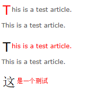
<!DOCTYPE html>
<html lang="zh-Hant">
<head>
<meta charset="UTF-8" />
<title>首字放大</title>
<style>
body {
  background-color: #FFFFFF;
  color: #595959;
}
.contain { width: 150px; }
.contain p {
  font: 80%/1.6 Verdana, Geneva, Arial, Helvetica, sans-serif;
}
.contain p::first-letter {
  font-size: 2em;
  padding: 0.1em;
  color: #000000;
  vertical-align: middle;
}
.contain p::first-line { color: red; }
.contain p:first-child::first-letter { color: red; }
.contain p:first-child::first-line { color: inherit; }
</style>
</head>
<body>
<div class="contain">
  <p>This is a test article. This is a test article.</p>
  <p>This is a test article. This is a test article.</p>
  <p>這是一個測試。</p>
</div>
</body>
</html>
相容性方面,::first-letter 支援 IE7 以上,::first-line 支援 IE8 以上。
二、多行放大(首字下沉)
更常見的雜誌效果是讓首字浮動、文字繞著它走,佔據好幾行的高度:
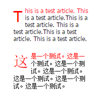
<!DOCTYPE html>
<html lang="zh-Hant">
<head>
<meta charset="UTF-8" />
<title>首字下沉</title>
<style>
* { margin: 0; padding: 0; }
body {
  font-size: 12px;
  font-family: Tahoma, Geneva, sans-serif;
  padding: 200px;
}
p {
  width: 150px;
  color: #000;
  font-size: 1em;
  margin-bottom: 20px;
}
p::first-letter {
  float: left;
  font-size: 2.5em;
  padding-right: 5px;
  text-transform: uppercase;
}
p::first-line { color: #f00; }
</style>
</head>
<body>
<p>This is a test article. This is a test article.</p>
<p>這是一個測試。這是一個測試。這是一個測試。</p>
</body>
</html>
兩者的差別只有一個 float
單行版靠 vertical-align: middle 讓大字與第一行對齊;多行版加上 float: left,首字就會浮到左側,後續文字自動繞排,高度由字級決定。這也是為什麼 ::first-letter 只能作用於塊級元素(如 p、div)——行內元素無法承載浮動。
實務提醒兩點:一是中文沒有大小寫概念,text-transform: uppercase 對中文無效,只對英文字母有用;二是首字放大後行距容易被撐開,記得微調 line-height 與 padding,避免相鄰行黏在一起。
- 上一篇文章: CSS Sprite 實戰:從大圖中摳出小圖並做滑入換圖
- 下一篇文章: span 與 div 到底差在哪:行內元素與塊級元素