一、線性漸層:linear-gradient
語法:
<linear-gradient> = linear-gradient([ [ <angle> | to <side-or-corner] ,]? <color-start>[, <color-end>]+)
<side-or-corner> = [left | right] || [top | bottom]
<color-start|end> = <color>[ <length>|<percentage>]?
下列值用來表示漸層的方向,可以用角度或關鍵字來設定:
<angle>:用角度值指定漸層的方向(或角度)。
to left:設定漸層從右到左,相當於 270deg。
to right:設定漸層從左到右,相當於 90deg。
to top:設定漸層從下到上,相當於 0deg。
to bottom:設定漸層從上到下,相當於 180deg。這是預設值,等同於留空不寫。
<color-start|end> 用於指定漸層的起止顏色:
<color>:指定顏色。
<length>:用長度值指定起止色位置,不允許負值。
<percentage>:用百分比指定起止色位置。
示例:

div { width: 200px; height: 100px; margin: 10px 5px; border: 1px solid #ddd000; }
#LinearStartToEnd { float: left; background: linear-gradient(#ff0000, #00ff00); }
#LinearPercentage { float: left; background: linear-gradient(#0000ff, #ff0000 52%, #00ff00); }
#LinearAnglePercentage { float: left; background: linear-gradient(90deg, #ff0000 20%, #00ff00 50%, #000000 80%); }
#LinearAngle { float: left; background: linear-gradient(30deg, #ffff00 30%, #ff0000, #00ff00); }
#LinearTopRight { float: left; background: linear-gradient(to right top, #00ff00, #ff0000 50%, #0000ff); }
二、徑向漸層:radial-gradient
語法:
<position> = [ <length>① | <percentage>① | left | center① | right ]? [ <length>② | <percentage>② | top | center② | bottom ]?
<shape> = circle | ellipse
<size> = <extent-keyword> | [<circle-size> || <ellipse-size>]
<extent-keyword> = closest-side | closest-corner | farthest-side | farthest-corner
<circle-size> = <length>
<ellipse-size> = [ <length> | <percentage> ]{2}
<radial-gradient> = radial-gradient([ [ <shape> || <size> ] [ at <position> ]? , | at <position> , ]? <color-start> [, <color-end> ]+)
<position> 確定圓心的位置。如果提供 2 個參數,第一個表示橫座標,第二個表示縱座標;如果只提供一個,第二值預設為 50%,即 center。
<length>①:用長度值指定徑向漸層圓心的橫座標值,可以為負值。
<percentage>①:用百分比指定徑向漸層圓心的橫座標值,可以為負值。
<length>②:用長度值指定徑向漸層圓心的縱座標值,可以為負值。
<percentage>②:用百分比指定徑向漸層圓心的縱座標值,可以為負值。
center①:設定中間為徑向漸層圓心的橫座標值。
center②:設定中間為徑向漸層圓心的縱座標值。
left:設定左邊為徑向漸層圓心的橫座標值。
right:設定右邊為徑向漸層圓心的橫座標值。
top:設定頂部為徑向漸層圓心的縱座標值。
bottom:設定底部為徑向漸層圓心的縱座標值。
<shape> 確定圓的類型:
circle:指定圓形的徑向漸層。
ellipse:指定橢圓形的徑向漸層。
<extent-keyword>(circle | ellipse 都接受該值作為 size):
closest-side:指定徑向漸層的半徑長度為從圓心到離圓心最近的邊。
closest-corner:指定徑向漸層的半徑長度為從圓心到離圓心最近的角。
farthest-side:指定徑向漸層的半徑長度為從圓心到離圓心最遠的邊。
farthest-corner:指定徑向漸層的半徑長度為從圓心到離圓心最遠的角。
<circle-size>(circle 接受該值作為 size):
<length>:用長度值指定正圓徑向漸層的半徑長度,不允許負值。
<ellipse-size>(ellipse 接受該值作為 size):
<length>:用長度值指定橢圓徑向漸層的橫向或縱向半徑長度,不允許負值。
<percentage>:用百分比指定橢圓徑向漸層的橫向或縱向半徑長度,不允許負值。
示例:

#RadialCenterCircle { float: left; background: radial-gradient(circle at center, #ff0000, #ffff00, #00ffff); }
#RadialClosestSide { float: left; background: radial-gradient(circle closest-side, #ff0000, #00ff00, #ffff00); }
#RadialFarthestSide { float: left; background: radial-gradient(farthest-side, #ff0000 20%, #ffff00 60%, #00ff00 80%); }
#RadialRightTop { float: left; background: radial-gradient(at right top, #ff0000, #ffff00, #00ff00); }
#RadialRadiusCenter { float: left; background: radial-gradient(farthest-side at top right, #ff0000, #ffff00, #01fefe); }
#RadialGroup { float: left; background: radial-gradient(farthest-side at top right, #ff0000, #ffff00, #009f00, transparent), radial-gradient(60px at top left, #ff0000, #ffff00, #00ff0e); }
三、重複的線性漸層:repeating-linear-gradient
語法與參數類似線性漸層,這裡就不再贅述,詳情請參考 CSS 手冊。
示例:
#RepeatingLinearPercentage { float: left; background: repeating-linear-gradient(#ff0000, #00ff00 10%, #000000 15%); }
#RepeatingLinearRight { float: left; background: repeating-linear-gradient(to right, #ff0000, #00ff00 10%, #000000 15%); }
#RepeatingLinearAngle { float: left; background: repeating-linear-gradient(45deg, #ff0000, #00ff00 10%, #0000ff 15%); }
#RepeatingLinearBottomLeft { float: left; background: repeating-linear-gradient(to bottom left, #00ffff, #ff0000 10%, #00ff00 15%); }
四、重複的徑向漸層:repeating-radial-gradient
語法與參數類似徑向漸層,這裡就不再贅述,詳情請參考 CSS 手冊。
示例:

#RepeatingRadialCircle { float: left; background: repeating-radial-gradient(circle, #ff0000 0, #00ff00 10%, #0000ff 15%); }
#RepeatingRadialTopLeft { float: left; background: repeating-radial-gradient(at top left, #ff0000, #00ff00 10%, #0de0f0 15%, #ffff00 20%, #000000 25%); }
#RepeatingRadialClosestCorner { float: left; background: repeating-radial-gradient(circle closest-corner at 20px 50px, #00ff00, #ff0000 10%, #00ffff 20%, #ffff00 30%, #ff00ff 40%); }
完整的例子:
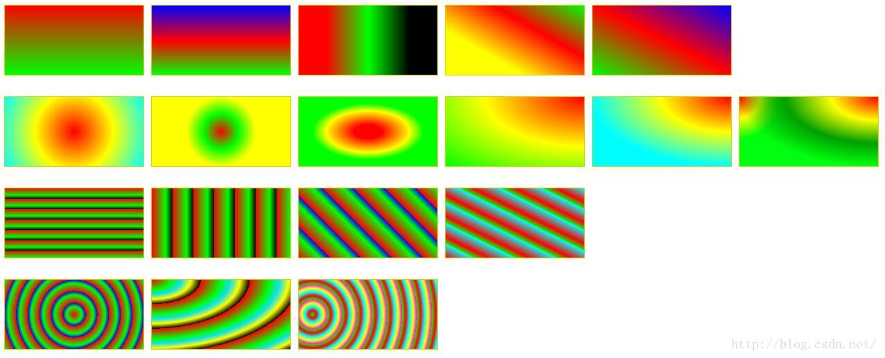
<!DOCTYPE html>
<html>
<head>
<meta charset="utf-8" />
<title>ImageCSS3</title>
<style>
div { width: 200px; height: 100px; margin: 10px 5px; border: 1px solid #ddd000; }
#LinearStartToEnd { float: left; background: linear-gradient(#ff0000, #00ff00); }
#LinearPercentage { float: left; background: linear-gradient(#0000ff, #ff0000 52%, #00ff00); }
#LinearAnglePercentage { float: left; background: linear-gradient(90deg, #ff0000 20%, #00ff00 50%, #000000 80%); }
#LinearAngle { float: left; background: linear-gradient(30deg, #ffff00 30%, #ff0000, #00ff00); }
#LinearTopRight { float: left; background: linear-gradient(to right top, #00ff00, #ff0000 50%, #0000ff); }
#RadialCenterCircle { float: left; background: radial-gradient(circle at center, #ff0000, #ffff00, #00ffff); }
#RadialClosestSide { float: left; background: radial-gradient(circle closest-side, #ff0000, #00ff00, #ffff00); }
#RadialFarthestSide { float: left; background: radial-gradient(farthest-side, #ff0000 20%, #ffff00 60%, #00ff00 80%); }
#RadialRightTop { float: left; background: radial-gradient(at right top, #ff0000, #ffff00, #00ff00); }
#RadialRadiusCenter { float: left; background: radial-gradient(farthest-side at top right, #ff0000, #ffff00, #01fefe); }
#RadialGroup { float: left; background: radial-gradient(farthest-side at top right, #ff0000, #ffff00, #009f00, transparent), radial-gradient(60px at top left, #ff0000, #ffff00, #00ff0e); }
#RepeatingLinearPercentage { float: left; background: repeating-linear-gradient(#ff0000, #00ff00 10%, #000000 15%); }
#RepeatingLinearRight { float: left; background: repeating-linear-gradient(to right, #ff0000, #00ff00 10%, #000000 15%); }
#RepeatingLinearAngle { float: left; background: repeating-linear-gradient(45deg, #ff0000, #00ff00 10%, #0000ff 15%); }
#RepeatingLinearBottomLeft { float: left; background: repeating-linear-gradient(to bottom left, #00ffff, #ff0000 10%, #00ff00 15%); }
#RepeatingRadialCircle { float: left; background: repeating-radial-gradient(circle, #ff0000 0, #00ff00 10%, #0000ff 15%); }
#RepeatingRadialTopLeft { float: left; background: repeating-radial-gradient(at top left, #ff0000, #00ff00 10%, #0de0f0 15%, #ffff00 20%, #000000 25%); }
#RepeatingRadialClosestCorner { float: left; background: repeating-radial-gradient(circle closest-corner at 20px 50px, #00ff00, #ff0000 10%, #00ffff 20%, #ffff00 30%, #ff00ff 40%); }
</style>
</head>
<body>
<!-- 指定線性漸層起止色 -->
<div id="LinearStartToEnd"></div>
<!-- 指定線性漸層起止色位置 -->
<div id="LinearPercentage"></div>
<!-- 指定線性漸層顏色漸變方向和起止色位置 -->
<div id="LinearAnglePercentage"></div>
<!-- 指定線性漸層顏色漸變方向 -->
<div id="LinearAngle"></div>
<!-- 設置漸變從右上到左下 -->
<div id="LinearTopRight"></div>
<div style="width:0; height:0; border:none; clear:both"></div>
<!-- 以中心點為圓心的圓形徑向漸層 -->
<div id="RadialCenterCircle"></div>
<!-- 徑向漸層半徑長度:圓心到離圓心最近邊的長度 -->
<div id="RadialClosestSide"></div>
<!-- 徑向漸層半徑長度:圓心到離圓心最遠邊的長度 -->
<div id="RadialFarthestSide"></div>
<!-- 左邊為徑向漸層圓心的橫座標值,頂邊為徑向漸層圓心的縱座標值 -->
<div id="RadialRightTop"></div>
<!-- 同時指定徑向漸層的圓心和半徑 -->
<div id="RadialRadiusCenter"></div>
<!-- 徑向漸層組合 -->
<div id="RadialGroup"></div>
<div style="width:0; height:0; border:none; clear:both"></div>
<!-- 指定顏色起止色位置的重複線性漸層 -->
<div id="RepeatingLinearPercentage"></div>
<!-- 從左到右漸變的重複線性漸層 -->
<div id="RepeatingLinearRight"></div>
<!-- 漸變角度為 45 度的重複線性漸層 -->
<div id="RepeatingLinearAngle"></div>
<!-- 從左下到右上的重複線性漸層 -->
<div id="RepeatingLinearBottomLeft"></div>
<div style="width:0; height:0; border:none; clear:both"></div>
<!-- 圓形重複徑向漸層 -->
<div id="RepeatingRadialCircle"></div>
<!-- 漸變方向為左上到右下的重複徑向漸層 -->
<div id="RepeatingRadialTopLeft"></div>
<!-- 重複徑向漸層:漸變半徑長度為從圓心到離圓心最近的角的距離 -->
<div id="RepeatingRadialClosestCorner"></div>
</body>
</html>
總結
以上就是這篇文章的全部內容。本文整理了目前常見的幾種用 CSS3 實現漸層顏色的方法,希望對大家的學習或工作能有所幫助,如果有疑問,歡迎留言交流。
- 上一篇文章: CSS3 實現文字波浪線效果的範例程式碼
- 下一篇文章: CSS3 2D 模擬摩天輪旋轉動畫