用 CSS3 手刻 iOS 風格滑動開關
編輯:關於CSS
H5 頁面需要一個 iOS 的滑動開關,想了一下,這東西用 CSS3 應該做得起來,於是就折騰出來了。核心不難:隱藏原生 checkbox,用 label 當作可視的軌道,再靠 :checked + label 兄弟選擇器切換狀態,中間的位移交給 transition。
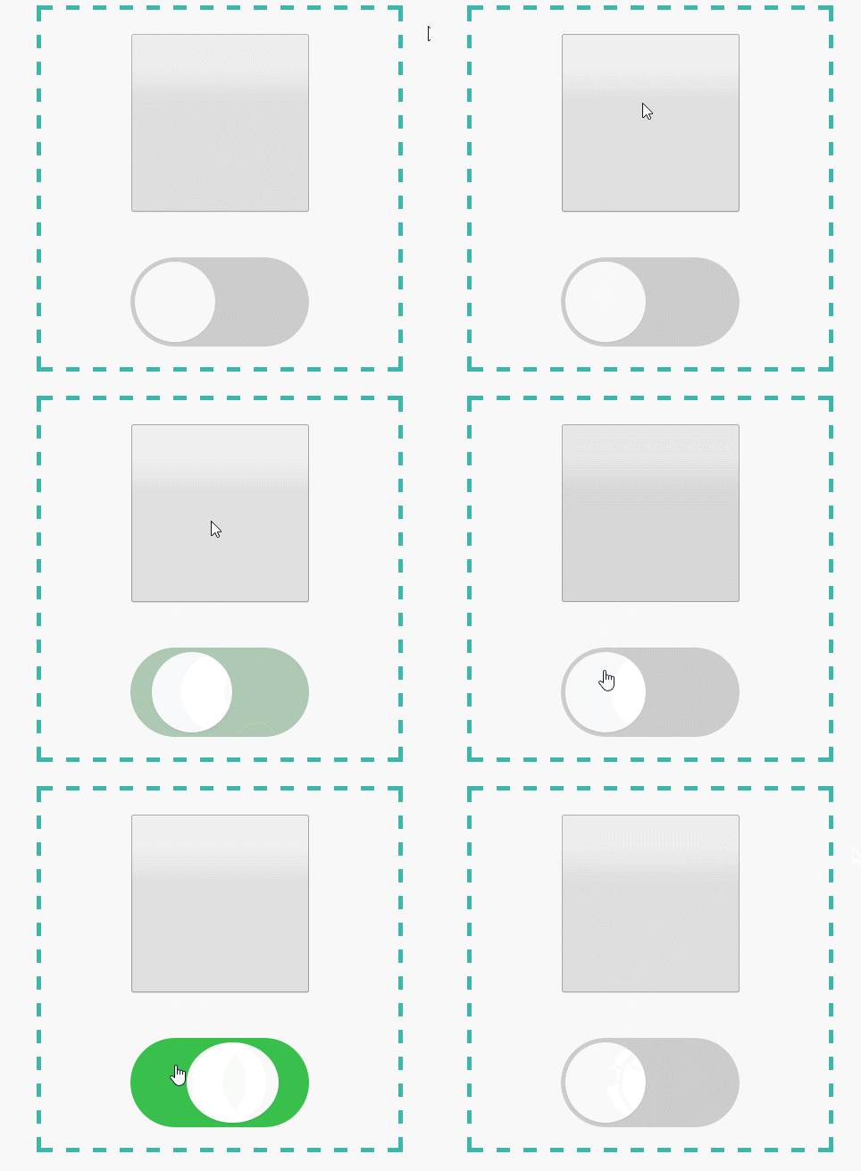
完整程式碼
<!DOCTYPE html>
<html lang="zh-Hant">
<head>
<meta charset="UTF-8">
<title>CSS3 模擬 iOS 開關</title>
<style type="text/css" media="screen">
/* 根元素字級,方便用 rem 縮放整體尺寸 */
html { font-size: 100px; }

/* 外層只是用來置中與畫虛線框 */
.ios-checkbox {
  height: 4rem;
  width: 4rem;
  position: absolute;
  left: 50%;
  top: 50%;
  transform: translate(-50%, -50%);
  border: .05rem dashed #3DB7A9;
  display: flex;
  flex-direction: column;
  flex-wrap: nowrap;
  justify-content: space-around;
  align-items: center;
}

/* label 就是那條灰色軌道 */
.emulate-ios-button {
  display: block;
  width: 2rem;
  height: 1rem;
  background: #ccc;
  border-radius: 5rem;
  cursor: pointer;
  position: relative;
  transition: all .3s ease;
}

/* 偽元素畫白色圓球滑塊 */
.emulate-ios-button:after {
  content: '';
  display: block;
  width: .9rem;
  height: .9rem;
  border-radius: 100%;
  background: #fff;
  box-shadow: 0 1px 1px rgba(0, 0, 0, .1);
  position: absolute;
  left: .05rem;
  top: .05rem;
  /* translateZ 強制啟用 GPU 硬體渲染 */
  transform: translateZ(0);
  transition: all .3s ease;
}

/* 按下的瞬間把圓球壓扁一點,模擬回饋 */
.emulate-ios-button:active:after { width: 1.1rem; }

/* 原生 checkbox 保留在畫面上,方便對照 */
.raw-checkbox { height: 2rem; width: 2rem; }

/* 勾選 → 軌道變綠 */
.raw-checkbox:checked + label { background: #34bf49; }

/* 勾選 → 圓球右移(.9 + .05 的起始值,所以是 1.05rem) */
.raw-checkbox:checked + label:after { left: 1.05rem; }

.raw-checkbox:checked + label:active:after { left: .5rem; }

/* 停用狀態 */
.raw-checkbox:disabled + label {
  background: #d5d5d5;
  pointer-events: none;
}
.raw-checkbox:disabled + label:after { background: #bcbdbc; }
</style>
</head>
<body>
<div class="ios-checkbox">
  <input type="checkbox" id="ios-checkbox" name="emulate-ios-button" class="raw-checkbox">
  <label for="ios-checkbox" class="emulate-ios-button"></label>
</div>
</body>
</html>
幾個設計決定
為什麼用 rem?根字級固定成 100px 後,1rem 就是 100px,整組元件要放大縮小只改一個數字即可,在切裝置密度時特別方便。
為什麼保留原生 checkbox?為了對照視覺效果,這裡刻意不隱藏它。正式專案裡加上 position: absolute 與 opacity: 0(或 clip 剪裁)把它藏起來即可,但務必保留在 tab 序中,鍵盤操作與螢幕閱讀器才不會失效。
translateZ(0) 的作用是強迫瀏覽器把元素提昇為獨立合成圖層,動畫交給 GPU 處理,滑動時比較不會掉格。
無障礙補充:純 CSS 的開關無法回報狀態給輔助工具,實務上建議補上 role="switch" 與 aria-checked,並在 focus 狀態加上明顯的 focus ring。
- 上一篇文章: CSS 背景圖片定位的四種實用解法
- 下一篇文章: CSS3 實作磨砂玻璃(毛玻璃)質感卡片