CSS3 實作磨砂玻璃(毛玻璃)質感卡片
編輯:關於CSS
緣起
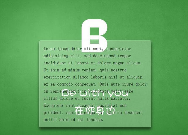
這個效果是在《CSS Secrets》裡看到的,一眼就很喜歡。原理其實不複雜:在卡片後面放一個放大並模糊的偽元素,讓它撐出卡片邊界之外,卡片本身再鋪一層半透明白,模糊與透光的疊合就出現了霧面玻璃的質感。
效果預覽
程式碼
<!DOCTYPE html>
<html lang="zh-Hant">
<head>
<meta charset="UTF-8">
<title>磨砂玻璃效果</title>
<style>
/**
 * 背景圖鋪滿視窗並固定
 * 上半部留白把內容推到垂直中心附近
 */
body {
  /* 此處背景圖請自行替換 */
  background: url(demo.jpg) no-repeat center center fixed;
  background-size: cover;
  min-height: 100vh;
  box-sizing: border-box;
  margin: 0;
  padding-top: calc(50vh - 6em);
  font: 150%/1.6 Baskerville, Palatino, serif;
}

/**
 * 卡片本體
 * 整體置中、半透明背景、溢出隱藏、圓角、文字淡陰影
 */
.description {
  position: relative;
  margin: 0 auto;
  padding: 1em;
  max-width: 23em;
  background: hsla(0, 0%, 100%, .25) border-box;
  overflow: hidden;
  border-radius: .3em;
  box-shadow: 0 0 0 1px hsla(0, 0%, 100%, .3) inset,
              0 .5em 1em rgba(0, 0, 0, 0.6);
  text-shadow: 0 1px 1px hsla(0, 0%, 100%, .3);
}

/* 關鍵一步:用偽元素複製背景並模糊 */
.description::before {
  content: '';
  position: absolute;
  top: 0;
  right: 0;
  bottom: 0;
  left: 0;
  margin: -30px;   /* 向外擴張,避免模糊後邊緣出現透明缺口 */
  z-index: -1;
  -webkit-filter: blur(20px);
  filter: blur(20px);
}
</style>
</head>
<body>
<p class="description">
Lorem ipsum dolor sit amet, consectetur adipisicing elit, sed do eiusmod
tempor incididunt ut labore et dolore magna aliqua. Ut enim ad minim veniam,
quis nostrud exercitation ullamco laboris nisi ut aliquip ex ea commodo
consequat. Duis aute irure dolor in reprehenderit in voluptate velit esse
cillum dolore eu fugiat nulla pariatur. Excepteur sint occaecat cupidatat non
proident, sunt in culpa qui officia deserunt mollit anim id est laborum.
</p>
</body>
</html>
幾個值得記下的細節
為什麼 margin 是負的?filter: blur 會讓像素向四周擴散,如果偽元素剛好等於卡片大小,邊緣就會出現一圈沒被模糊到的空白。往外撐 30px 再靠 overflow: hidden 裁回來,邊緣才會均勻。
為什麼用 hsla?半透明白如果直接寫 rgba(255,255,255,.25),想調亮度時得重新換算三個數字;改用 hsla 只要動第一個飽和度與明度參數,色調直覺得多,也更貼近人眼對明暗的判斷。
為什麼用 em?整組尺寸以 em 為單位,改一次 font-size 就能整體放大縮小,維護成本很低。
順手記一個背景簡寫:background 的斜槓是分隔 position 與 size 的唯一方式,兩者不可混寫。
/* 分開寫 */
background-color: #ff0;
background-image: url(background.gif);
background-repeat: no-repeat;
background-attachment: fixed;
background-position: 0 0;
background-size: cover;

/* 簡寫:background-size 必須用斜槓隔開 */
background: #ff0 url(background.gif) no-repeat / fixed cover;
另外要留意,filter 的模糊半徑越大越吃效能,在大量卡片同時套用時建議降低半徑或改用圖片預處理,並且記得為不支援 filter 的環境準備一組較不透明的背景色作為後備。
- 上一篇文章: 用 CSS3 手刻 iOS 風格滑動開關
- 下一篇文章: CSS3 三角形邊框實作優雅的頁面折角