CSS3 三角形邊框實作優雅的頁面折角
編輯:關於CSS
先看效果
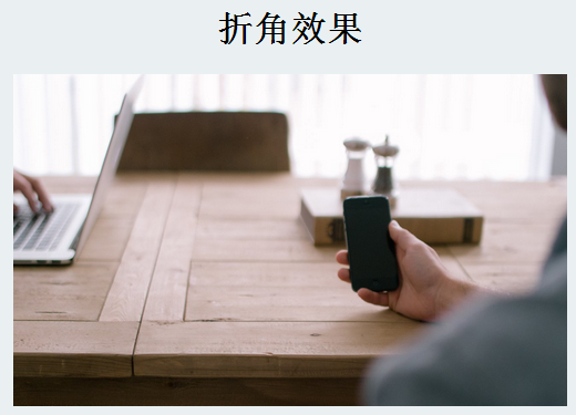
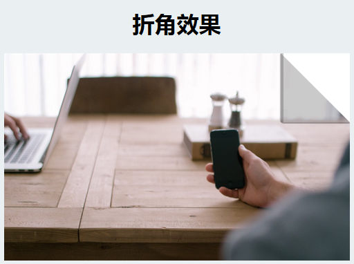
折角效果的原理是「邊框三角形」:把一個寬高為 0 的元素,替它設上不同顏色的 border,相接的兩條邊斜切後就形成三角形。上面那層是陰影用的深色三角,下面墊一個白色三角做出折疊的厚度感,滑過時再把 border-width 撐大,折角就像被掀開一樣。
完整原始碼
<!DOCTYPE html>
<html>
<head>
<meta charset="UTF-8">
<title>折角效果</title>
<style>
body { background-color: #eaf0f2; }
h1 { text-align: center; }

.box {
  width: 500px;
  height: 300px;
  margin: 0 auto;
  position: relative;
}

.img-layer {
  position: absolute;
  width: 500px;
  height: 300px;
  top: 0;
  left: 0;
  overflow: hidden;
}

.img-layer img { width: 500px; cursor: pointer; }

/* 折角本體:寬高為 0,只靠 border 撐出三角形 */
.img-layer:before {
  content: '';
  position: absolute;
  top: 0;
  right: 0;
  width: 0;
  height: 0;
  border-style: solid;
  border-width: 0;
  border-color: rgba(0, 0, 0, 0.2) #fff;
  border-radius: 0 0 0 4px;
  box-shadow: 0 1px 1px rgba(0, 0, 0, 0.3),
              -1px 1px 1px rgba(0, 0, 0, 0.2);
  transition: all 0.4s ease-out;
}

/* 滑移時把兩條可見邊撐到 100px,折角被「掀開」 */
.img-layer:hover:before {
  border-right-width: 100px;
  border-bottom-width: 100px;
}
</style>
</head>
<body>
<h1>折角效果</h1>
<div class="box">
  <div class="img-layer">
    <img src="https://p6.qhimg.com/d/inn/3f563406/table.jpg" alt="">
  </div>
</div>
</body>
</html>
要點回顧
border-color 只給了兩個值,右上與左下的斜接處自然形成對比;border-radius 修掉折角內側的生硬轉折;兩層 box-shadow 一層近一層遠,做出紙張翻起時的層次。最後 overflow: hidden 確保折角永遠被裁在容器內,transition 則負責讓 0 → 100px 的變化平順播放。
這個技巧的好處是純 CSS、零圖片、可任意縮放,很適合用在卡片、相框或價格標示上;缺點是三角形本質上是裝飾,不應承載有意義的文字內容。
- 上一篇文章: CSS3 實作磨砂玻璃(毛玻璃)質感卡片
- 下一篇文章: 用 CSS3 animation 做一個免 JS 的簡易輪播