讓 DIV 固定在屏幕正中央的兩種實用方法
編輯:關於CSS
在做彈窗、遮罩層或提示框時,經常需要讓某個 DIV 相對於整個視窗保持居中,且不隨頁面滾動而移動。這裡分享兩種簡單可行的做法。
方法一:純 CSS 實現(position: fixed + margin: auto)
只要同時給元素設置四個方向的偏移量為 0,再配合 margin: auto,瀏覽器便會自動計算出居中位置:
#a {
  position: fixed;
  top: 0;
  left: 0;
  right: 0;
  bottom: 0;
  margin: auto;
  width: 200px;
  height: 200px;
  background-color: aquamarine;
}
這種方式無需 JavaScript,代碼最為乾淨。需要注意的是,元素必須具備明確的寬高,居中效果才會如預期呈現。
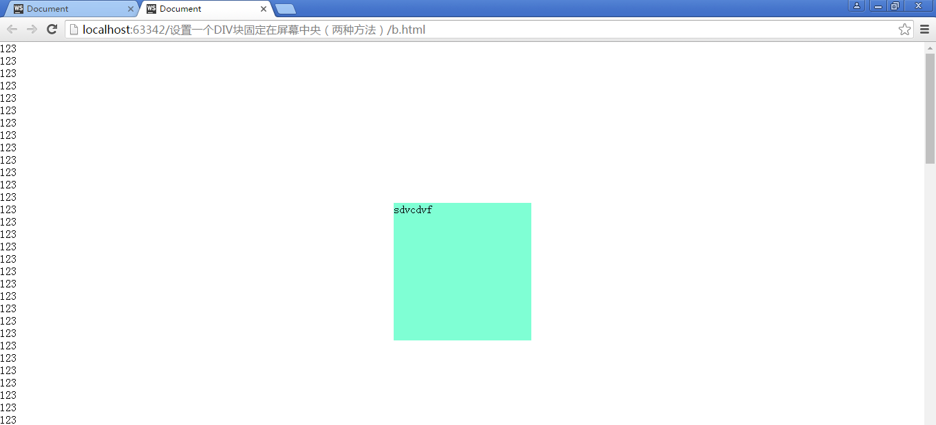
效果如下圖所示:
方法二:藉由 JavaScript 動態計算
如果不希望依賴 fixed 的四邊定位,也可以用腳本取得視窗可視區域的尺寸,再減去元素自身寬高並除以二,計算出居中座標:
window.onload = function () {
  var a = document.getElementById("a");
  var Height = document.documentElement.clientHeight; // 可視區域高度
  var Width  = document.documentElement.clientWidth;  // 可視區域寬度
  var h = a.offsetHeight;  // 元素高度
  var w = a.offsetWidth;   // 元素寬度
  a.style.top  = (Height - h) / 2 + "px";
  a.style.left = (Width  - w) / 2 + "px";
};
此時元素的 CSS 只需保留 position: fixed 即可:
#a {
  position: fixed;
  width: 200px;
  height: 200px;
  background-color: aquamarine;
}
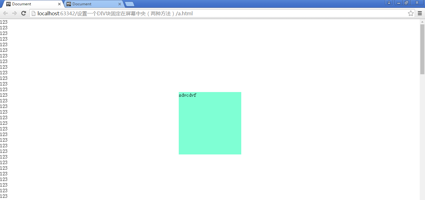
效果如下圖:
兩種方式的取捨
純 CSS 方案簡潔高效,是首選;而 JavaScript 方案更為靈活,適合需要根據動態條件反覆調整位置、或搭配複雜互動邏輯的場景。可依實際需求靈活選用。