這是一篇來自實務現場的開發筆記,記錄了幾個在大型網站上累積出來的小技巧與規範。
類目之間的橫豎線
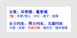
很久以前,主選單之間那條分隔豎線的做法基本只有三種:
- 背景圖:在 a 標籤上設 padding,再用一張寬 1px 的背景圖 position 到右側。缺點是最後一個項目還是要靠 class 把背景藏掉。
- 符號:在每組 a 之間填一個「|」。缺點是 HTML 檔案變大、維護麻煩,而且那個符號在結構上毫無意義。
- border-right:概念同背景圖,只是改用邊框實作。缺點也一樣。
後來發現淘寶首頁用的是另一條路:幫 ul 設 overflow: hidden,再把 li 的 margin-left 設為 -1px。這樣做同時避開了上述三個缺點——不需要額外 class,也不需要多餘符號。這手法在淘寶改版上線後不久,就有同行首頁跟進採用。
圓角的做法
為了圓角,前端工程師付出的心力實在太多:既要顧 http 連線數,又要權衡 CSS 與 HTML 的代碼量與語意。以下是一個近期用來替換現有方案的寫法,好處是只需一張圖片、某種程度上能任意縮放、便於維護;缺點則是多了幾層無語意的標籤。
.c, .c i, .c i i, .c b, .c b b, .c p {
    background-image: url(rounded.png);
    background-repeat: no-repeat;
}
.c {
    width: 200px;
    background-position: 0 -4px;
}
.c i {
    display: block;
    height: 4px;
}
.c i i {
    margin: 0 0 0 4px;
    background-position: right 0;
}
.c b {
    display: block;
    height: 4px;
    background-position: 0 bottom;
}
.c b b {
    margin: 0 0 0 4px;
    background-position: right bottom;
}
.c p {
    margin: 0 0 0 4px;
    padding: 0 4px 0 0;
    background-position: right -4px;
}
<p class="c">
<i><i></i></i>
<p>按鈕按鈕按鈕按鈕按鈕按鈕</p>
<b><b></b></b>
</p>四個角各由一層元素負責,共用同一張 sprite 圖,靠 background-position 取用不同區塊。
table 的全域定義
caption 在 Firefox 下左側會多出 1px 的空隙,很惱人。想到最簡單的解法就是給它一個 -1px 的 margin。
table {
    border-collapse: collapse;
}
table caption, table td, table th {
    border: 1px solid #a2bbdd;
    background: #c3d9ff;
}
table caption {
    text-align: left;
    border-bottom: none;
    margin-left: -1px;
}
<table>
<caption>表格標題</caption>
<tr>
<th>標題</th><th>標題</th><th>標題</th><th>標題</th>
</tr>
<tr>
<td>內容</td><td>內容</td><td>內容</td><td>內容</td>
</tr>
</table>兩個值得正視的標籤
acronym:用來解釋名詞非常合適,可惜用得太少。配上 acronym { cursor: help },使用者把游標移上去就會看到說明。
ins:曾在某個網站上看到有人把它用在 h2 裡放「更多」連結。後來翻了書才發現這個用法頗具爭議,這裡僅記錄不建議照抄。
標題右側「更多」的實現
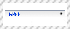
要做下圖那種效果,直覺做法是靠 position 相對定位把元素推到 h2 右側。程式碼確實會多出好幾行:
<h2><a href="#">標題</a> <span>更多…</span></h2>h2 {
position: relative;
height: 20px;
}
span {
position: absolute;
right: 0;
top: 0;
display: block;
height: 20px;
}但其實還有更笨也更省事的做法:
h2 {
    height: 20px;
}
span {
    float: right;
    display: block;
    margin: -10px 0 0 0;
    height: 20px;
}
原理是:float 預設會掉到 h2 底下換行,那就用負的 margin-top 把它拉回去。程式碼更少,效果相同。
屬性書寫順序規範
以前部門裡每個人都有自己的書寫習慣,讀對方的 CSS 非常吃力,於是團隊定了一套順序:
* {
/* 顯示屬性 */
display
position
float
clear
cursor
...

/* 盒模型 */
margin
padding
width
height

/* 排版 */
vertical-align
white-space
text-decoration
text-align
...

/* 文字 */
color
font
content

/* 邊框與背景:這兩項修改頻率最高,放最後方便查閱 */
border
background
}說穿了,這個順序的邏輯是:先身材、再服裝類型、然後服裝款式,最後才是妝容與髮型。這套規範並非瀏覽器廠商推行,制約力有限,但它是團隊實踐後認為最適合當時環境的寫法——重點不在順序本身,而在於全隊統一。
CSS 代碼簡寫備忘
0px不需要單位,直接寫margin: 0。- 盒模型簡寫語法是
margin: 上 右 下 左,甚至可再簡化為margin: 上(右左)下,前提是左右值相同。 - 最後一項的分號可以省略(不建議)。
normal可用 400 代替,bold可用 700 代替。- 十六進位色值若每兩位相同可縮寫一半:
#000000→#000,#0044DD→#04D。 - 邊框簡寫語法:
border: width style color,例如border: 1px solid red。 - 背景簡寫語法:
color image repeat attachment position,例如background: #f00 url(bg.gif) no-repeat fixed 0 0。 - 字體簡寫,最完整如
font: italic small-caps bold 1em/140% "SimSun", sans-serif,最精簡可只寫font: 12px "SimSun"。 - 清單簡寫語法:
list-style: square inside url(image.gif),一般較少用到。 - 最後一條:把多餘的換行與空格清掉。
- 上一篇文章: 14 個必備 CSS 技巧與常見問題解答
- 下一篇文章: Div+CSS 的五大觀念誤區:別把「節省代碼」當宗旨