一、IE 瀏覽器 Hack 標識
CSS 屬性層級
ie6      { _property: value; }
ie7      { +property: value; }
ie9      { property: value\9\0; }
lte ie7  { *property: value; }
gte ie8  { property: value\0; }
all ie   { property: value\9; }

/* 註:除非萬不得已,不建議使用 hack。
   一旦使用,必須實測所有瀏覽器(含新版的 IE)。 */
條件註解
<!-- 所有 IE -->
<!--[if IE]>
<script>alert('ie');</script>
<![endif]-->

<!-- 非 IE -->
<!--[if !IE]>
<script>alert('!ie');</script>
<![endif]-->

<!-- 指定版本 -->
<!--[if IE 版本號]> ... <![endif]-->

<!-- 大於或等於 -->
<!--[if gte IE 版本號]> ... <![endif]-->

<!-- 小於或等於 -->
<!--[if lte IE 版本號]> ... <![endif]-->
二、浮動相關的常見問題
1. IE6 雙倍 margin。浮動元素的 margin 方向與文字流相同時,IE6 會把間距算成兩倍。解法是加上 display: inline。
2. 行內元素浮動後變塊級。設了 float 或絕對定位後,元素自動成為塊級盒,可直接設定 width 與 height,不必再寫 display: block。
3. IE7 最後一排的 margin-bottom 失效。多排浮動元素中,最後一排的外下邊距會被忽略。
4. IE6/7 清單浮動產生左側空白。解法是將 list-style-position 設為 outside。
5. 父元素塌陷。子元素浮動後父元素高度為 0,用 ::after 偽元素搭配 zoom: 1 清除:
.clearfix::after {
  content: '';
  display: block;
  height: 0;
  visibility: hidden;
  clear: both;
}
.clearfix { zoom: 1; }   /* IE6/7 */
三、其他屬性失效案例
line-height 在 IE9 失效。多與字型有關,改指定為宋體或微軟雅黑可恢復。
overflow: hidden 在 IE6/7 失效。當子元素為相對定位時會發生,解法是讓父元素也設為相對定位。
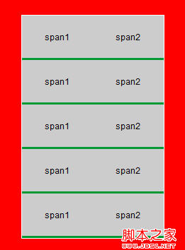
li 內子元素浮動造成間隙。縱向排列的 li 之間會多出幾像素,看似 padding-top 或 margin-top。
<!DOCTYPE html>
<html>
<head>
<meta http-equiv="Content-Type" content="text/html; charset=gb2312" />
<title>列表 li 內子元素浮動帶來的 bug</title>
<style>
body, div, dl, dt, dd, ul, ol, li,
h1, h2, h3, h4, h5, h6, pre, code, form,
fieldset, legend, input, textarea, p, blockquote,
th, td, hr, button, article, aside, details,
figcaption, figure, footer, header, hgroup,
menu, nav, section { margin: 0; padding: 0; }

body, button, input, select, textarea {
  font: 12px/1.5 Arial, "microsoft yahei", "微軟雅黑";
}
ul  { list-style: none; }
img { border: none; }

.clear-fix::after {
  content: '.';
  display: block;
  height: 0;
  visibility: hidden;
  clear: both;
}
.clear-fix { zoom: 1; }

body { background-color: #F00; }
.module { width: 200px; height: 300px; border: 1px solid #FFF; margin: 100px auto; }
.module ul { width: 100%; background-color: #093; }
.module li { width: 100%; background-color: #CCC; }
.module li span {
  float: left;
  display: inline;
  text-align: center;
  width: 50%;
  line-height: 60px;
}
</style>
</head>
<body>
<div class="module">
<ul>
  <li class="clear-fix"><span>span1</span><span>span2</span></li>
  <li class="clear-fix"><span>span1</span><span>span2</span></li>
  <li class="clear-fix"><span>span1</span><span>span2</span></li>
  <li class="clear-fix"><span>span1</span><span>span2</span></li>
  <li class="clear-fix"><span>span1</span><span>span2</span></li>
</ul>
</div>
</body>
</html>
IE6、7 中的顯示:

四、固定容器內讓圖片垂直居中
這個需求看似簡單,實作卻要處理「圖片必須是行內元素」以及「字型與行高會撐大容器」兩個陷阱。
<!DOCTYPE html>
<html>
<head>
<meta charset="gb2312" />
<title>圖片垂直居中 demo</title>
<style>
body, div, dl, dt, dd, ul, ol, li,
h1, h2, h3, h4, h5, h6, pre, code, form,
fieldset, legend, input, textarea, p, blockquote,
th, td, hr, button, article, aside, details,
figcaption, figure, footer, header, hgroup,
menu, nav, section { margin: 0; padding: 0; }

body, button, input, select, textarea {
  font: 12px/1.5 Arial, "microsoft yahei", "微軟雅黑";
}
ul  { list-style: none; }
img { border: none; }

.clear-fix::after {
  content: '.';
  display: block;
  height: 0;
  visibility: hidden;
  clear: both;
}
.clear-fix { zoom: 1; }

.box { width: 800px; margin: 100px auto; }

.pic-wrap {
  width: 220px;
  height: 220px;
  border: 1px solid #F00;

  /* 標準瀏覽器:模擬表格居中 */
  display: table-cell;
  vertical-align: middle;
  text-align: center;

  /* 避免字型與行高把容器撐大 */
  font-size: 0;
  line-height: 1;

  /* IE7 及以下的對應做法 */
  *display: block;
  +line-height: 220px;
  _font-size: 192px;   /* 字型大小約為 height / 1.14 */
  _font-family: sans-serif;
}

.pic-wrap img {
  display: inline;      /* 圖片必須為行內元素 */
  vertical-align: middle;
}
</style>
<body>
<div class="box">
  <a href="" class="pic-wrap" target="_blank">
    <img src="https://img01.taobaocdn.com/tps/i1/T1LZ.8XdVcXXcb7DQt-185-205.jpg"
         alt="來源 xxx" title="來源 xxx" />
  </a>
</div>
</body>
</html>
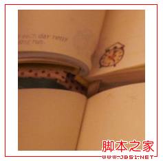
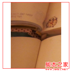
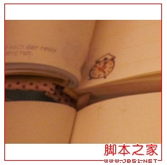
三種不同尺寸圖片的展示(圖片皆不超過容器大小,會自動等比例縮放):
原理說明與現代寫法
這個技巧的關鍵是 display: table-cell:它讓容器像表格儲存格一樣支援 vertical-align: middle,而圖片維持行內元素,因此對齊得以生效。
font-size: 0 與 line-height: 1 是為了消除行內格式化上下文造成的底部多餘空間。IE6/7 則改用 line-height 等於容器高度、並放大字型來製造行高——這是完全不同的機制,只是視覺結果相似。
今天不必再這樣寫。flex 一行解決,且圖片尺寸不限:
.pic-wrap {
  width: 220px;
  height: 220px;
  display: flex;
  align-items: center;
  justify-content: center;
}
.pic-wrap img {
  max-width: 100%;
  max-height: 100%;
  object-fit: contain;
}
object-fit: contain 保證圖片在保持比例的前提下完整呈現,不會變形也不會溢出。