SVG 與 canvas 一樣,採用標準 HTML/CSS 的顏色表示法,這些顏色都能套用到 fill 與 stroke 屬性上。基本寫法有以下幾種:
- 顏色名稱:直接寫 red、blue、black 這類關鍵字。
- rgb/rgba 值:例如
rgb(255,0,0)、rgba(255,100,100,0.5)。 - 十六進位值:例如
#ff0000、#ffffff。 - 漸層值:與 canvas 相同,支援線性漸層與放射狀漸層兩種。
- 圖樣填充:使用自訂圖樣作為填色。
下圖是線性漸層與放射狀漸層的效果示意:
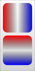
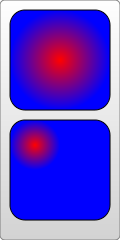
前幾種都很直觀,重點放在後兩種填色方式上。
線性漸層
使用 <linearGradient> 元素定義線性漸層,每一段漸層成分用 <stop> 元素描述:
<svg width="120" height="240">
  <defs>
    <linearGradient id="Gradient1">
      <stop class="stop1" offset="0%" />
      <stop class="stop2" offset="50%" />
      <stop class="stop3" offset="100%" />
    </linearGradient>
    <linearGradient id="Gradient2" x1="0" x2="0" y1="0" y2="1">
      <stop offset="0%" stop-color="red" />
      <stop offset="50%" stop-color="black" stop-opacity="0" />
      <stop offset="100%" stop-color="blue" />
    </linearGradient>
    <style type="text/css"><![CDATA[
      #rect1 { fill: url(#Gradient1); }
      .stop1 { stop-color: red; }
      .stop2 { stop-color: black; stop-opacity: 0; }
      .stop3 { stop-color: blue; }
    ]]></style>
  </defs>

  <rect id="rect1" x="10" y="10" rx="15" ry="15"
        width="100" height="100" />
  <rect x="10" y="120" rx="15" ry="15"
        width="100" height="100" fill="url(#Gradient2)" />
</svg>
這個例子要注意的地方
- 漸層元素必須放在 <defs> 元素中。
- 必須為漸層元素設定 id,否則其他元素無法引用它。
- 漸層的成員用 <stop> 定義,其屬性也可以用 CSS 設定,並支援 class、id 這類標準 HTML 屬性。
<stop> 的常用屬性如下:
- offset:定義該成員色的作用範圍,取值從 0% 到 100%(或 0 到 1)。通常第一個顏色設為 0%,最後一個設為 100%。
- stop-color:定義該成員色的顏色。
- stop-opacity:定義該成員色的不透明度。
- x1、y1、x2、y2:這兩個點定義漸層的方向。不寫的話預設是水平漸層;上面的例子同時示範了一個垂直漸層。
- 漸層的使用方式如範例所示:以
url(#id)的形式賦值給fill或stroke即可。 - 漸層成員可以複用:你也可以用
xlink:href參照已定義的漸層成員,因此上面的例子可以改寫成:
<linearGradient id="Gradient1">
  <stop class="stop1" offset="0%" />
  <stop class="stop2" offset="50%" />
  <stop class="stop3" offset="100%" />
</linearGradient>
<linearGradient id="Gradient2" x1="0" x2="0" y1="0" y2="1"
                xlink:href="#Gradient1" />
放射狀漸層
使用 <radialGradient> 元素定義放射狀漸層,同樣以 <stop> 定義成員色:
<svg width="120" height="240">
  <defs>
    <radialGradient id="Gradient3">
      <stop offset="0%" stop-color="red" />
      <stop offset="100%" stop-color="blue" />
    </radialGradient>
    <radialGradient id="Gradient4" cx="0.25" cy="0.25" r="0.25">
      <stop offset="0%" stop-color="red" />
      <stop offset="100%" stop-color="blue" />
    </radialGradient>
  </defs>

  <rect x="10" y="10" rx="15" ry="15" width="100" height="100"
        fill="url(#Gradient3)" />
  <rect x="10" y="120" rx="15" ry="15" width="100" height="100"
        fill="url(#Gradient4)" />
</svg>
從上例可以看到,除了元素名稱與幾個特有屬性之外,其餘一切(stop 的定義方式、必須放進 defs、必須設定 id、以 url(#id) 賦值)都與線性漸層相同。特有的屬性有:
- offset:取值範圍與線性漸層一樣,但含義不同。在放射狀漸層中,0% 代表圓心處。
- cx、cy、r:定義漸層圓環的圓心與半徑。對照上例中圓的大小與位置就能理解。
- fx、fy:定義顏色中心(焦點)的位置,也就是漸層最濃處的座標。上例中「最紅」的位置落在圓心,這是預設行為;若想改變,就設定 fx、fy。
這裡有個問題:cx、cy、r、fx、fy 的值都是小數,那單位是什麼?這要先認識另一個相關屬性——gradientUnits,它定義漸層所使用的座標單位,有兩個可用值:userSpaceOnUse 與 objectBoundingBox。
objectBoundingBox 是預設值,此時所有座標都相對於物件的包圍盒(方形包圍盒;非方形的情況較複雜,這裡略過),取值範圍是 0 到 1。例如上例中 cx、cy 為 (0.25, 0.25),代表圓心位於包圍盒左上角四分之一處;半徑 0.25 代表半徑長度是物件方形包圍盒邊長的四分之一,就像圖中看到的那樣。
userSpaceOnUse 代表使用絕對座標。採用這個設定時,你必須確保漸層與被填充的物件維持在同一個位置上。
再看下面這個例子(gradientUnits 的預設值是 objectBoundingBox):
<svg width="120" height="120">
  <defs>
    <radialGradient id="Gradient5"
      cx="0.5" cy="0.5" r="0.5" fx="0.25" fy="0.25">
      <stop offset="0%" stop-color="red" />
      <stop offset="100%" stop-color="blue" />
    </radialGradient>
  </defs>

  <rect x="10" y="10" rx="15" ry="15" width="100" height="100"
        fill="url(#Gradient5)" stroke="black" stroke-width="2" />
  <circle cx="60" cy="60" r="50" fill="transparent"
          stroke="white" stroke-width="2" />
  <circle cx="35" cy="35" r="2" fill="white" stroke="white" />
  <circle cx="60" cy="60" r="2" fill="white" stroke="white" />
  <text x="38" y="40" fill="white" font-family="sans-serif"
        font-size="10pt">(fx,fy)</text>
  <text x="63" y="63" fill="white" font-family="sans-serif"
        font-size="10pt">(cx,cy)</text>
</svg>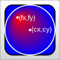
看過效果圖,「焦點」的含義就很清楚了。
此外,漸層元素還有一些變換相關的屬性,例如 gradientTransform;這不是本節重點,後面總結變換時再一併說明。
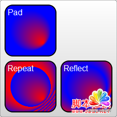
另一個常用屬性是 spreadMethod,它定義漸層抵達終點之後該如何處理剩下的區域,有三個可選值:pad(預設)、reflect、repeat。
pad:自然過渡,漸層結束後直接用最後一個成員色渲染剩餘部分。reflect:讓漸層繼續延伸,但方向反轉,從最後一個顏色往回走到第一個顏色;再次抵達終點後再反序,如此往返直到填滿整個物件。repeat:同樣讓漸層繼續延伸,但不反序,一遍又一遍地從第一種顏色走到最後一種顏色。
效果圖如下:
下面是一段重複渲染的程式碼:
<svg width="220" height="220">
  <defs>
    <radialGradient id="Gradient"
      cx="0.5" cy="0.5" r="0.25" fx=".25" fy=".25"
      spreadMethod="repeat">
      <stop offset="0%" stop-color="red" />
      <stop offset="100%" stop-color="blue" />
    </radialGradient>
  </defs>
  <rect x="50" y="50" rx="15" ry="15" width="100" height="100"
        fill="url(#Gradient)" />
</svg>
圖樣填充
圖樣填充也是相當受歡迎的一種填色方式。在 SVG 中,可以用 <pattern> 建立一個圖樣,再用它去填充其他物件。直接看例子:
<svg width="200" height="200">
  <defs>
    <linearGradient id="Gradient6">
      <stop offset="0%" stop-color="white" />
      <stop offset="100%" stop-color="blue" />
    </linearGradient>
    <linearGradient id="Gradient7" x1="0" x2="0" y1="0" y2="1">
      <stop offset="0%" stop-color="red" />
      <stop offset="100%" stop-color="orange" />
    </linearGradient>
  </defs>
  <defs>
    <pattern id="Pattern" x=".05" y=".05" width=".25" height=".25">
      <rect x="0" y="0" width="50" height="50" fill="skyblue" />
      <rect x="0" y="0" width="25" height="25" fill="url(#Gradient7)" />
      <circle cx="25" cy="25" r="20" fill="url(#Gradient6)"
              fill-opacity="0.5" />
    </pattern>
  </defs>

  <rect fill="url(#Pattern)" stroke="black"
        x="0" y="0" width="200" height="200" />
</svg>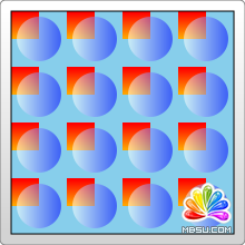
例子看起來很單純:先用漸層組成 pattern,再用這個 pattern 去填充矩形。這裡有幾點需要注意:
- 不同瀏覽器渲染這個 pattern 的效果並不一致。上例在 Firefox 與 Chrome 中結果相同;但如果你把漸層與 pattern 定義在同一個 <defs> 組合裡,Firefox 仍能正常渲染,Chrome 卻認不出漸層,只會用預設的黑色填充。
- pattern 同樣需要定義 id。
- pattern 同樣必須定義在 <defs> 中。
- pattern 的使用方式也一樣,把
url(#id)直接賦值給fill或stroke。
上面這些都很簡單,真正的重點是例子中的座標表示——pattern 裡的座標機制相對複雜。
patternUnits 與 patternContentUnits
pattern 有兩個相關屬性:patternUnits 與 patternContentUnits。兩者的取值都只有 objectBoundingBox 與 userSpaceOnUse 這兩個,含義前面已經說明。容易搞混的是這兩個屬性的預設值不同,但理解背後原因之後,你會發現這樣設計還真有道理。
1. patternUnits 屬性
它與漸層的 gradientUnits 是一樣的,預設採用 objectBoundingBox。受這個屬性影響的是 x、y、width、height 這四個屬性,分別定義 pattern 的起點與寬高,因此它們使用的是相對值。範例中希望在水平與垂直方向都填滿 4 次,所以 width 與 height 都設為 0.25。
2. patternContentUnits 屬性
它的預設值正好相反,採用 userSpaceOnUse。這個屬性描述的是 pattern 內部所繪製圖形(例如上例的 rect、circle)的座標系統。也就是說,預設情況下,你在 pattern 裡畫的圖形,與 pattern 自身的大小/位置,使用的是兩套不同的座標系。
對照範例來想:我們要填的是一個 200×200 的矩形,每個方向重複 4 次,這意味著每個 pattern 是 50×50,因此 pattern 裡的兩個矩形和一個圓,就是畫在這個 50×50 的範圍中——這樣就能理解那些座標值的由來了。此外,範例中的 pattern 為了置中,需要先偏移 10px 才開始渲染,而這個偏移量受 patternUnits 約束,所以預設情況下 x、y 的值就是 10/200 = 0.05。
那麼,為什麼要讓這兩個屬性採用不同的預設值?答案取決於實際使用情境:
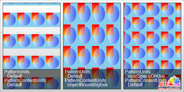
第一種 pattern 樣式(多數情況,因此被設為預設):pattern 會隨外層圖形縮放而被拉伸,不管外圍方形多大,pattern 在兩個方向上都會被填滿 4 次;但 pattern 內部包含的圖形不會隨外層方形縮放而拉伸。
第二種 pattern 樣式:希望 pattern 內的圖形也跟著外層圖形一起縮放。只要明確把 patternContentUnits 設為 objectBoundingBox 即可:
<pattern id="Pattern" width=".25" height=".25"
         patternContentUnits="objectBoundingBox">
  <rect x="0" y="0" width=".25" height=".25" fill="skyblue" />
  <rect x="0" y="0" width=".125" height=".125" fill="url(#Gradient2)" />
  <circle cx=".125" cy=".125" r=".1" fill="url(#Gradient1)"
          fill-opacity="0.5" />
</pattern>
改過之後,當被填充矩形的大小改變時,pattern 內的圖形也會一起拉伸。而且由於座標改成了相對於外層物件,pattern 的 x、y 就不再需要了——它會自動調整以貼合被填充的形狀。
第三種 pattern 樣式:希望 pattern 的形狀與大小完全固定,不管外層物件怎麼縮放都不受影響。把兩套座標系統都改成 userSpaceOnUse 就能達到這個效果:
<pattern id="Pattern" x="10" y="10" width="50" height="50"
         patternUnits="userSpaceOnUse">
  <rect x="0" y="0" width="50" height="50" fill="skyblue" />
  <rect x="0" y="0" width="25" height="25" fill="url(#Gradient2)" />
  <circle cx="25" cy="25" r="20" fill="url(#Gradient1)"
          fill-opacity="0.5" />
</pattern>
這三種典型的 pattern 效果如下圖所示:
實用參考
- 官方文件:
https://www.w3.org/TR/SVG11/ - 腳本索引:
https://msdn.microsoft.com/zh-cn/library/ff971910(v=vs.85).aspx - 開發中心:
https://developer.mozilla.org/en/SVG - 熱門參考:
https://www.chinasvg.com/