CSS3 實作會隨進度變色的動態進度條
編輯:HTML5詳解
週末閒逛時看到一款用 CSS3 寫成的進度條,覺得很值得分享。它最討喜的地方在於顏色會隨著百分比變化——從告急的橘紅一路走到完成的亮綠,而且整個過程完全不需要 JavaScript。下面先看成果:
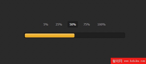
外觀走的是沉穩路線,有幾分 jQuery UI 的味道。線上也可以直接點擊切換進度,感受顏色與寬度的連動。
一、HTML:用 radio 當開關
關鍵技巧在這裡:我們用一組同名的 radio 當作進度選擇器,再用 label 當成可點擊的按鈕,然後靠 CSS 的相鄰兄弟選擇器去控制下方的進度條。
<input type="radio" class="radio" name="progress" value="five" id="five">
<label for="five" class="label">5%</label>

<input type="radio" class="radio" name="progress" value="twentyfive" id="twentyfive" checked>
<label for="twentyfive" class="label">25%</label>

<input type="radio" class="radio" name="progress" value="fifty" id="fifty">
<label for="fifty" class="label">50%</label>

<input type="radio" class="radio" name="progress" value="seventyfive" id="seventyfive">
<label for="seventyfive" class="label">75%</label>

<input type="radio" class="radio" name="progress" value="onehundred" id="onehundred">
<label for="onehundred" class="label">100%</label>

<div class="progress">
  <div class="progress-bar"></div>
</div>
二、進度條本體的外觀
外槽用半透明黑底加上內陰影做出凹陷感,內層的 .progress-bar 則透過偽元素疊上斜紋與上緣高光,質感就出來了。transition-property 指定 width 與 background-color 兩個屬性,是讓寬度與顏色能同時平滑過渡的原因。
.container {
  margin: 80px auto;
  width: 640px;
  text-align: center;
}

.progress {
  margin: 0 auto;
  width: 400px;
  padding: 4px;
  background: rgba(0, 0, 0, 0.25);
  border-radius: 6px;
  box-shadow: inset 0 1px 2px rgba(0, 0, 0, 0.25),
              0 1px rgba(255, 255, 255, 0.08);
}

.progress-bar {
  position: relative;
  height: 16px;
  border-radius: 4px;
  transition: 0.4s linear;
  transition-property: width, background-color;
  box-shadow: 0 0 1px 1px rgba(0, 0, 0, 0.25),
              inset 0 1px rgba(255, 255, 255, 0.1);
}

.progress-bar:before,
.progress-bar:after {
  content: "";
  position: absolute;
  top: 0;
  left: 0;
  right: 0;
}

.progress-bar:before {
  bottom: 0;
  background: url("../img/stripes.png") 0 0 repeat;
  border-radius: 4px 4px 0 0;
}

.progress-bar:after {
  z-index: 2;
  bottom: 45%;
  border-radius: 4px;
  background-image: linear-gradient(to bottom,
    rgba(255, 255, 255, 0.3), rgba(255, 255, 255, 0.05));
}
三、最關鍵的一段:讓 radio 驅動進度
下面這段就是整套效果的靈魂。:checked ~ .progress > .progress-bar 的意思是「當某個 radio 被選取時,往後找到同層的進度條並改變它」——寬度與顏色一次搞定,一行 JavaScript 都不用寫。
#five:checked ~ .progress > .progress-bar {
  width: 5%; background-color: #f63a0f;
}
#twentyfive:checked ~ .progress > .progress-bar {
  width: 25%; background-color: #f27011;
}
#fifty:checked ~ .progress > .progress-bar {
  width: 50%; background-color: #f2b01e;
}
#seventyfive:checked ~ .progress > .progress-bar {
  width: 75%; background-color: #f2d31b;
}
#onehundred:checked ~ .progress > .progress-bar {
  width: 100%; background-color: #86e01e;
}

.radio { display: none; }

.label {
  display: inline-block;
  margin: 0 5px 20px;
  padding: 3px 8px;
  color: #aaa;
  text-shadow: 0 1px black;
  border-radius: 3px;
  cursor: pointer;
}

.radio:checked + .label {
  color: white;
  background: rgba(0, 0, 0, 0.25);
}
這套寫法最大的價值,是用 CSS 的選擇器與狀態機制取代了原本需要 JavaScript 才能完成的互動,程式碼更短、效能更好,也天然支援鍵盤操作。若想擴充成任意百分比,只要再補上一組 radio 與對應的 width、background-color 即可。完整原始碼附在下載連結中,歡迎自行拆解研究。