Nginx 實作網站 PC 與手機版自動分流
編輯:HTML5詳解
需求背景
許多網站為了兼顧不同裝置的使用體驗,會準備電腦版與手機版兩套頁面。當使用者開啟同一個網址時,伺服器會判斷用戶端裝置,再導向對應版本。
一、判斷用戶端裝置類型
HTTP 請求標頭中的 User-Agent 可用來辨識瀏覽器與裝置類型。由於不同作業系統與瀏覽器的 User-Agent 差異很大,自行維護規則並不容易,因此可參考開源方案,例如 detectmobilebrowsers.com 提供的判斷規則。
在 Nginx 中,可先設定一個變數作為開關,再用正則表達式比對 User-Agent。若符合行動裝置特徵,就將變數設為 perform。
set $mobile_rewrite do_not_perform;

if ($http_user_agent ~* "(android|iphone|ipad|ipod|mobile|windows phone)") {
    set $mobile_rewrite perform;
}
二、依裝置導向不同頁面
完成裝置判斷後,即可在 location 區塊中分流。若後端是動態網站,可使用反向代理;若只是靜態頁面,則可用 root 指向不同資料夾。
location / {
    proxy_pass https://192.168.20.1;

    if ($mobile_rewrite = perform) {
        proxy_pass https://192.168.20.2;
    }
}
若為靜態頁面,可改寫成:
location / {
    root /html/pc;

    if ($mobile_rewrite = perform) {
        root /html/mobile;
    }
}
三、允許手機版使用者切換到電腦版
有些使用者可能因為裝置判斷不準確,或希望查看更多資訊,而想進入電腦版。此時可在手機版頁面底部提供「電腦版」連結,並透過 Cookie 記錄使用者意願。

點擊連結時,可寫入一個 Cookie:
document.cookie = "gotopc=true";
同時在 Nginx 中加入判斷,若 Cookie 存在,就不進行手機版分流:
if ($http_cookie ~ "gotopc=true") {
    set $mobile_rewrite do_not_perform;
}
四、調試與驗證
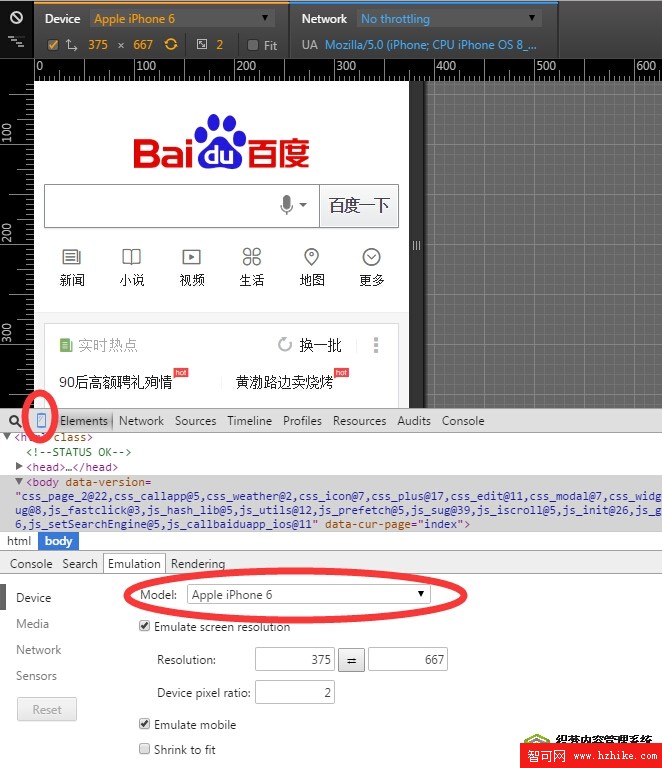
完成設定後,可使用 Chrome 開發者工具模擬手機、平板等裝置,檢查 User-Agent 是否正確、頁面是否導往預期版本。
結語
透過 Nginx 進行裝置分流,能在不改動前端路由的情況下,完成 PC 與手機版本的流量分配。搭配 Cookie 機制,也能保留使用者手動切換的彈性,讓網站在不同裝置上都能提供更合適的體驗。
- 上一篇文章: 用 Canvas 打造 LOW POLY 圖片三角化效果
- 下一篇文章: CSS3 calc() 函式:讓樣式表也能做動態計算