Move.js 入門:用幾行程式碼寫出 CSS3 動畫
編輯:關於JavaScript
CSS3 的 transition 與 animation 是當前製作輕量動畫的首選,但語法繁瑣、prefix 一堆,寫起來容易頭痛。Move.js 就是為了解這個問題而生:用簡單的函式串接,底層自動幫你處理 CSS3。
先看對比
純 CSS 要讓滑過時往右移動 100px:
.box {
  -webkit-transition: margin 1s;
  -moz-transition: margin 1s;
  -o-transition: margin 1s;
  transition: margin 1s;
}
.box:hover { margin-left: 100px; }
用 Move.js 只要:
move('.box').set('margin-left', 100).end();
準備環境
到 Move.js 的 GitHub 頁面下載最新版,把 move.js 放進工作目錄並引入:
<!DOCTYPE html>
<html>
<head>
<title>Move.js Demo</title>
<link rel="stylesheet" type="text/css" href="styles.css">
</head>
<body>
<a href="#" id="playButton">Play</a>
<div class="box"></div>
<script type="text/javascript" src="js/move.js"></script>
<script type="text/javascript">
document.getElementById('playButton').onclick = function (e) {
  move('.box').x(300).end();
};
</script>
</body>
</html>
.box {
  margin-left: 10px; width: 100px; height: 100px;
  background: #7C9DD4; box-shadow: 5px 5px 0px #D1D1D1;
}
#playButton {
  display: block; font-size: 20px; margin: 20px 10px;
  font-weight: bold; color: #222; text-decoration: none;
}
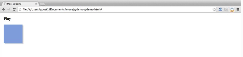
按下 Play,方塊就會平滑地向右移動 300px。
方法速查
set(prop, val) — 設定 CSS 屬性:
.set('background-color', '#CCC').set('margin-left', 500).set('color', '#222')
add(prop, val) / sub(prop, val) — 在既有值上增減,參數必須是數值:
.add('margin-left', 200)   // 目前值 + 200
.sub('margin-left', 200)   // 目前值 - 200
rotate(deg) — 旋轉,底層寫入 transform:
.rotate(90) // 等同 transform: rotate(90deg)
duration(n) — 設定動畫時長:
move('.box').set('margin-left', 200).set('background-color', '#CCC').rotate(90).duration('2s').end();
translate(x[, y])、x()、y() — 位移,只給一個參數時視為 x:
.translate(200, 400)
.x(300).y(-20)
skew(x, y) — 依 x/y 軸傾斜,也可拆成 skewX(deg) 與 skewY(deg):
.skew(30, 40)
scale(x, y) — 縮放:
.scale(3, 3)
ease(fn) — 對應 CSS 的 timing function:
.ease('in').x(400)
.ease('cubic-bezier(0,1,1,0)').x(400)
delay(n) — 延遲後再播放:
move('.box').set('background-color', 'red').delay(1000).end();
end([callback]) — 收尾並真正觸發動畫,可接受回呼:
move('.box').set('background-color', 'red').duration(1000).end(function () {
  alert("Animation Over!");
});
then() — 最重要的方法,把動畫切成兩段依序執行:
move('.box')
  .set('background-color', 'red').x(500)
  .then()
  .y(400).set('background-color', 'green')
  .end();
組一個複雜動畫
把上面的積木堆起來,就能寫出多階段的複合動畫:
move('.square')
  .to(500, 200)
  .rotate(180)
  .scale(.5)
  .set('background-color', '#FF0551')
  .set('border-color', 'black')
  .duration('3s')
  .skew(50, -10)
  .then()
  .set('opacity', 0)
  .duration('0.3s')
  .scale(0.1)
  .pop()
  .end();
Move.js 的價值在於「動畫集中在一處」:所有位移、旋轉、變色、時序都在同一條鏈上,要調參數或修 bug,不必在 CSS 與 JS 之間來回跳。