Bootstrap 復選框與單選按鈕美化插件詳解
編輯:關於JavaScript
Bootstrap 原生的表單控件樣式比較樸素,如果想讓 checkbox 和 radio 更好看一些,可以借助 awesome-bootstrap-checkbox 這類方案。官網地址可在對應項目頁查閱。
使用前需要引入三樣東西:awesome-bootstrap-checkbox.css、font-awesome.css,以及 font-awesome 對應的字體文件(font 目錄),這些都可以從官網下載。
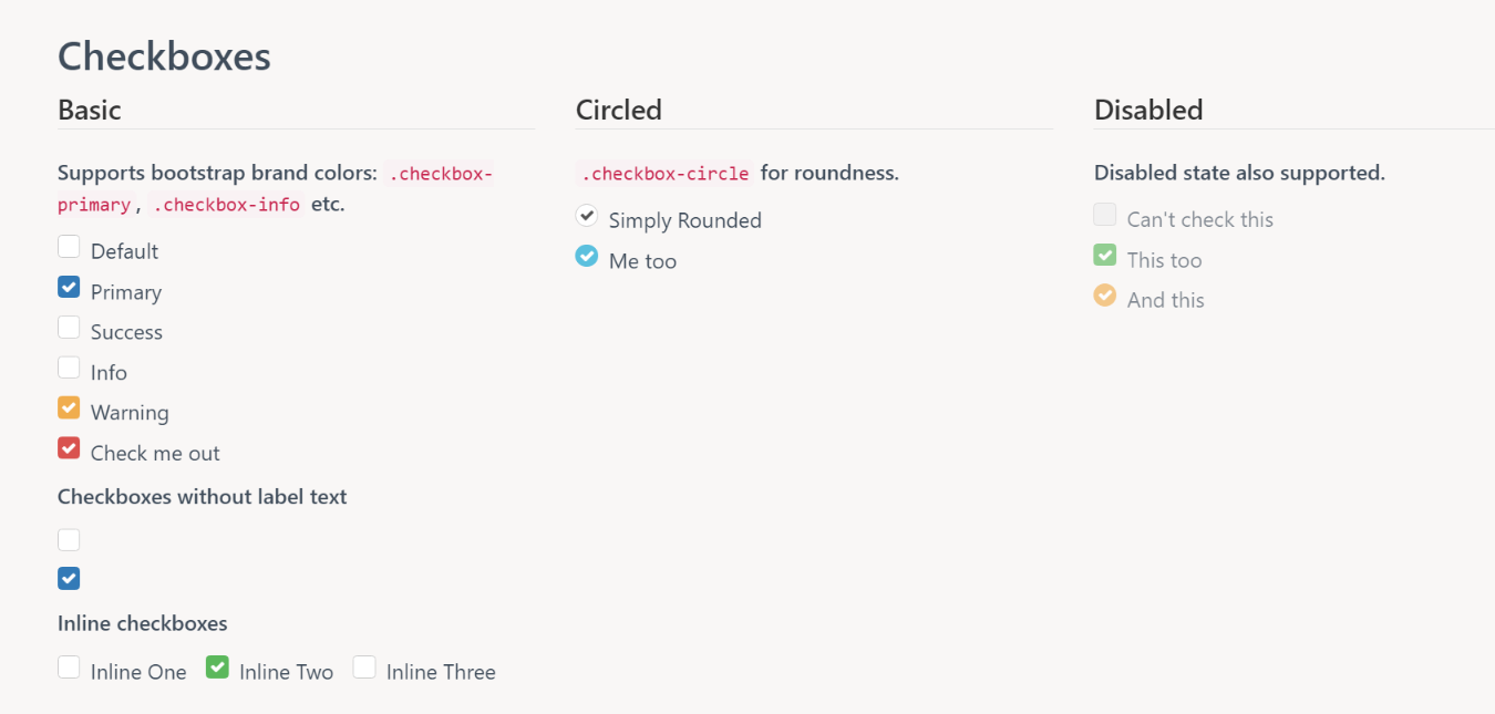
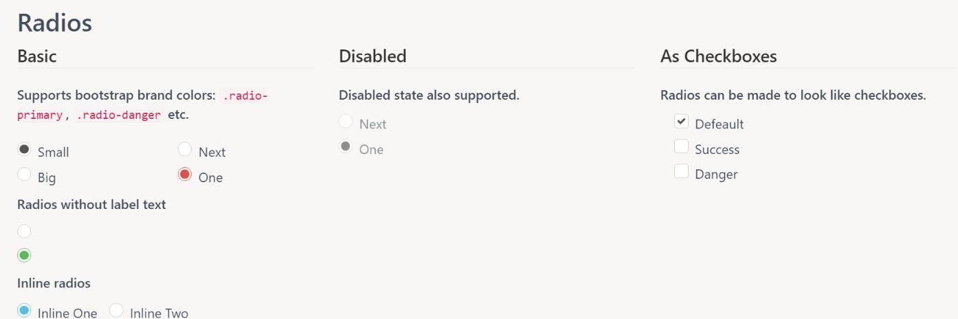
默認效果預覽
checkbox 的樣式:
radio 的樣式:
自定義樣式
文件引入之後,如果默認配色不合口味,完全可以自己改。核心原理是把原生 input 透明化,再用 ::before 畫方框、::after 畫勾:
.checkbox label::before {
    content: "";
    display: inline-block;
    position: absolute;
    width: 20px; height: 20px;
    left: 0; margin-left: -20px;
    border: 1px solid #cccccc;      /* 未選中時的邊框顏色 */
    border-radius: 3px;
    background-color: #fff;         /* 未選中時的背景色 */
    -webkit-transition: border 0.15s ease-in-out, color 0.15s ease-in-out;
    transition: border 0.15s ease-in-out, color 0.15s ease-in-out;
}

.checkbox label::after {
    display: inline-block;
    position: absolute;
    width: 16px; height: 16px;
    left: 0; top: 0;
    margin-left: -19px;             /* 以下三行可調整「勾」的位置 */
    padding-left: 3px;
    padding-top: 1px;
    font-size: 13px;                /* 字體越大,勾越明顯 */
    color: #FAD500;                 /* 選中後勾的顏色 */
}

.checkbox input[type="checkbox"],
.checkbox input[type="radio"] {
    opacity: 0;
    z-index: 1;
}

.checkbox input[type="checkbox"]:checked + label::before,
.checkbox input[type="radio"]:checked + label::before {
    background-color: black;        /* 選中後的背景色 */
    border-color: black;            /* 選中後的邊框色 */
}

.checkbox input[type="checkbox"]:checked + label::after,
.checkbox input[type="radio"]:checked + label::after {
    font-family: "FontAwesome";
    content: "\f00c";
}

.checkbox input[type="checkbox"]:disabled + label,
.checkbox input[type="radio"]:disabled + label {
    opacity: 0.65;
}

.checkbox input[type="checkbox"]:disabled + label::before,
.checkbox input[type="radio"]:disabled + label::before {
    background-color: #eeeeee;
    cursor: not-allowed;
}

.checkbox.checkbox-circle label::before {
    border-radius: 50%;             /* 改成圓形 */
}
結構上則是標準的 input + label 組合,把 radio 換成圓形只需多掛一個 checkbox-circle 類:
<div class="checkbox checkbox-circle">
    <input id="radio1" class="styled" type="radio" name="radio">
    <label for="radio1">radio1</label>
</div>
<div class="checkbox checkbox-circle">
    <input id="radio2" class="styled" type="radio" name="radio">
    <label for="radio2">radio2</label>
</div>
最終呈現的效果:
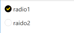
以上就是 Bootstrap 復選框與單選按鈕美化的完整做法。有疑問歡迎留言,我會及時回復。
- 上一篇文章: JavaScript 調試技巧:用好 Chrome 與 IE 的錯誤堆棧
- 下一篇文章: Bootstrap Table 使用教程體系梳理
相關文章
-
AngularJS + Bootstrap 自製分頁元件實例 EasyUI 中 checkbox 的幾個常見操作整理 在 Bootstrap 專案中以 Vue.js 取代 jQuery Bootstrap 入門範例:條紋表格、表單與登入頁設計 SpringMVC 與 Bootstrap 模態框分頁查詢 用 Bootstrap 美化 Ajax 頁面:載入、刪除與詳情彈窗 Bootstrap 響應式實用工具實例詳解 Bootstrap 經典後台柵格布局完整實例 jQuery 表單操作小結:單選鈕、多選框、下拉選單的取值的與設值 JS 與 jQuery 操作 select、radio、checkbox 取值與設置大全