關於 Bootstrap
Bootstrap 出自 Twitter,是目前流傳最廣的前端框架之一。它以 HTML、CSS、JavaScript 為基礎,語法簡潔、擴展靈活,能明顯縮短 Web 開發的時間成本。
縮略圖元件(Thumbnail)
縮略圖最常見的舞臺是商品列表頁:一行排列數張圖片,圖片下方再附上標題、描述文字與按鈕。Bootstrap 把這段結構抽成獨立元件,只要搭配 .thumbnail 類名與格線系統即可還原。
對應的原始碼檔案:LESS 為 tbumbnails.less,SASS 為 _tbumbnails.scss。
實作原理:排版完全依賴格線系統,而元件本身的樣式如下:
 .thumbnail {
  display: block;
  padding: 4px;
  margin-bottom: 20px;
  line-height: 1.42857143;
  background-color: #fff;
  border: 1px solid #ddd;
  border-radius: 4px;
  -webkit-transition: all .2s ease-in-out;
  transition: all .2s ease-in-out;
}
.thumbnail > img, .thumbnail a > img {
  margin-right: auto;
  margin-left: auto;
}
a.thumbnail:hover, a.thumbnail:focus, a.thumbnail.active {
  border-color: #428bca;
}
.thumbnail .caption {
  padding: 9px;
  color: #333;
}
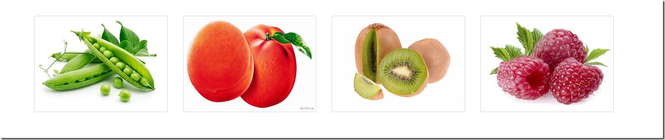
一個只放圖片的簡化版本:
 <div class="container">
 <div class="row">
 <div class="col-md-3">
 <a herf="#" class="thumbnail">
 <img src="img/1.jpg" style="height:180px;width:100%;display: block">
 </a>
 </div>
 <div class="col-md-3">
 <a herf="#" class="thumbnail">
 <img src="img/2.jpg" style="height:180px;width:100%;display: block">
 </a>
 </div>
 <div class="col-md-3">
 <a herf="#" class="thumbnail">
 <img src="img/3.jpg" style="height:180px;width:100%;display: block">
 </a>
 </div>
 <div class="col-md-3">
 <a herf="#" class="thumbnail" >
 <img src="img/4.jpg" style="height:180px;width:100%;display: block">
 </a>
 </div>
 </div>
</div>
效果如下:
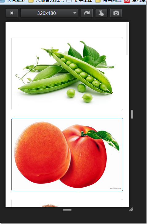
搭配 Firefox 的響應式設計檢視,可以直接觀察格線在不同視窗寬度下的收放:
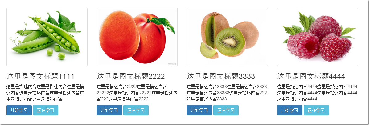
若想讓卡片承載更多資訊,只要在縮略圖外層補上一個 .caption 容器,把標題、描述、按鈕放進去即可:
 <div class="container">
 <div class="row">
 <div class="col-md-3">
 <a href="#" class="thumbnail">
 <img src="img/1.jpg" style="height:180px;width:100%;display: block">
 </a>
 <div class="caption">
 <h3>這裡是圖文標題1111</h3>
 <p>這裡是描述內容……</p>
 <a href="#" class="btn btn-primary">開始學習</a>
 <a href="#" class="btn btn-info">正在學習</a>
 </div>
 </div>
 <div class="col-md-3">
 <a href="#" class="thumbnail">
 <img src="img/2.jpg" style="height:180px;width:100%;display: block">
 </a>
 <div class="caption">
 <h3>這裡是圖文標題2222</h3>
 <p>這裡是描述內容2222……</p>
 <a href="#" class="btn btn-primary">開始學習</a>
 <a href="#" class="btn btn-info">正在學習</a>
 </div>
 </div>
 <div class="col-md-3">
 <a href="#" class="thumbnail">
 <img src="img/3.jpg" style="height:180px;width:100%;display: block">
 </a>
 <div class="caption">
 <h3>這裡是圖文標題3333</h3>
 <p>這裡是描述內容3333……</p>
 <a href="#" class="btn btn-primary">開始學習</a>
 <a href="#" class="btn btn-info">正在學習</a>
 </div>
 </div>
 <div class="col-md-3">
 <a href="#" class="thumbnail">
 <img src="img/4.jpg" style="height:180px;width:100%;display: block">
 </a>
 <div class="caption">
 <h3>這裡是圖文標題4444</h3>
 <p>這裡是描述內容4444……</p>
 <a href="#" class="btn btn-primary">開始學習</a>
 <a href="#" class="btn btn-info">正在學習</a>
 </div>
 </div>
 </div>
</div>
警示框元件(Alert)
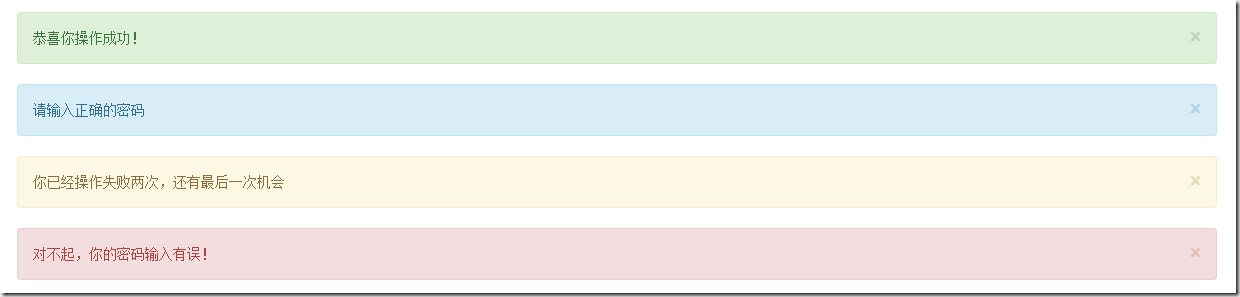
Bootstrap 以 .alert 為基礎樣式,另外提供四種情境變化:
1、成功提示:操作完成,在 .alert 上追加 .alert-success;
2、資訊提示:一般說明,追加 .alert-info;
3、警告提示:需要留意,追加 .alert-warning;
4、錯誤提示:操作失敗,追加 .alert-danger。
基礎樣式主要處理背景色、邊框、圓角與文字顏色,同時也一併調整了 h4、p、ul 與 .alert-link 的間距:
 .alert {
  padding: 15px;
  margin-bottom: 20px;
  border: 1px solid transparent;
  border-radius: 4px;
}
.alert h4 { margin-top: 0; color: inherit; }
.alert .alert-link { font-weight: bold; }
.alert > p, .alert > ul { margin-bottom: 0; }
.alert > p + p { margin-top: 5px; }
.alert-success { color: #3c763d; background-color: #dff0d8; border-color: #d6e9c6; }
.alert-success hr { border-top-color: #c9e2b3; }
.alert-success .alert-link { color: #2b542c; }
.alert-info { color: #31708f; background-color: #d9edf7; border-color: #bce8f1; }
.alert-info hr { border-top-color: #a6e1ec; }
.alert-info .alert-link { color: #245269; }
.alert-warning { color: #8a6d3b; background-color: #fcf8e3; border-color: #faebcc; }
.alert-warning hr { border-top-color: #f7e1b5; }
.alert-warning .alert-link { color: #66512c; }
.alert-danger { color: #a94442; background-color: #f2dede; border-color: #ebccd1; }
.alert-danger hr { border-top-color: #e4b9c0; }
.alert-danger .alert-link { color: #843534; }
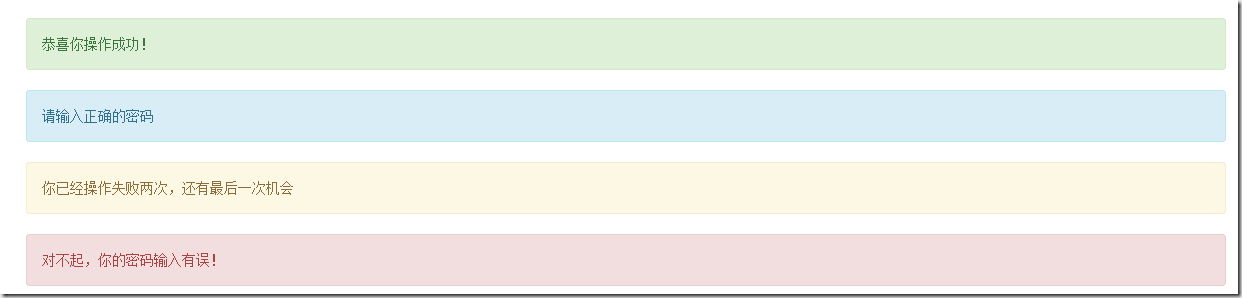
四種外觀對照如下:
 <div class="alert alert-success" role="alert">恭喜你操作成功!</div>
<div class="alert alert-info" role="alert">請輸入正確的密碼</div>
<div class="alert alert-warning" role="alert">你已經操作失敗兩次,還有最後一次機會</div>
<div class="alert alert-danger" role="alert">對不起,你的密碼輸入有誤!</div>
可關閉的警示框
步驟只有三步:在容器上補一個 .alert-dismissable;在 button 中放入 .close 作為關閉鈕;最後別忘了加上 data-dismiss="alert",因為關閉行為是由 JS 偵測這個屬性來驅動的。
 <div class="alert alert-success alert-dismissable" role="alert">
 <button class="close" type="button" data-dismiss="alert">×</button>
 恭喜你操作成功!
 </div>
<div class="alert alert-info alert-dismissable" role="alert">
 <button class="close" type="button" data-dismiss="alert">×</button>
 請輸入正確的密碼
 </div>
<div class="alert alert-warning alert-dismissable" role="alert">
 <button class="close" type="button" data-dismiss="alert">×</button>
 你已經操作失敗兩次,還有最後一次機會
 </div>
<div class="alert alert-danger alert-dismissable" role="alert">
 <button class="close" type="button" data-dismiss="alert">×</button>
 對不起,你的密碼輸入有誤!
 </div>
警示框裡的連結
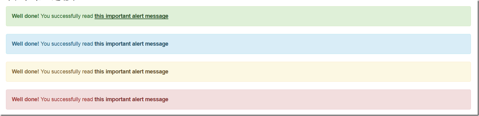
當提示文字中需要引導使用者跳往其他頁面時,可以為 <a> 加上 .alert-link,框架會自動幫它加粗並套用與所屬警示框相襯的色調:
 .alert .alert-link { font-weight: bold; }
/* 各類型警示框中的連結顏色 */
.alert-success .alert-link { color: #2b542c; }
.alert-info .alert-link { color: #245269; }
.alert-warning .alert-link { color: #66512c; }
.alert-danger .alert-link { color: #843534; }
 <div class="alert alert-success" role="alert">
 <strong>Well done!</strong> You successfully read <a href="#" class="alert-link">this important alert message</a>
 </div>
<div class="alert alert-info" role="alert">
 <strong>Well done!</strong> You successfully read <a href="#" class="alert-link">this important alert message</a>
 </div>
<div class="alert alert-warning" role="alert">
 <strong>Well done!</strong> You successfully read <a href="#" class="alert-link">this important alert message</a>
 </div>
<div class="alert alert-danger" role="alert">
 <strong>Well done!</strong> You successfully read <a href="#" class="alert-link">this important alert message</a>
 </div>
縮略圖負責「排版呈現」,警示框負責「狀態回饋」,兩者搭配使用,就能用極少的 class 完成相當完整的頁面資訊設計。