瀑布流是一種視覺上高低錯落的多欄排版,頁面往下滾動時還會不斷把新的內容塊附加到尾端。最早讓這種形式爆紅的是 Pinterest,後來被大量圖片站與清新風格網站採用。
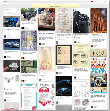
它的特色大致有三點:畫面以大小不一的圖片為主、視覺風格偏唯美、操作門檻極低——滑一下滾輪就有新內容出現。而實作方式主要有三種,各有取捨。
方式一:傳統多列浮動
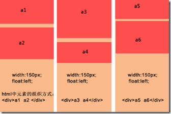
做法要點:各欄固定寬度並向左浮動;同一欄的內容塊視為一組依序堆疊;載入更多資料時,需要手動決定插入哪一欄。
優點:排版邏輯簡單,幾乎沒有門檻;而且不需要預先知道內容塊高度,圖片沒指定高度也能跑。
缺點:欄數固定、擴充不易,視窗縮放時只能維持固定欄數,想加一欄往往得重排資料;追加資料時還得指定欄別,維護起來不方便。
 <!DOCTYPE html>
<html lang="en">
<head>
<meta charset="UTF-8">
<title>傳統多列浮動</title>
<style>
div{
    float:left;
    margin: 5px 5px 5px 5px;
}
p{
    background: #90EE90;
    width:160px;
    text-align:center;
}
</style>
</head>
<body>
<div>
<p style="height:230px;">a1</p>
<p style="height:100px;">a2</p>
</div>
<div>
<p style="height:100px;">a3</p>
<p style="height:300px;">a4</p>
</div>
<div>
<p style="height:250px;">a5</p>
<p style="height:200px;">a6</p>
</div>
</body>
</html>
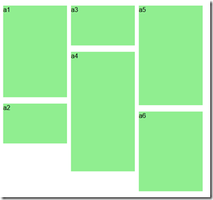
效果:
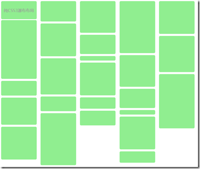
方式二:CSS3 多欄樣式
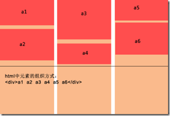
優點:純 CSS 就能搞定,最省事;擴充也方便,直接往容器丟內容即可。
缺點:只有較新的瀏覽器支援;更關鍵的是它的填充分法是「先由上到下填滿一欄,再填下一欄」,這與瀑布流「依序橫向填入最矮處」的本質不同,閱讀順序會被打亂。因此它其實更適合文字多欄排版,而不是圖片瀑布流。
 <!DOCTYPE HTML>
<html>
<head>
<meta http-equiv="Content-Type" content="text/html; charset=utf-8">
<title>CSS3瀑布布局</title>
<style>
.container{
    -webkit-column-width:160px;
    -moz-column-width:160px;
    -o-colum-width:160px;
    -webkit-column-gap:1px;
    -moz-column-gap:1px;
    -o-column-gap:1px;
}
div:not(.container){
    -webkit-border-radius:5px;
    -moz-border-radius:5px;
    border-radius:5px;
    background:#90EE90;
    border::#CCC 1px solid;
    display:inline-block;
    width:157px;
    position:relative;
    margin:2px;
}
.title{
    line-height:80px;
    font-size:18px;
    color:#999;
    text-align:center;
    font-family:"Microsoft YaHei";
}
</style>
</head>
<body>
<section>
<div class="container">
<div style="height:80px" class="title">純CSS3瀑布布局</div>
<div style="height:260px"></div>
<div style="height:65px"></div>
<div style="height:120px"></div>
<div style="height:145px"></div>
<div style="height:90px"></div>
<div style="height:145px"></div>
<div style="height:160px"></div>
<div style="height:65px"></div>
<div style="height:230px"></div>
<div style="height:140px"></div>
<div style="height:85px"></div>
<div style="height:20px"></div>
<div style="height:145px"></div>
<div style="height:50px"></div>
<div style="height:65px"></div>
<div style="height:230px"></div>
<div style="height:140px"></div>
<div style="height:85px"></div>
<div style="height:20px"></div>
<div style="height:145px"></div>
<div style="height:50px"></div>
<div style="height:145px"></div>
<div style="height:160px"></div>
<div style="height:240px"></div>
</div>
</section>
</body>
</html>
效果:
方式三:絕對定位(推薦)
由 JS 計算每個區塊的座標,再用絕對定位擺放。這是三者中最靈活的一種。
優點:新增內容方便,視窗變化時欄數與區塊位置都會自動重算。
缺點:必須事先知道區塊高度(含圖片時要知道圖片高度);且位置全靠 JS 計算,若使用者頻繁縮放視窗,可能明顯吃效能,記得加上 resize 的節流處理。
排版演算法
1. 取得容器元素以讀取總寬度,並由外部傳入欄寬與最小欄數。
2. 以「視窗寬度 ÷ 區塊寬度」向下取整算出欄數,設定容器居中。
3. 建立一個陣列記錄每一欄的當前高度,這樣才知道新區塊該從哪個 y 座標開始。
4. 逐一取出區塊,找出當前最矮的一欄,依欄序決定 left(欄序號 × 欄寬)與 top(該欄當前高度),插入後把該欄高度加上這個區塊的高度。
5. 全部插入完成後,把容器高度設為各欄中的最大值,一次排版結束。
異步加載的兩個步驟
1. 綁定滾動事件並設定預載入線——通常就取「最矮欄的高度」,只需比較目前捲動值與這個門檻即可判斷是否觸發。
2. 執行載入:把載入函式與停止條件(載入多少筆後停止)當參數傳入,方便外部控制流程。
三種方式各有適用場景:追求簡單可以用浮動,內容以文字為主可用 CSS3 多欄,而真正要做圖片瀑布流,絕對定位仍是首選。
- 上一篇文章: 原生 JavaScript 實作瀑布流排版(含滾動自動加載)
- 下一篇文章: JavaScript 運動效果兩個實戰案例:輪播與浮動視窗