物體運動的原理其實很單純:不斷改變元素的位置,讓它看起來在移動。就像物理公式那樣——目標位置 = 起始位置 + 速度 × 時間。理解了這一點,剩下的都是細節處理。
基本方法與步驟
1. 要運動的元素必須是絕對定位。
2. 透過改變 left、right、top、bottom 來移動;左右移動也可以讀 offsetLeft 來判斷。
三個固定步驟:先清除舊定時器(否則連續點擊會開出多個定時器,速度越來越快導致錯亂)、開啟定時器並計算速度、用 if/else 把「運動」與「停止」分開,判斷停止條件後執行位移。
關鍵技巧
多物體:把定時器掛在元素身上(obj.timer),每個物體各自獨立。
鏈式運動:在結束 callback 裡再開啟下一段定時器。
多值運動:用一個定時器同時改變多個屬性,並用一個 bStop 旗標(初始設為 true,迴圈中若發現 cur != json[attr] 就設為 false)判斷是否全部到位。
一、定時器基礎
JavaScript 有兩個定時器函式:
 timename = setTimeout("function();", delaytime);   //倒計定時器
 timename = setInterval("function();", delaytime);  //循環定時器
function() 是到點要執行的內容(函式或語句,用分號隔開),delaytime 是間隔毫秒數。前者只觸發一次,後者會反覆觸發。取消時分別使用:
 clearTimeout(timename);
 clearInterval(timename);
倒計時常用在「幾秒後跳轉」這類一次性場景;循環定時器則適合滾動公告、狀態欄等需要持續重複的效果。
二、運動實作解析
1. 勻速運動
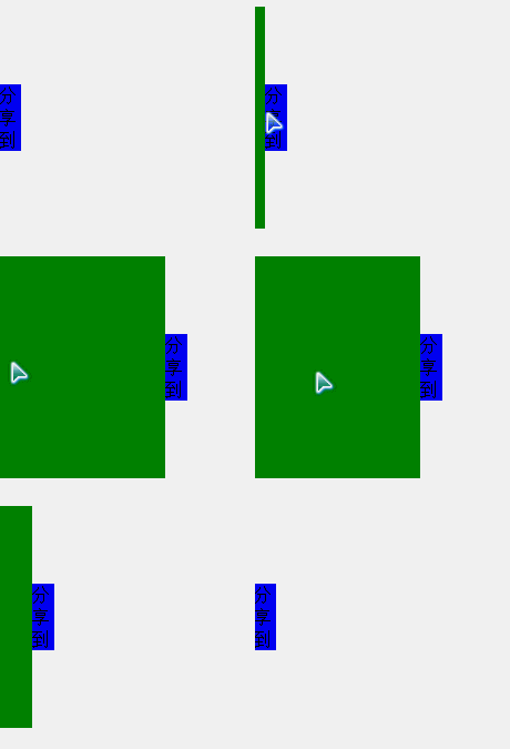
示範一個「滑鼠移入滑出」的分享按鈕,並逐一說明實作中會踩到的坑:
問題:到不了指定位置就停不下來。原因是 offsetLeft 不一定剛好等於目標值(例如速度是 7,可能停在 301)。解法是把等號判斷改成 >= 或 <=。
問題:到達 300 後再點按鈕還會繼續動。原因是點擊又開了一個定時器。解法是加 else,只在還沒到目標時才位移。
問題:連續點擊速度變快。每點一次就多一個定時器同時跑。解法是進入函式第一件事先 clearInterval(),保證任何時刻只有一個定時器在工作。
 <!DOCTYPE HTML>
<html>
<head>
<meta charset="utf-8">
<title>分享到</title>
<style>
#div1 {width:150px; height:200px; background:green; position:absolute; left:-150px;}
#div1 span {position:absolute; width:20px; height:60px; line-height:20px; background:blue; right:-20px; top:70px;}
</style>
<script>
window.onload=function ()
{
    var oDiv=document.getElementById('div1');
    oDiv.onmouseover=function ()
    {
        startMove(0);
    };
    oDiv.onmouseout=function ()
    {
        startMove(-150);
    };
};

var timer=null;
function startMove(iTarget)
{
    var oDiv=document.getElementById('div1');
    clearInterval(timer);
    timer=setInterval(function (){
        var speed=0;
        if(oDiv.offsetLeft>iTarget)
        {
            speed=-10;
        }
        else
        {
            speed=10;
        }

        if(oDiv.offsetLeft==iTarget)
        {
            clearInterval(timer);
        }
        else
        {
            oDiv.style.left=oDiv.offsetLeft+speed+'px';
        }
    }, 30);
}
</script>
</head>
<body>
<div id="div1"><span>分享到</span></div>
</body>
</html>
效果如下:
淡入淡出
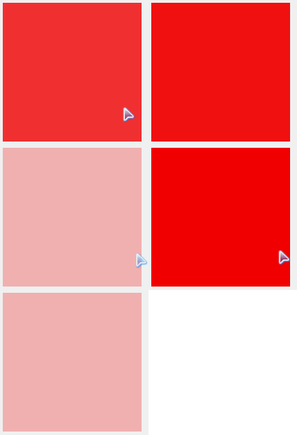
把「位置」換成「透明度」即可,注意要同時設定 filter(舊 IE)與 opacity:
 <!DOCTYPE HTML>
<html>
<head>
<meta charset="utf-8">
<title>淡入淡出</title>
<style>
#div1 {width:200px; height:200px; background:red; filter:alpha(opacity:30); opacity:0.3;}
</style>
<script>
window.onload=function ()
{
    var oDiv=document.getElementById('div1');
    oDiv.onmouseover=function ()
    {
        startMove(100);
    };
    oDiv.onmouseout=function ()
    {
        startMove(30);
    };
};

var alpha=30;
var timer=null;
function startMove(iTarget)
{
    var oDiv=document.getElementById('div1');
    clearInterval(timer);
    timer=setInterval(function (){
        var speed=0;
        if(alpha<iTarget)
        {
            speed=10;
        }
        else
        {
            speed=-10;
        }

        if(alpha==iTarget)
        {
            clearInterval(timer);
        }
        else
        {
            alpha+=speed;
            oDiv.style.filter='alpha(opacity:'+alpha+')';
            oDiv.style.opacity=alpha/100;
        }
    }, 30);
}
</script>
</head>
<body>
<div id="div1"></div>
</body>
</html>
效果如下:
停止條件的改良:距離足夠近
与其用等號,不如判斷「差距的絕對值小於等於速度」,停止時直接把位置設為目標值,這樣就不會停在 299 或 301:
 <!DOCTYPE HTML>
<html>
<head>
<meta charset="utf-8">
<title>勻速運動的停止條件</title>
<style>
#div1 {width:100px; height:100px; background:red; position:absolute; left:600px; top:50px;}
#div2 {width:1px; height:300px; position:absolute; left:300px; top:0; background:black;}
#div3 {width:1px; height:300px; position:absolute; left:100px; top:0; background:black;}
</style>
<script>
var timer=null;
function startMove(iTarget)
{
    var oDiv=document.getElementById('div1');
    clearInterval(timer);
    timer=setInterval(function (){
        var speed=0;
        if(oDiv.offsetLeft<iTarget)
        {
            speed=7;
        }
        else
        {
            speed=-7;
        }

        if(Math.abs(iTarget-oDiv.offsetLeft)<=7)
        {
            clearInterval(timer);
            oDiv.style.left=iTarget+'px';
        }
        else
        {
            oDiv.style.left=oDiv.offsetLeft+speed+'px';
        }
    }, 30);
}
</script>
</head>
<body>
<input type="button" value="到100" onclick="startMove(100)" />
<input type="button" value="到300" onclick="startMove(300)" />
<div id="div1"></div>
<div id="div2"></div>
<div id="div3"></div>
</body>
</html>
2. 變速運動(緩衝運動)
緩衝的核心公式:速度 = (目標值 - 當前值) / 縮放係數。距離越遠速度越大,越接近終點越慢,視覺上就有「慢慢停下來」的效果。縮放係數不能省略,否則速度過大會瞬間到位、完全沒有過程感。
問題:永遠到不了 300。因為速度會變成小數(例如 0.9),而 CSS 像素不會四捨五入。解法是取整:Math.ceil() 向上、Math.floor() 向下,並依方向選擇:
speed = speed > 0 ? Math.ceil(speed) : Math.floor(speed);
 <!DOCTYPE HTML>
<html>
<head>
<meta charset="utf-8">
<title>緩沖運動</title>
<style>
#div1 {width:100px; height:100px; background:red; position:absolute; left:600px; top:50px;}
#div2 {width:1px; height:300px; position:absolute; left:300px; top:0; background:black;}
</style>
<script>
function startMove()
{
    var oDiv=document.getElementById('div1');
    setInterval(function (){
        var speed=(300-oDiv.offsetLeft)/10;
        speed=speed>0?Math.ceil(speed):Math.floor(speed);
        oDiv.style.left=oDiv.offsetLeft+speed+'px';
        document.title=oDiv.offsetLeft+','+speed;
    }, 30);
}
</script>
</head>
<body>
<input type="button" value="開始運動" onclick="startMove()">
<div id="div1"></div>
<div id="div2"></div>
</body>
</html>
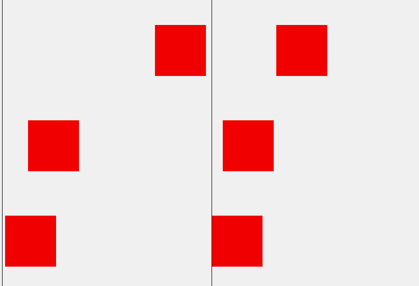
效果如下:
3. 多物體運動
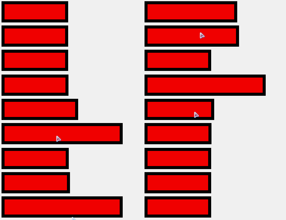
多個 div 滑鼠移入變寬時,如果共用同一個定時器變數,就會互相搶走對方的動畫。解法是把定時器與狀態都掛在元素上:obj.timer、obj.alpha。一句經驗法則:多物體運動框架裡,所有狀態都不能共用。
另外要注意 offsetWidth 的陷阱——它回傳的是盒模型尺寸(含 border 與 padding),並不等於真正的 width。若元素加了 border,用 offset 計算就會出錯。兩個解法:一是把寬度存在 style.width 用 parseInt 讀;二是乾脆寫一個 getStyle 函式統一處理:
 function getStyle(obj, name) {
   if (obj.currentStyle) {
     return obj.currentStyle[name];
   } else {
     return getComputedStyle(obj, false)[name];
   }
 }
 <!DOCTYPE HTML>
<html>
<head>
<meta charset="utf-8">
<title>無標題文檔</title>
<style>
div {width:100px; height:50px; background:red; margin:10px; border:10px solid black;}
</style>
<script>
window.onload=function ()
{
    var aDiv=document.getElementsByTagName('div');
    for(var i=0;i<aDiv.length;i++)
    {
        aDiv[i].timer=null;
        aDiv[i].onmouseover=function ()
        {
            startMove(this, 400);
        };
        aDiv[i].onmouseout=function ()
        {
            startMove(this, 100);
        };
    }
};

function startMove(obj, iTarget)
{
    clearInterval(obj.timer);
    obj.timer=setInterval(function (){
        var speed=(iTarget-obj.offsetWidth)/6;
        speed=speed>0?Math.ceil(speed):Math.floor(speed);

        if(obj.offsetWidth==iTarget)
        {
            clearInterval(obj.timer);
        }
        else
        {
            obj.style.width=obj.offsetWidth+speed+'px';
        }
    }, 30);
}
</script>
</head>
<body>
<div></div>
<div></div>
<div></div>
</body>
</html>
效果如下:
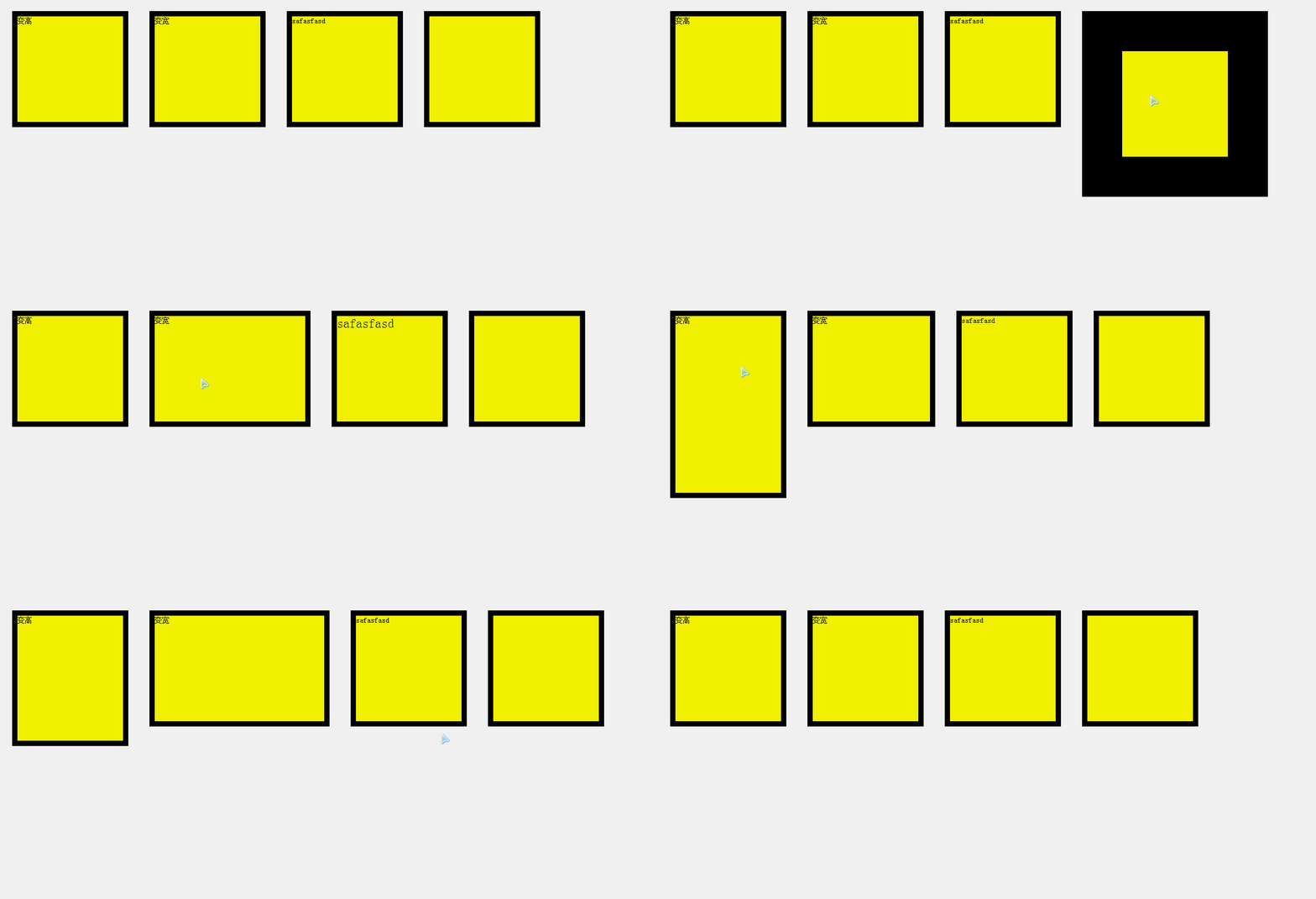
4. 任意值運動
把屬性名稱當參數傳進來,就能讓同一個框架處理 height、width、fontSize、borderWidth 等 px 類屬性:
 <!DOCTYPE HTML>
<html>
<head>
<meta charset="utf-8">
<title>無標題文檔</title>
<style>
div {width:200px; height:200px; margin:20px; float:left; background:yellow; border:10px solid black; font-size:14px;}
</style>
<script>
window.onload=function ()
{
    var oDiv1=document.getElementById('div1');
    oDiv1.onmouseover=function (){startMove(this, 'height', 400);};
    oDiv1.onmouseout=function (){startMove(this, 'height', 200);};

    var oDiv2=document.getElementById('div2');
    oDiv2.onmouseover=function (){startMove(this, 'width', 400);};
    oDiv2.onmouseout=function (){startMove(this, 'width', 200);};

    var oDiv3=document.getElementById('div3');
    oDiv3.onmouseover=function (){startMove(this, 'fontSize', 50);};
    oDiv3.onmouseout=function (){startMove(this, 'fontSize', 14);};

    var oDiv4=document.getElementById('div4');
    oDiv4.onmouseover=function (){startMove(this, 'borderWidth', 100);};
    oDiv4.onmouseout=function (){startMove(this, 'borderWidth', 10);};
};

function getStyle(obj, name)
{
    if(obj.currentStyle)
    {
        return obj.currentStyle[name];
    }
    else
    {
        return getComputedStyle(obj, false)[name];
    }
}

function startMove(obj, attr, iTarget)
{
    clearInterval(obj.timer);
    obj.timer=setInterval(function (){
        var cur=parseInt(getStyle(obj, attr));
        var speed=(iTarget-cur)/6;
        speed=speed>0?Math.ceil(speed):Math.floor(speed);

        if(cur==iTarget)
        {
            clearInterval(obj.timer);
        }
        else
        {
            obj.style[attr]=cur+speed+'px';
        }
    }, 30);
}
</script>
</head>
<body>
<div id="div1">變高</div>
<div id="div2">變寬</div>
<div id="div3">safasfasd</div>
<div id="div4"></div>
</body>
</html>
效果如下:
透明度是特例,因為它的值域是 0~1 而不是 px,讀寫都要額外判斷:讀值時乘 100 轉成整數,寫入時同時設定 filter 與 opacity(後者要除以 100)。
5. 鏈式運動
在框架裡多開一個參數 fnEnd,只有傳入時才呼叫。這樣就能做到「滑鼠移入先變寬、結束後彈出提示」、「先橫向展開再縱向展開」、「移出時先變回不透明、再變矮、最後變窄」這類序列動畫。
三、封裝成 move.js
把前面的經驗整合起來,就得到一個通用性很強的運動框架:
 function getStyle(obj, name)
{
    if(obj.currentStyle)
    {
        return obj.currentStyle[name];
    }
    else
    {
        return getComputedStyle(obj, false)[name];
    }
}

function startMove(obj, json, fnEnd)
{
    clearInterval(obj.timer);
    obj.timer=setInterval(function ()
    {
        var bStop=true;  //假設:所有值都已經到了
        for(var attr in json)
        {
            var cur=0;
            if(attr=='opacity')
            {
                cur=Math.round(parseFloat(getStyle(obj, attr))*100);
            }
            else
            {
                cur=parseInt(getStyle(obj, attr));
            }

            var speed=(json[attr]-cur)/6;
            speed=speed>0?Math.ceil(speed):Math.floor(speed);

            if(cur!=json[attr])
                bStop=false;

            if(attr=='opacity')
            {
                obj.style.filter='alpha(opacity:'+(cur+speed)+')';
                obj.style.opacity=(cur+speed)/100;
            }
            else
            {
                obj.style[attr]=cur+speed+'px';
            }
        }

        if(bStop)
        {
            clearInterval(obj.timer);
            if(fnEnd)fnEnd();
        }
    }, 30);
}
這個框架支援多屬性、任意屬性、透明度、多物體獨立計時與鏈式回調,基本涵蓋了不依賴 CSS3 的絕大多數網頁動畫需求。
- 上一篇文章: 把表單序列化字串轉成 JavaScript 物件(支援巢狀物件)
- 下一篇文章: 用 JavaScript 實作網頁倒數計時自動跳轉