CSS3 實現 hover 下劃線動畫的兩種思路對比
編輯:關於CSS
前幾天看到 Hexo 的 next 主題裡標題懸停時的下劃線效果相當精緻,於是動手復刻了一版,同時也把 next 官方的實現方式一併拆解對比。
效果預覽
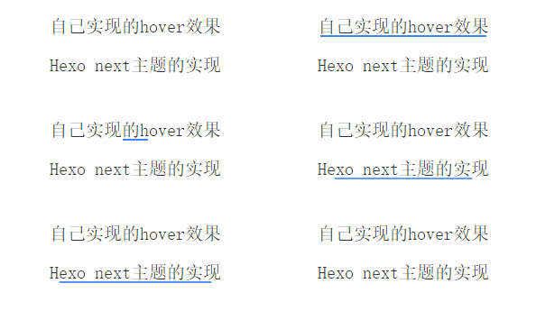
思路一:改變 width
<!-- html 結構 -->
<div>
  <a href="javascript:void(0);" class="demo1">自己實現的 hover 效果</a>
</div>
/* css 樣式 */
.demo1{
  position: relative;
  text-decoration: none;
  font-size: 20px;
  color: #333;
}
.demo1:before{
  content: "";
  position: absolute;
  left: 50%;
  bottom: -2px;
  width: 0;
  height: 2px;
  background: #4285f4;
  transition: all .3s;
}
.demo1:hover:before{
  width: 100%;
  left: 0;
  right: 0;
}
關鍵在於默認狀態把 width 設為 0,懸停時過渡到 100%,這樣就有了一個從無到有的生長動畫。而 left 初始為 50%,是為了讓動畫的起點落在文字正中央。
思路二:next 主題的官方實現
<!-- html 結構 -->
<div>
  <a href="javascript:void(0);" class="demo2">Hexo next 主題的實現</a>
</div>
/* css 樣式 */
.demo2{
  position: relative;
  text-decoration: none;
  font-size: 20px;
  color: #333;
}
.demo2:before{
  content: "";
  position: absolute;
  left: 0;
  bottom: -2px;
  height: 2px;
  width: 100%;
  background: #4285f4;
  transform: scale(0);
  transition: all 0.3s;
}
.demo2:hover:before{
  transform: scale(1);
}
這裡的關鍵是 scale(0) 到 scale(1) 的變化。CSS3 中 scale 變換的默認原點是元素中心,所以動畫會從中間向兩側展開。
兩者的差異
對比動畫不難看出,next 的版本帶有透明度漸變的观感,這是 scale 變換本身的特性帶來的。而第一種實現只是單純的寬度變化,線條是「實心」生長出來的。
如果希望第一種方案也有淡入效果,可以額外加上 opacity 過渡,或者改用 animation 關鍵幀來同時控制 width 與 opacity:
.demo1:before{
  content: "";
  position: absolute;
  left: 50%;
  bottom: -2px;
  width: 0;
  height: 2px;
  background: #4285f4;
  opacity: 0;
  transition: all .3s;
}
.demo1:hover:before{
  width: 100%;
  left: 0;
  opacity: 1;
}
兩種思路各有適用場景:scale 方案性能更好(只觸發合成層變換,不引起重排),適合大量元素;width 方案則更容易精確控制線條的起止位置。