CSS ::before 與 ::after 偽元素的進階用法
編輯:前端技巧
CSS 中的 :before 與 :after 兩個偽元素,常被用來添加一些自訂格式,但它們的潛力遠不止於此。除了 transform 變形之外,許多令人驚豔的創意連結特效,正是大量運用了這兩個偽元素。
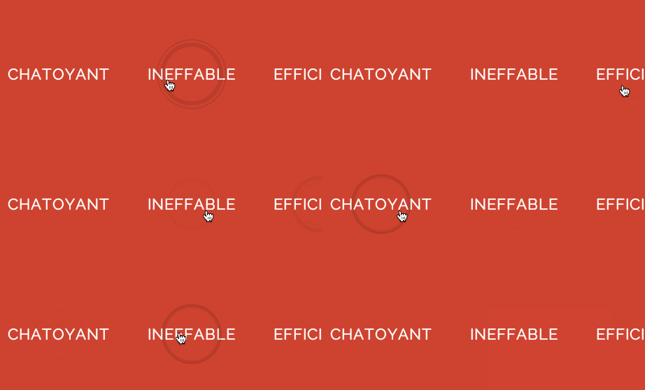
Creative Button Styles
一、基本語法
若只是單純添加自訂字元,使用偽類的單冒號寫法即可,以確保相容性:
p:before {}不過在 CSS3 中,為了區分偽元素與偽類,偽元素採用了雙冒號寫法。當搭配 display、width 等屬性使顯示脫離原元素後,建議依標準雙寫:
img::after {}這兩個偽元素特有的 content 屬性,可用於在元素的邏輯頭尾添加內容。要注意的是,這些內容不會改變文件、不會出現在 DOM 中、無法複製,僅存在於 CSS 渲染層。常用值包括:
- [String]:以引號包住字串,例如
a:after { content:"↗"; } - attr():呼叫元素屬性,例如
a:after { content:"(" attr(href) ")"; } - url() / uri():引用媒體檔,例如
h1::before { content:url(logo.png); } - counter():呼叫計數器,可不用列表就實現序號,搭配 counter-increment 與 counter-reset 使用。
二、進階技巧
清除浮動是常見問題,過去常需加一個空的 div 搭配 clear:both;。如今只需以下樣式,就能在元素尾部自動清除浮動,無須再增加無意義的標籤:
.clear-fix { *overflow:hidden; *zoom:1; }
.clear-fix:after { display:table; content:""; width:0; clear:both; }
许多人喜欢为 blockquote 引用段添加巨大的引号作为背景,这时可用 :before 取代 background,既能给背景留出空间,又能直接使用文字而非图片:
blockquote::before {
    content: open-quote;
    position: absolute;
    z-index: -1;
    color: #DDD;
    font-size: 120px;
    font-family: serif;
    font-weight: bolder;
}
三、特效妙用
配合強大的定位與特效屬性,偽元素相當於為元素額外附加最多兩個容器。需特別注意:即使不需要文字內容,content 屬性也不能為空,否則其他樣式一概不會生效,此時應寫成 content:"";。
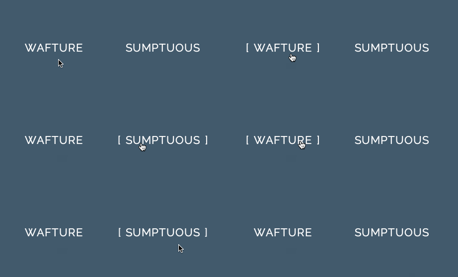
懸浮出現方括號
滑鼠移上連結時出現方括號:
a {
    position: relative;
    display: inline-block;
    outline: none;
    text-decoration: none;
    color: #000;
    font-size: 32px;
    padding: 5px 10px;
}

a:hover::before, a:hover::after { position: absolute; }
a:hover::before { content:"\5B"; left:-20px; }
a:hover::after { content:"\5D"; right:-20px; }
同理,只需搭配 display:block 與 position:absolute,就能把偽元素當成兩個容器,拼合出懸浮時出現雙邊框的特效:
a {
    position: relative;
    display: inline-block;
    outline: none;
    text-decoration: none;
    color: #000;
    font-size: 32px;
    padding: 0 10px;
}

/* 大框 */
a:hover::before, a:hover::after {
    content:"";
    display: block;
    position: absolute;
    top:-15%; left:-14%;
    width:120%; height:120%;
    border-style: solid;
    border-width: 4px;
    border-color: #DDD;
}

/* 小框 */
a:hover::after {
    top:0%; left:0%;
    width:100%; height:100%;
    border-width: 2px;
}
掌握這兩個偽元素,就能以純 CSS 創造出豐富多變的視覺效果。
- 上一篇文章: Web 開發中讓盒子水平垂直居中的多種方法
- 下一篇文章: CSS 前端知識點系統總結