微信小程序實作圓形旋轉菜單(仿建行 APP 首頁)
編輯:關於JavaScript
建行 APP 首頁有一個圓形的旋轉菜單,很適合在小程序中練習觸控手勢與三角函數計算。以下記錄實作過程與幾個關鍵細節。
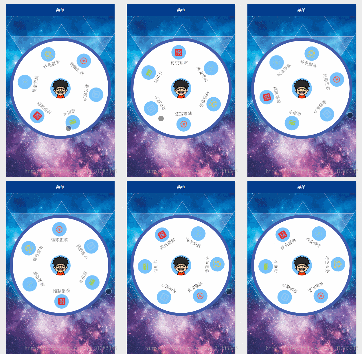
功能設計
- 一個圓形背景,環繞六個功能項,圓心放使用者頭像。
- 支援觸控拖曳旋轉。速度較慢時,手指抬起即停止;速度較快時,手指抬起後還會依慣性繼續轉動一段時間再減速停下。
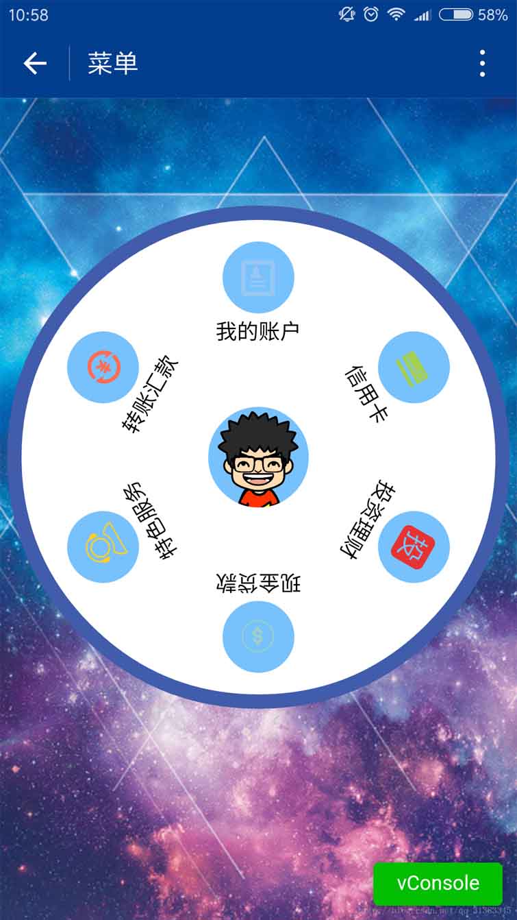
真機實測截圖:
index.js
var app = getApp()

Page({
  data: {
    userInfo: {},
    menuList: {},      // 菜單集合
    animationData: {},
    startPoint: {},    // 觸摸起點
    dotPoint: {},      // 圓心座標
    startAngle: 0,     // 起始角度
    tempAngle: 0,      // 移動角度
    downTime: 0,       // 按下時間
    upTime: 0          // 抬起時間
  },

  onLoad: function () {
    var that = this
    app.getUserInfo(function (userInfo) {
      that.setData({ userInfo: userInfo })
    })

    wx.getSystemInfo({
      success: function (res) {
        var windowWidth = res.windowWidth * 0.5
        that.setData({
          // 圓心 x 為螢幕寬度一半,y 為半徑加上 margin-top
          // 後續觸摸座標是 px 單位,此處直接用 px
          dotPoint: { clientX: windowWidth, clientY: 250 }
        })
      }
    })
  },

  onReady: function (e) {
    var that = this
    app.menuConfig = {
      menu: [
        { 'index': 0, 'menu': '我的賬戶', 'src': '../images/account.png' },
        { 'index': 1, 'menu': '信用卡',   'src': '../images/card.png' },
        { 'index': 2, 'menu': '投資理財', 'src': '../images/investment.png' },
        { 'index': 3, 'menu': '現金貸款', 'src': '../images/loan.png' },
        { 'index': 4, 'menu': '特色服務', 'src': '../images/service.png' },
        { 'index': 5, 'menu': '轉賬匯款', 'src': '../images/transfer.png' }
      ]
    }

    // 繪製圓盤:平均分配角度
    var menuConfig = app.menuConfig.menu,
        len = menuConfig.length,
        menuList = [],
        degNum = 360 / len

    for (var i = 0; i < len; i++) {
      menuList.push({
        deg: i * degNum,
        menu: menuConfig[i].menu,
        src: menuConfig[i].src
      })
    }

    that.setData({ menuList: menuList })
  },

  // 觸摸開始:記錄起點與起始角度
  buttonStart: function (e) {
    this.setData({ startPoint: e.touches[0] })
    var x = this.data.startPoint.clientX - this.data.dotPoint.clientX
    var y = this.data.startPoint.clientY - this.data.dotPoint.clientY
    var startAngle = Math.asin(y / Math.hypot(x, y)) * 180 / Math.PI
    this.setData({ startAngle: startAngle })
  },

  // 觸摸移動:依角度差旋轉所有項目
  buttonMove: function (e) {
    this.setData({ downTime: Date.now() })

    var endPoint = e.touches[e.touches.length - 1]
    var x = endPoint.clientX - this.data.dotPoint.clientX
    var y = endPoint.clientY - this.data.dotPoint.clientY
    var moveAngle = Math.asin(y / Math.hypot(x, y)) * 180 / Math.PI

    // 依 x、y 正負判斷所在象限
    var quadrant = 1
    if (x >= 0) { quadrant = y >= 0 ? 4 : 1 }
    else        { quadrant = y >= 0 ? 3 : 2 }

    var tempAngle = 0
    if (quadrant == 1 || quadrant == 4) {
      // 一、四象限:直接相減
      tempAngle += moveAngle - this.data.startAngle
    } else {
      // 二、三象限:方向相反
      tempAngle += this.data.startAngle - moveAngle
    }

    var menuConfig = app.menuConfig.menu, menuList = []
    for (var i = 0; i < this.data.menuList.length; i++) {
      menuList.push({
        deg: this.data.menuList[i].deg + tempAngle,
        menu: menuConfig[i].menu,
        src: menuConfig[i].src
      })
    }
    this.setData({ menuList: menuList })

    // 重置起始點與起始角度,供下次移動計算
    this.setData({ startPoint: endPoint })
    var endX = endPoint.clientX - this.data.dotPoint.clientX
    var endY = endPoint.clientY - this.data.dotPoint.clientY
    this.setData({
      startAngle: Math.asin(endY / Math.hypot(endX, endY)) * 180 / Math.PI,
      tempAngle: tempAngle
    })
  },

  // 觸摸結束:依角速度決定是否慣性滾動
  buttonEnd: function (e) {
    var that = this
    var upTime = Date.now()
    var angleSpeed = this.data.tempAngle * 1000 / (upTime - this.data.downTime)

    // 角速度小於 100,直接停止
    if (Math.abs(angleSpeed) < 100) { return }

    // 角速度大於 100,啟動慣性動畫
    if (angleSpeed > 0) {
      if (angleSpeed > 500) angleSpeed = 500
      var animationRun = wx.createAnimation({
        duration: 2000,
        timingFunction: 'ease-out'   // 結束時減速
      })
      that.animationRun = animationRun
      animationRun.rotate(angleSpeed).step()
      that.setData({ animationData: animationRun.export() })
    } else {
      if (angleSpeed < -500) angleSpeed = -500
      angleSpeed = Math.abs(angleSpeed)
      var animationRun = wx.createAnimation({
        duration: 2000,
        timingFunction: 'ease-out'
      })
      that.animationRun = animationRun
      animationRun.rotate(-angleSpeed).step()
      that.setData({ animationData: animationRun.export() })
    }
  }
})
index.wxml
<view class="circle-out">
  <view class="circle-in">
    <image class="userinfo-avatar" src="{{userInfo.avatarUrl}}"></image>
    <view class="menu-list"
          catchtouchmove="buttonMove"
          catchtouchstart="buttonStart"
          catchtouchend="buttonEnd">
      <view class="menu-item" wx:for="{{menuList}}" wx:key="unique"
            animation="{{animationData}}">
        <view class="menu-circle-item"
              style="-webkit-transform: rotate({{item.deg}}deg);"
              data-menu="{{item.menu}}">
          <image class="image-style" src="{{item.src}}"></image>
        </view>
        <view class="menu-circle-text-item"
              style="-webkit-transform: rotate({{item.deg}}deg);">
          <text class="text-style">{{item.menu}}</text>
        </view>
      </view>
    </view>
  </view>
</view>
index.wxss
page {
  background-image: url('https://ac-ejx0nsfy.clouddn.com/ac767407f474e1c3970a.jpg');
  background-attachment: fixed;
  background-repeat: no-repeat;
  background-size: cover;
}

.circle-out {
  margin: 75px auto;
  position: relative;
  width: 350px;
  height: 350px;
  border-radius: 50%;
  background-color: #415cab;
}

.userinfo-avatar {
  width: 70px;
  height: 70px;
  border-radius: 50%;
  position: absolute;
  top: 0; bottom: 0; left: 0; right: 0;
  margin: auto;
}

/* 子元素透明度 = 父元素透明度 × 子元素透明度。
   父層設了 opacity 之後,子層設為 1 也無效,因此必須分開處理 */
.circle-in {
  position: absolute;
  width: 330px;
  height: 330px;
  border-radius: 50%;
  top: 0; bottom: 0; left: 0; right: 0;
  margin: auto;
  background-color: #fff;
}

.menu-list {
  position: absolute;
  left: 0; top: 0;
  width: inherit;
  height: inherit;
}

.menu-item {
  position: absolute;
  left: 0; top: 0;
  width: 100%;
  height: 100%;
  font-weight: 500;
}

.menu-circle-item {
  -webkit-transform-origin: 50% 150px;
  transform-origin: 50% 150px;
  margin: 0 auto;
  margin-top: 15px;
  position: relative;
  height: 50px;
  width: 50px;
  background-color: #77c2fc;
  text-align: center;
  border-radius: 50%;
}

.image-style {
  height: 25px;
  width: 25px;
  margin: 12.5px auto;
}

.text-style {
  margin: 5px auto;
  font-size: 15px;
}

.menu-circle-text-item {
  -webkit-transform-origin: 50% 100px;
  transform-origin: 50% 100px;
  margin: 0 auto;
  position: relative;
  height: 25px;
  width: auto;
  text-align: center;
}
關鍵邏輯說明
1. 如何取得旋轉角度
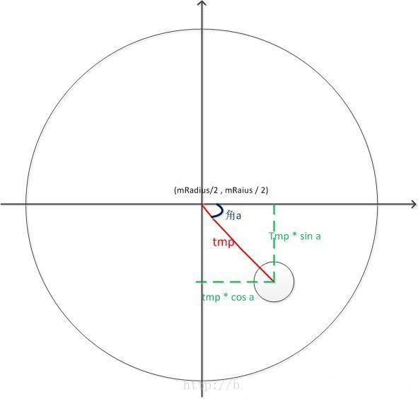
核心是三角函數。以圓心為原點,觸控點到圓心的橫向差值為 x、縱向差值為 y,則斜邊長為 Math.sqrt(x * x + y * y)。由 sin a = y / 斜邊,可得:
var angle = Math.asin(y / Math.hypot(x, y)) * 180 / Math.PI;
Math.hypot(x, y) 直接回傳斜邊長,省去自己開根號。乘上 180 / Math.PI 是把弧度轉成角度,因為 CSS 的 rotate 使用的是角度。
2. 如何計算角速度
用角度變化量除以耗時,再換算成每秒的速率:
var angleSpeed = this.data.tempAngle * 1000 / (upTime - this.data.downTime);
3. 慣性門檻的取捨
角速度絕對值小於 100 時視為無慣性,手指抬起即停止;大於 100 則啟動自動滾動,並用動畫模擬減速。這裡最難處理的是動畫時長與速度的對應關係——固定 duration 的做法很難同時兼顧快轉與慢轉的流暢度,實測偶爾會有生硬感。若要更自然的物理效果,需要改用逐幀更新角度並套用衰減係數的方式,而不是依賴單一 CSS 動畫。
4. 分象限的必要性
Math.asin 的回傳值域只有 -90 到 90 度,無法完整描述整圈。因此必須依 x 的正負判斷觸控點落在哪一半:x 大於等於 0 落在右半(一、四象限),x 小於 0 落在左半(二、三象限),兩側的角度變化方向恰好相反,需要分別處理才能讓旋轉方向跟手一致。