上一篇整理過第一批好用的 Bootstrap 元件,這篇接著往下補,涵蓋多值輸入、自動完成搜尋、步驟流程、按鈕 loading、開關與星級評分共六個元件。全部都有可運行的程式碼,直接抄就能用。
七、多值輸入元件 jquery-manifest
輸入框要能一次塞多個值,是很常見的需求。manifest 同時支援本地清單與遠端搜尋兩種模式。
效果展示
本地多值輸入框

遠端多值輸入框

依賴說明
manifest 並不依賴 Bootstrap,它只需要 jQuery,再加上 jquery.manifest.css、jquery.ui.widget.js、jquery.manifest.js 三個檔案。Bootstrap 的 CSS/JS 只是為了讓畫面好看才引入。
本地多值輸入
<link href="~/Content/bootstrap/css/bootstrap.css" rel="stylesheet" />
<link href="~/Content/jquery-manifest-master/src/jquery.manifest.css" rel="stylesheet" />
<script src="~/Content/jquery-1.9.1.js"></script>
<script src="~/Content/bootstrap/js/bootstrap.js"></script>
<script src="~/Content/jquery-manifest-master/build/parts/jquery.ui.widget.js"></script>
<script src="~/Content/jquery-manifest-master/build/jquery.manifest.js"></script>
<input type='text' autocomplete="off" id="txt_man" />
<script type="text/javascript">
$(function () { $('#txt_man').manifest(); });
</script>
常用屬性與方法:
// 取得輸入框中所有項目
var values = $('#txt_man').manifest('values');
// 移除最後一項
$('#txt_man').manifest('remove', ':last');
// 新增一項,第二個參數的格式取決於你的資料結構
$('#txt_man').manifest('add', { id: "1", name: "ABC" });
// 取得遠端搜尋回傳的清單
$('#txt_man').manifest('list');
// 新增事件
$('#txt_man').on('manifestadd', function (event, data, $item, initial) {});
// 移除事件
$('#txt_man').on('manifestremove', function (event, data, $item) {});
// 以鍵盤切換選項時觸發
$('#txt_man').on('manifestselect', function (event, data, $item) {});
遠端多值輸入
遠端模式需要多引入一個 jquery.marcopolo.js,並提供一個回傳資料的 URL。
<link href="~/Content/bootstrap/css/bootstrap.css" rel="stylesheet" />
<link href="~/Content/jquery-manifest-master/src/jquery.manifest.css" rel="stylesheet" />
<script src="~/Content/jquery-1.9.1.js"></script>
<script src="~/Content/bootstrap/js/bootstrap.js"></script>
<script src="~/Content/jquery-manifest-master/build/parts/jquery.ui.widget.js"></script>
<script src="~/Content/jquery-manifest-master/build/parts/jquery.marcopolo.js"></script>
<script src="~/Content/jquery-manifest-master/build/jquery.manifest.js"></script>
<form action="https://api.foursquare.com/v2/venues/search?callback=?" method="get">
  <div class="form-group">
    <div class="col-xs-10">
      <input type='text' id="txt_man2" />
      <img src="~/Content/jquery-manifest-master/busy.gif" />
    </div>
  </div>
</form>
<script type="text/javascript">
$(function () {
  $('#txt_man2').manifest({
    formatDisplay: function (data, $item, $mpItem) { return data.name; },
    formatValue: function (data, $value, $item, $mpItem) { return data.id; },
    marcoPolo: {
      data: { intent: 'global', limit: 5, v: '20150601' },
      formatData: function (data) { return data.response.venues; },
      formatItem: function (data, $item) { return data.name; },
      minChars: 3,
      param: 'query'
    },
    required: true
  });
});
</script>
若你打算接自己的 API,只要依樣回傳相同結構的資料即可。上例中原本寫在 data 裡的 client_id、client_secret 屬於憑證,正式專案請移到後端,不要放在前端。

八、搜尋框元件 bootstrap-typeahead
自動完成的實作很多,jQuery UI 的 autocomplete 就是一例。選 bootstrap-typeahead 的理由是風格與 Bootstrap 一致、體積小、上手快。


初始化
<link href="~/Content/bootstrap/css/bootstrap.css" rel="stylesheet" />
<link href="~/Content/twitter-bootstrap-typeahead-master/twitter-bootstrap-typeahead-master/demo/css/prettify.css" rel="stylesheet" />
<script src="~/Content/jquery-1.9.1.js"></script>
<script src="~/Content/bootstrap/js/bootstrap.js"></script>
<script src="~/Content/twitter-bootstrap-typeahead-master/twitter-bootstrap-typeahead-master/js/bootstrap-typeahead.js"></script>
<input type='text' class="form-control" id="txt_man" />
資料來源在本地
<script type="text/javascript">
$(function () {
  $("#txt_man").typeahead({
    source: [
      { key: 1, value: 'Toronto' },
      { key: 2, value: 'Montreal' },
      { key: 3, value: 'New York' },
      { key: 4, value: 'Buffalo' },
      { key: 5, value: 'Boston' },
      { key: 6, value: 'Columbus' },
      { key: 7, value: 'Dallas' },
      { key: 8, value: 'Vancouver' },
      { key: 9, value: 'Seattle' },
      { key: 10, value: 'Los Angeles' }
    ],
    display: "value",
    val: "key"
  });
});
</script>
資料來源用 Ajax 取得
<script type="text/javascript">
$(function () {
  $("#txt_man").typeahead({
    ajax: {
      url: '/Home2/TypeaheadData',
      timeout: 300,
      method: 'post',
      triggerLength: 1,
      loadingClass: null,
      displayField: null,
      preDispatch: null,
      preProcess: null
    },
    display: "value",
    val: "key"
  });
});
</script>
public JsonResult TypeaheadData() {
    var lstRes = new List<object>();
    for (var i = 0; i < 20; i++)
        lstRes.Add(new { key = i, value = Guid.NewGuid().ToString().Substring(0, 4) });
    return Json(lstRes, JsonRequestBehavior.AllowGet);
}
常用屬性:display(顯示欄位)、val(實際值)、items(預設顯示筆數,預設 8)、source(本地陣列)、ajax(可為字串 URL 或物件,物件形式下 triggerLength 決定觸發字元數)。
常用事件:itemSelected,選中項目時觸發,三個參數分別是選中的物件、實際值與顯示值。
九、Bootstrap 步驟元件
先前介紹的 ystep 適合呈現進度,但遇到「依當前步驟處理不同業務」的複雜流程就力有未逮。這款步驟元件在這方面表現好得多。


<link href="~/Content/bootstrap/css/bootstrap.css" rel="stylesheet" />
<link href="~/Content/bootstrap-step/css/bs-is-fun.css" rel="stylesheet" />
<script src="~/Content/jquery-1.9.1.js"></script>
<script src="~/Content/bootstrap/js/bootstrap.js"></script>
<script src="~/Content/bootstrap-step/js/brush.js"></script>
箭頭樣式:
<ul class="nav nav-pills nav-justified step step-arrow">
  <li class="active"><a>step1</a></li>
  <li class="active"><a>step2</a></li>
  <li><a>step3</a></li>
</ul>
方形樣式:
<ul class="nav nav-pills nav-justified step step-square">
  <li class="active"><a>step1</a></li>
  <li><a>step2</a></li>
  <li><a>step3</a></li>
</ul>
圓形樣式:
<ul class="nav nav-pills nav-justified step step-round">
  <li class="active"><a>step1</a></li>
  <li class="active"><a>step2</a></li>
  <li><a>step3</a></li>
</ul>
進度條樣式:
<ul class="nav nav-pills nav-justified step step-progress">
  <li class="active"><a>step1<span class="caret"></span></a></li>
  <li class="active"><a>step2<span class="caret"></span></a></li>
  <li><a>step3<span class="caret"></span></a></li>
  <li><a>step4<span class="caret"></span></a></li>
  <li><a>step5<span class="caret"></span></a></li>
  <li><a>step6<span class="caret"></span></a></li>
</ul>
「上一步/下一步」的做法,是把步驟條放進 modal,再用 Bootstrap 的 carousel 承載各步驟內容:
<div class="modal fade" id="myModalNext">
  <div class="modal-dialog modal-lg">
    <div class="modal-content">
      <div class="modal-header">
        <button type="button" class="close" data-dismiss="modal" aria-label="Close">
          <span aria-hidden="true">×</span>
        </button>
        <h4 class="modal-title">選項配置</h4>
        <ul class="nav nav-pills nav-justified step step-progress">
          <li class="active"><a>步驟一<span class="caret"></span></a></li>
          <li><a>步驟二<span class="caret"></span></a></li>
          <li><a>步驟三<span class="caret"></span></a></li>
          <li><a>步驟四<span class="caret"></span></a></li>
          <li><a>步驟五<span class="caret"></span></a></li>
          <li><a>步驟六<span class="caret"></span></a></li>
        </ul>
      </div>
      <div class="modal-body">
        <div class="container-fluid">
          <div class="carousel slide" data-ride="carousel" data-interval="false" data-wrap="false">
            <div class="carousel-inner" role="listbox">
              <div class="item active">
                <p>步驟一</p>
                <div class="col-xs-2">配置角色</div>
                <div class="col-xs-4"><input type="text" class="form-control" /></div>
                <div class="col-xs-4"><button type="button" class="btn btn-primary">保存</button></div>
              </div>
              <div class="item"><p>步驟二</p></div>
              <div class="item"><p>步驟三</p></div>
              <div class="item"><p>步驟四</p></div>
              <div class="item"><p>步驟五</p></div>
              <div class="item"><p>步驟六</p></div>
            </div>
          </div>
        </div>
      </div>
      <div class="modal-footer">
        <button type="button" class="btn btn-default MN-pre">上一步</button>
        <button type="button" class="btn btn-primary MN-next">下一步</button>
      </div>
    </div>
  </div>
</div>
$("#myModalNext .modal-footer button").each(function () {
  $(this).click(function () {
    if ($(this).hasClass("MN-next")) {
      $("#myModalNext .carousel").carousel('next');
      $("#myModalNext .step li.active").next().addClass("active");
    } else {
      $("#myModalNext .carousel").carousel('prev');
      if ($("#myModalNext .step li").length > 1) {
        $($($("#myModalNext .step li.active"))[$("#myModalNext .step li.active").length - 1]).removeClass("active");
      }
    }
  });
});
這段邏輯只是示意,正式導入前請補上邊界條件與表單校驗測試。
十、按鈕載入元件 ladda-bootstrap
按鈕按下後若不鎖住,重複送出幾乎無可避免。ladda 把「按下—等待—完成」的視覺回饋做得相當漂亮。

<link href="~/Content/bootstrap/css/bootstrap.css" rel="stylesheet" />
<link href="~/Content/ladda-bootstrap-master/ladda-bootstrap-master/dist/ladda-themeless.min.css" rel="stylesheet" />
<script src="~/Content/jquery-1.9.1.js"></script>
<script src="~/Content/bootstrap/js/bootstrap.js"></script>
<script src="~/Content/ladda-bootstrap-master/ladda-bootstrap-master/dist/spin.min.js"></script>
<script src="~/Content/ladda-bootstrap-master/ladda-bootstrap-master/dist/ladda.min.js"></script>
<button class="btn btn-primary ladda-button" data-style="expand-left"><span class="ladda-label">expand-left</span></button>
<button class="btn btn-primary ladda-button" data-style="expand-right"><span class="ladda-label">expand-right</span></button>
<button class="btn btn-primary ladda-button" data-style="zoom-in"><span class="ladda-label">zoom-in</span></button>
<button class="btn btn-primary ladda-button" data-style="zoom-out"><span class="ladda-label">zoom-out</span></button>

$(function () {
  $('button').click(function (e) {
    e.preventDefault();
    var l = Ladda.create(this);
    l.start();
    l.setProgress(0 - 1);
    $.post("/Home2/TypeaheadData", {}, function (data, statu) {
      console.log(statu);
    }, "json").always(function () {
      l.stop();
    });
    return false;
  });
});
關鍵就三行:Ladda.create(this) 取得實例、l.start() 啟動、l.stop() 收尾。注意這裡的 this 是原生 DOM 物件,不是 jQuery 物件。
data-style 可選值:expand-left、expand-right、expand-up、expand-down、zoom-in、zoom-out、slide-left、slide-right、slide-up、slide-down、contract。
data-size 可選值:xs、s、l。 spinner 顏色用 data-spinner-color 指定。
進度條設定:
Ladda.bind('button', {
  callback: function (instance) {
    var progress = 0;
    var interval = setInterval(function () {
      progress = Math.min(progress + Math.random() * 0.1, 1);
      instance.setProgress(progress);
      if (progress === 1) {
        instance.stop();
        clearInterval(interval);
      }
    }, 200);
  }
});
instance.setProgress(progress) 用來設定當前進度,取值介於 0 到 1。範例中的隨機遞增只是為了看效果,實務上要依請求實際狀況回報。
十一、開關元件 bootstrap-switch
Bootstrap 中文網首頁就有這個元件的身影。
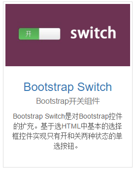


原始碼與文件:https://github.com/nostalgiaz/bootstrap-switch 與 https://www.bootstrap-switch.org/examples.html
<link href="~/Content/bootstrap/css/bootstrap.css" rel="stylesheet" />
<link href="~/Content/bootstrap-switch-master/bootstrap-switch-master/dist/css/bootstrap3/bootstrap-switch.css" rel="stylesheet" />
<script src="~/Content/jquery-1.9.1.js"></script>
<script src="~/Content/bootstrap/js/bootstrap.js"></script>
<script src="~/Content/bootstrap-switch-master/bootstrap-switch-master/dist/js/bootstrap-switch.js"></script>
<input type="checkbox" checked />
$(function () {
  $('input[type=checkbox]').bootstrapSwitch({ size: "large" });
});
size 參數可省略,不傳就使用預設樣式。常用屬性包含 size(mini/small/normal/large)、onColor 與 offColor(primary/info/success/warning/danger/default)、onText 與 offText(預設 ON/OFF),事件則有 onInit 與 onSwitchChange。
十二、星級評分元件 bootstrap-star-rating
電商、論壇、社群系統裡的評分功能,用這個元件幾行 HTML 就能搞定。

<link href="~/Content/bootstrap/css/bootstrap.css" rel="stylesheet" />
<link href="~/Content/bootstrap-star-rating-master/bootstrap-star-rating-master/css/star-rating.css" rel="stylesheet" />
<script src="~/Content/jquery-1.9.1.js"></script>
<script src="~/Content/bootstrap-star-rating-master/bootstrap-star-rating-master/js/star-rating.js"></script>
<script src="~/Content/bootstrap-star-rating-master/bootstrap-star-rating-master/js/locales/zh.js"></script>
<input id="input-2b" type="number" class="rating" min="0" max="5" step="0.5" data-size="xl" data-symbol="" data-default-caption="{rating} hearts" data-star-captions="{}">
<input id="input-21a" value="0" type="number" class="rating" min=0 max=5 step=0.5 data-size="xl">
<input id="input-21b" value="4" type="number" class="rating" min=0 max=5 step=0.2 data-size="lg">
<input id="input-21c" value="0" type="number" class="rating" min=0 max=8 step=0.5 data-size="xl" data-stars="8">
<input id="input-21d" value="2" type="number" class="rating" min=0 max=5 step=0.5 data-size="sm">
<input id="input-21e" value="0" type="number" class="rating" min=0 max=5 step=0.5 data-size="xs">
<input id="input-21f" value="0" type="number" class="rating" min=0 max=5 step=0.5 data-size="md">
<input id="input-2ba" type="number" class="rating" min="0" max="5" step="0.5" data-stars=5 data-symbol="" data-default-caption="{rating} hearts" data-star-captions="{}">
<input id="input-22" value="0" type="number" class="rating" min=0 max=5 step=0.5 data-rtl=1 data-container-class='text-right' data-glyphicon=0>
只要給上 class="rating" 就會自動初始化。參數含义:value 是初始分數、min/max 界定範圍、step 是最小刻度、data-size 控制星星尺寸、data-stars 決定星星數量。取值時用 $("#input-21a").val() 即可。
以上就是這批元件的整理。共同前提是 jQuery 與 Bootstrap,導入前建議先確認版本相容性,並把任何第三方 API 的憑證放到後端。
- 上一篇文章: 深入解讀 Knockout.js 源碼:訂閱機制剖析
- 下一篇文章: 用 JavaScript 自動標記當前啟用的導覽選單