Easy Tabs 選項卡實作:滑鼠移入即切換的最簡樣式
編輯:關於JavaScript
選項卡(Tabs)是內容分區最省空間的做法。本文示範 Easy Tabs 插件中的一個簡化版本:四個標籤、四個內容區,滑鼠移入即切換,並帶有輕微的視覺變化。整份程式碼只有兩個小函式,非常適合當作自製 Tabs 的起點。
運行效果如下:
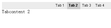
線上預覽:https://demo.jb51.net/js/2015/js-Easy-Tabs-cha-menu-codes/
兩個核心函式
 /* 顯示與隱藏內容區 */
function blendoff(idname) { document.getElementById(idname).style.display = 'none'; }
function blendon(idname)  { document.getElementById(idname).style.display = 'block'; }

/* 切換標籤的樣式狀態 */
function swichtabs(wert) {
    if (wert == '1'){
        document.getElementById('tablink1').className = 'tab1 tabactive';
        document.getElementById('tablink2').className = 'tab2';
        document.getElementById('tablink3').className = 'tab3';
        document.getElementById('tablink4').className = 'tab4';
    }else if (wert == '2'){
        document.getElementById('tablink1').className = 'tab1';
        document.getElementById('tablink2').className = 'tab2 tabactive';
        document.getElementById('tablink3').className = 'tab3';
        document.getElementById('tablink4').className = 'tab4';
    }
    // 3、4 依此類推
}
職責切得很乾淨:blendon/blendoff 只管內容區的顯示,swichtabs 只管標籤的高亮樣式。兩者透過 onclick 上的 tabactive 類別切換完成視覺回饋。
樣式
 .menu {
    background-color:#ececec; color:#272727;
    border-bottom:1px solid #d7d7d7; height:23px;
    font:11px Arial, Helvetica, sans-serif;
}
.menu ul { margin:0px; padding:0px; list-style:none; text-align:center;}
.menu li { display:inline; line-height:23px;}
.menu li a {
    color:#000000; text-decoration:none;
    padding:4px 5px 6px 5px;
    border-left:1px solid #ececec; border-right:1px solid #ececec;
}
.menu li a.tabactive {
    border-left:1px solid #d7d7d7; border-right:1px solid #d7d7d7;
    background-color:#CCCCCC; font-weight:bold; position:relative;
}
選用中的標籤加上 position:relative 是為了讓它能疊在底邊線之上,營造「內容與標籤相連」的視覺。
完整結構
 <!--Start of the Tabmenu -->
<div class="menu">
 <ul>
  <li><a href="#" onmouseover="blendon('tabcontent1'); blendoff('tabcontent2');
      blendoff('tabcontent3'); blendoff('tabcontent4'); swichtabs('1');"
      onclick="return false;" class="tabactive" id="tablink1">Tab 1 </a></li>
  <li><a href="#" onmouseover="blendon('tabcontent2'); blendoff('tabcontent1');
      blendoff('tabcontent3'); blendoff('tabcontent4'); swichtabs('2');"
      onclick="return false;" id="tablink2">Tab 2 </a></li>
  <li><a href="#" onmouseover="blendon('tabcontent3'); blendoff('tabcontent1');
      blendoff('tabcontent2'); blendoff('tabcontent4'); swichtabs('3');"
      onclick="return false;" id="tablink3">Tab 3 </a></li>
  <li><a href="#" onmouseover="blendon('tabcontent4'); blendoff('tabcontent1');
      blendoff('tabcontent2'); blendoff('tabcontent3'); swichtabs('4');"
      onclick="return false;" id="tablink4">Tab 4 </a></li>
 </ul>
</div>
<!--End of the Tabmenu -->

<div style="display:block;" id="tabcontent1"> Tabcontent 1 </div>
<div style="display:none;"  id="tabcontent2"> Tabcontent 2 </div>
<div style="display:none;"  id="tabcontent3"> Tabcontent 3 </div>
<div style="display:none;"  id="tabcontent4"> Tabcontent 4 </div>
可以更好的地方
這個版本求簡,因此 inline 事件顯得冗長——每個標籤都要寫四次 blendoff。実務上建議改寫成事件委託:
 var links = document.querySelectorAll('.menu li a');
links.forEach(function(a, i){
    a.addEventListener('mouseover', function(){
        document.querySelectorAll('.tabcontent').forEach(function(p, j){
            p.style.display = (i === j) ? 'block' : 'none';
        });
        links.forEach(function(x, j){ x.className = (i === j) ? 'tabactive' : ''; });
    });
});
如此一來,不論加幾個標籤都不用改 JavaScript。另外若希望更符合無障礙規範,可把 onmouseover 搭配 onfocus,並為每個面板加上 role="tabpanel" 與 aria-labelledby,鍵盤操作才不會被排除在外。
希望這份 Tabs 範例對你的 JavaScript 開發有所幫助。