表格是後台系統裡最常被使用的元素,也常常是被需求改來改去的重灾区。好消息是,Bootstrap 已經把常見的表格變體都準備好了,用幾個 class 就能應付大部分場面。
基本樣式
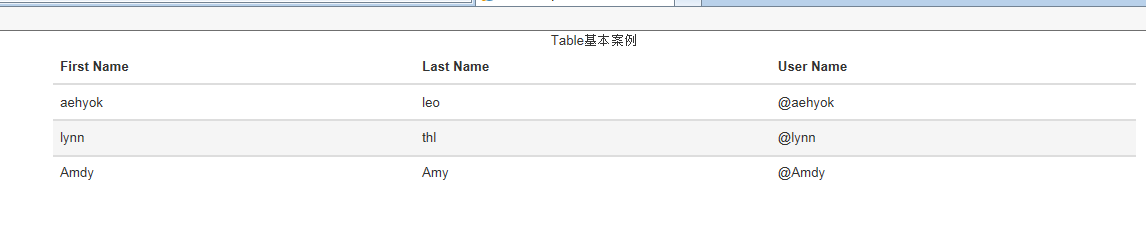
替任意 <table> 加上 .table,就能得到基本的內距與水平分隔線。Bootstrap 刻意不給 table 元素套全域預設樣式,是因為 table 的應用太廣,若預設樣式會干擾日曆、日期選擇器等外掛,因此把樣式獨立成 class。
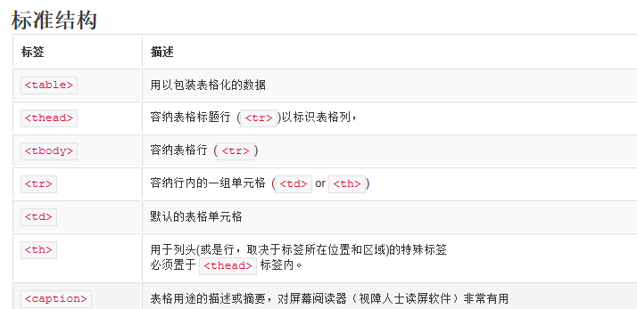
<table class="table">
  <caption>表格基本範例</caption>
  <thead>
    <tr><th>First Name</th><th>Last Name</th><th>User Name</th></tr>
  </thead>
  <tbody>
    <tr><td>aehyok</td><td>leo</td><td>@aehyok</td></tr>
  </tbody>
</table>

斑馬紋表格
.table-striped 會替 <tbody> 內的奇數列加上底色,讓大量資料列更容易閱讀。
<table class="table table-striped">

帶邊框的表格
.table-bordered 為表格與每個儲存格加上邊框,適合需要明確區隔的資料表。
<table class="table table-bordered">

滑鼠移入高亮
.table-hover 讓 <tbody> 內的列在滑鼠移過時變色,使用者能清楚知道自己對準哪一列。
<table class="table table-hover">
緊湊表格
.table-condensed 把儲存格的內距減半,資訊密度更高,很適合資料量大的後台頁面。
<table class="table table-condensed">
狀態 class
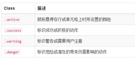
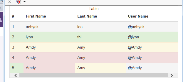
透過狀態 class 可以為「列」或「個別儲存格」上色,用來傳達資料狀態:.active(目前/暫存)、.success(成功)、.warning(警告)、.danger(錯誤)。
<tr class="active"> ... </tr>
<tr class="success"> ... </tr>
<tr class="warning"> ... </tr>
<tr class="danger"> ... </tr>

<!-- 也可以套在單一儲存格上 -->
<td class="success">5</td>
<td class="danger">Amdy</td>

響應式表格
把 .table 包進 .table-responsive 容器即可。運作規則很單純:當視窗寬度小於 768px 時,表格會出現水平捲軸;寬度超過 768px 後捲軸自動消失。
<div class="table-responsive">
  <table class="table"> ... </table>
</div>
這個設計的意義在於:与其在手機上把七欄資料硬壓成不可讀的窄條,不如保留原始欄寬、讓使用者橫向滑動。實務上通常還會搭配「隱藏次要欄位」的策略,兩者併用體驗更好。
小結
這幾個 class 都是可以自由組合的,例如 table table-striped table-hover table-condensed 同時使用完全合法。幾行程式碼就能把頁面等級拉到水準以上,之後真的不必再為表格樣式煩惱了。