Bootstrap 是 Twitter 推出的開源前端工具包,由 Mark Otto 與 Jacob Thornton 共同開發,本質上是一套 CSS/HTML 框架,以動態樣式語言 Less 撰寫,並內建了統一的 HTML 與 CSS 規範。它問世後迅速累積人氣,一直是 GitHub 上的熱門專案,就連 NASA 與 MSNBC 的新聞網站都曾採用。
圖片輪播是網頁裡再常見不過的需求,但若純手寫,往往要處理上百行程式碼,還得自己解決圖片尺寸與自適應的問題。改用 Bootstrap 的 Carousel 元件(Carousel 原意正是「旋轉木馬」),能省下大量時間。
一、目標
做出一個多圖輪播:滑鼠移入時自動暫停(元件內建行為),每張圖下方帶一段圖說文字。
由於錄影軟體品質不佳,下面的 GIF 顏色失真較明顯,但基本效果仍可辨識。
要留意兩點相容性問題:Carousel 不支援 IE6 與 IE7,若必須支援,需另外下載 Bootstrap 的 IE6 相容套件;此外在 Chrome 中,圖說文字邊緣會帶一點淡淡的黑色陰影,不影響閱讀。

不同瀏覽器的呈現略有差異,IE8 下的效果如下:

二、版面規劃
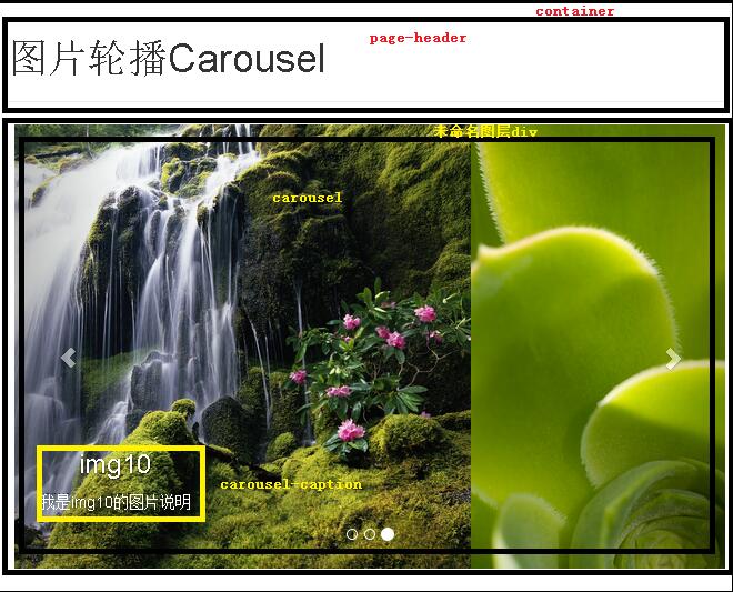
整體結構很單純:一個置中的固定尺寸容器,裡面放輪播元件。
三、實作步驟
1. 準備檔案
先到官網下載正式環境用的 Bootstrap。Bootstrap 3 與 2 並不相容,建議直接依 3.x 的開發文件撰寫,本文亦以 Bootstrap 3 為例。
另一個關鍵細節:Bootstrap 3 的 JavaScript 效果需要 jQuery 1.11 支援,請下載相容舊版 IE6 的 jQuery 1.11,而不是不支援舊 IE 的 jQuery 2.x。
下載完成後建立站點目錄,把 Bootstrap 3 直接解壓到站點根目錄,並把 jquery-1.11.1.js 放進 js 目錄,與 bootstrap.js 同層。目錄結構大致如下:

2. 完整程式碼
 <!DOCTYPE html PUBLIC "-//W3C//DTD XHTML 1.0 Transitional//EN" "https://www.w3.org/TR/xhtml1/DTD/xhtml1-transitional.dtd">
<html xmlns="https://www.w3.org/1999/xhtml">
<head>
<meta http-equiv="Content-Type" content="text/html; charset=utf-8" />
<meta name="viewport" content="width=device-width,initial-scale=1.0,user-scalable=no">
<link href="css/bootstrap.css" rel="stylesheet" media="screen">
<script type="text/javascript" src="js/jquery-1.11.1.js"></script>
<script type="text/javascript" src="js/bootstrap.js"></script>
<title>圖片輪播Carousel</title>
</head>
<body>
<div class="container">
<div class="page-header">
<h1> 圖片輪播Carousel </h1>
</div>
<div style="width: 640px; height: 480px; margin-right: auto; margin-left: auto;">
<div id="carousel" class="carousel slide" data-ride="carousel" data-interval="1000">
<ol class="carousel-indicators">
<li data-target="#carousel-example-generic" data-slide-to="0" class="active"></li>
<li data-target="#carousel-example-generic" data-slide-to="1"></li>
<li data-target="#carousel-example-generic" data-slide-to="2"></li>
</ol>
<div class="carousel-inner" role="listbox">
<div class="item active">
<a href="images/img0.jpg"><img src="images/img0.jpg" alt="img0"></a>
<div class="carousel-caption">
<h3> img0 </h3>
<p> 我是img0的圖片說明 </p>
</div>
</div>
<div class="item">
<a href="images/img10.jpg"><img src="images/img10.jpg" alt="img10"></a>
<div class="carousel-caption">
<h3> img10 </h3>
<p> 我是img10的圖片說明 </p>
</div>
</div>
<div class="item">
<a href="images/img2.jpg"><img src="images/img2.jpg" alt="img2"></a>
<div class="carousel-caption">
<h3> img2 </h3>
<p> 我是img2的圖片說明 </p>
</div>
</div>
</div>
<a class="left carousel-control" href="#carousel-example-generic" role="button" data-slide="prev">
<span class="glyphicon glyphicon-chevron-left"></span>
</a>
<a class="right carousel-control" href="#carousel-example-generic" role="button" data-slide="next">
<span class="glyphicon glyphicon-chevron-right"></span>
</a>
</div>
</div>
</div>
</body>
</html>
3. head 部分說明
 <head>
<!-- 宣告編碼;viewport 讓頁面自適應裝置寬度;Bootstrap 的 CSS 與 JS 各引入一次,JS 部分需 jQuery 先載入 -->
<meta http-equiv="Content-Type" content="text/html; charset=utf-8" />
<meta name="viewport" content="width=device-width,initial-scale=1.0,user-scalable=no">
<link href="css/bootstrap.css" rel="stylesheet" media="screen">
<script type="text/javascript" src="js/jquery-1.11.1.js"></script>
<script type="text/javascript" src="js/bootstrap.js"></script>
<title>圖片輪播Carousel</title>
</head>
4. body 部分說明
先宣告一個 container 容器,Bootstrap 會讓內部元素自動居中並套用統一的左右留白。
 <div class="page-header">
<h1> 圖片輪播Carousel </h1>
</div>
接著定義一個未命名的 div 圖層,用來約束輪播元件的尺寸。這裡有個容易忽略的點:Carousel 的尺寸不能靠元件內的元素撐開,必須在外層用 width 與 height 明確指定,否則元件會變形。另外,若要讓它居中,必須寫 margin-right: auto; margin-left: auto;;只加 align="center" 是完全没有效果的。
5. 元件各部分的含義
 <div style="width: 640px; height: 480px; margin-right: auto; margin-left: auto;">
 <!-- carousel 為元件名稱;data-ride 是 Bootstrap 要求存在的屬性;data-interval 為自動切換間隔,1000 即 1 秒,數值太小元件會失真 -->
 <div id="carousel" class="carousel slide" data-ride="carousel" data-interval="1000">
 <!-- 指示器:決定有幾張圖。要增加一張就再補一個 li,data-slide-to 依序加一。第一張(索引 0)必須帶 class="active",否則元件無法啟動 -->
 <ol class="carousel-indicators">
 <li data-target="#carousel-example-generic" data-slide-to="0" class="active"></li>
 <li data-target="#carousel-example-generic" data-slide-to="1"></li>
 <li data-target="#carousel-example-generic" data-slide-to="2"></li>
 </ol>
 <div class="carousel-inner" role="listbox">
 <!-- 第一張圖的 class 必須是 item active,其餘只要 item -->
 <div class="item active">
 <!-- 外層 a 使圖片可點擊開啟連結;若不需要連結,直接移除 a 標籤即可 -->
 <a href="images/img0.jpg"><img src="images/img0.jpg" alt="img0"></a>
 <div class="carousel-caption">
 <!-- 圖片下方的說明文字 -->
 <h3> img0 </h3>
 <p> 我是img0的圖片說明 </p>
 </div>
 </div>
 <div class="item">
 <a href="images/img10.jpg"><img src="images/img10.jpg" alt="img10"></a>
 <div class="carousel-caption">
 <h3> img10 </h3>
 <p> 我是img10的圖片說明 </p>
 </div>
 </div>
 <div class="item">
 <a href="images/img2.jpg"><img src="images/img2.jpg" alt="img2"></a>
 <div class="carousel-caption">
 <h3> img2 </h3>
 <p> 我是img2的圖片說明 </p>
 </div>
 </div>
 </div>
 <!-- 左右切換按鈕,屬固定框架,data-slide 決定方向 -->
 <a class="left carousel-control" href="#carousel-example-generic" role="button" data-slide="prev">
 <span class="glyphicon glyphicon-chevron-left"></span>
 </a>
 <a class="right carousel-control" href="#carousel-example-generic" role="button" data-slide="next">
 <span class="glyphicon glyphicon-chevron-right"></span>
 </a>
 </div>
</div>
實作時的三個關鍵點
第一,首張圖片務必帶 active,指示器與 .item 兩處都要加,漏一處元件就不動。第二,data-target 與容器的 id 必須一致,這裡示例沿用了官方文件中的 carousel-example-generic,實作時建議改成自己的 id 並同步修改所有 li。第三,data-interval 別設太小,1 秒其實已接近實用下限,設成 3000~5000 閱讀體驗會好很多。
以上就是 Bootstrap Carousel 元件的完整解析,從檔案準備到逐段程式碼都做了說明,希望能對你的開發有所幫助。
- 上一篇文章: JS 動態為物件新增屬性與值:eval 與更安全的替代寫法
- 下一篇文章: JavaScript 身份證號合法性驗證:校驗碼演算法實作