讓 Bootstrap 模態框真正垂直居中:從源碼下手
編輯:關於JavaScript
Bootstrap 官網:https://v3.bootcss.com/
專案裡大量用到 modal 彈出視窗,一開始就發現它預設是偏上的,無法垂直居中也不能拖曳,官方文檔也沒提供對應的屬性或方法,於是就這樣將就著用了。直到客戶提出:小視窗偏上讓整個頁面看起來失衡,能不能居中?
上網搜了一圈,能找到的方案不多,最常見的是這段:
 $("#myModal").modal().css({
 "margin-top": function () { return -($(this).height() / 2); }
});
參考來源:https://www.g2w.me/2012/06/bootstrap-modal-shown-in-the-center/
實測之後並不理想:沒辦法真正居中,視窗尺寸不同時每次的 margin-top 還會變,遮罩層甚至會冒出滾動條。原因是視窗彈出之前根本取不到 $(this).height() 的值,改用 ($(window).height() - $(this).height()) / 2 一樣行不通。
最後只能去讀源碼,找到 modal 顯示的環節,在 bootstrap.js 約 900 行之後插入以下邏輯,就能同時處理垂直與水平居中:
 that.$element.children().eq(0).css("position", "absolute").css({
 "margin": "0px",
 "top": function () {
 return (that.$element.height() - that.$element.children().eq(0).height() - 40) / 2 + "px";
 },
 "left": function () {
 return (that.$element.width() - that.$element.children().eq(0).width()) / 2 + "px";
 }
});
頁面結構就是標準的 modal 寫法:
<div> <button class="btn btn-primary btn-lg" data-toggle="modal" data-target="#myModal">Launch demo modal</button> <!-- Modal --> <div class="modal fade" id="myModal" tabindex="-1" role="dialog" aria-labelledby="myModalLabel" aria-hidden="true"> <div class="modal-dialog"> <div class="modal-content"> <div class="modal-header"> <button type="button" class="close" data-dismiss="modal" aria-hidden="true">×</button> <h4 class="modal-title" id="myModalLabel">Modal title</h4> </div> <div class="modal-body">...</div> <div class="modal-footer"> <button type="button" class="btn btn-default" data-dismiss="modal">Close</button> <button type="button" class="btn btn-primary">Save changes</button> </div> </div><!-- /.modal-content --> </div><!-- /.modal-dialog --> </div><!-- /.modal --> </div>
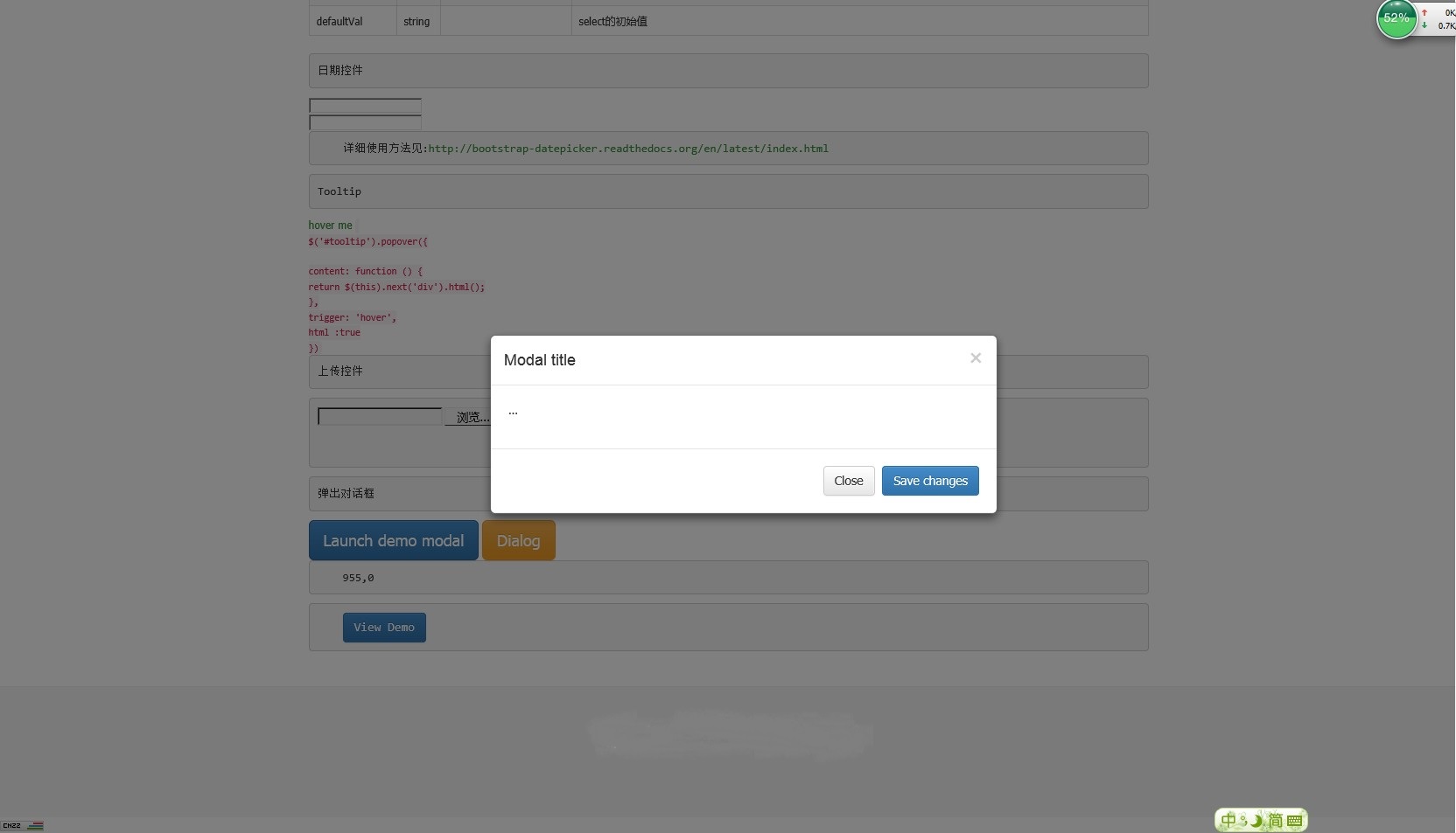
效果如下:
直接改 bootstrap.js 雖然有效,但升級框架時會被覆蓋。更穩妥的做法是把這段邏輯抽成一個外掛,掛在 shown.bs.modal 事件上處理,這樣既不侵入源碼,也能在視窗高度變化時重新計算位置。