所謂「粘頁腳」,說得更具體一些,就是讓固定高度的頁腳始終貼在頁面底部:內容不足時它老老實實待在視窗下方,內容超出一屏時它又能被正常頂到下面,不會蓋住正文。由於實際專案的結構與官方模板總有出入,照抄並不一定馬上見效,下面把原理講清楚。
一、頁面效果
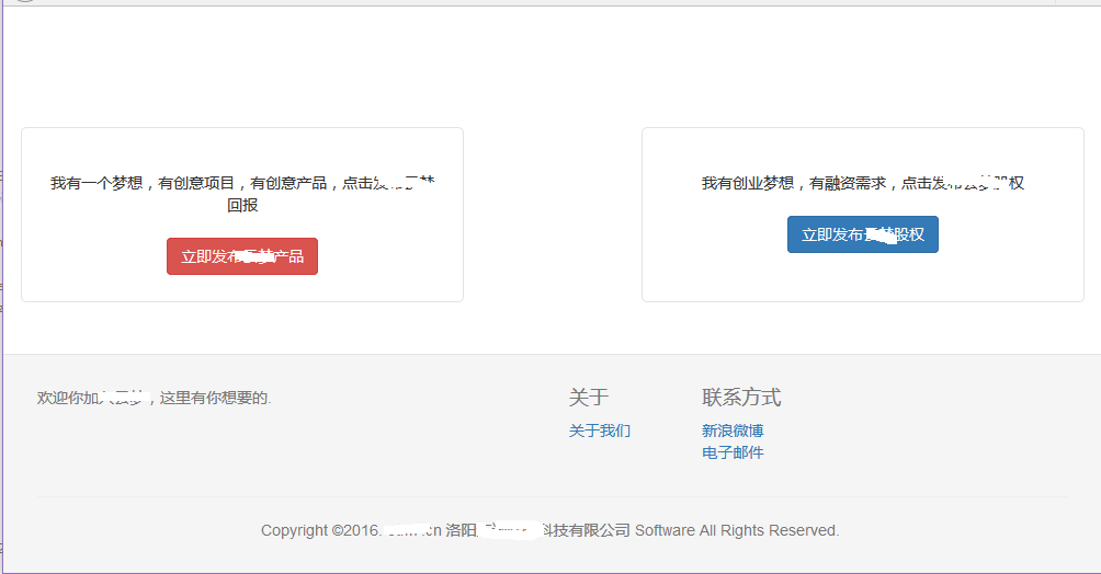
頁面結構很簡單,注意图中的亮線是火狐的邊緣線,可以清楚看到灰色的頁腳沉在頁面底部。
二、實作講解
① 完整程式碼
<!DOCTYPE html PUBLIC "-//W3C//DTD XHTML 1.0 Transitional//EN" "https://www.w3.org/TR/xhtml1/DTD/xhtml1-transitional.dtd">
<html xmlns="https://www.w3.org/1999/xhtml">
<head>
<title>發布項目</title>
<link type="text/css" rel="stylesheet" href="/ymeng/components/bootstrap/css/bootstrap.css" />
<style type="text/css">
html, body {
height: 100%;
}
#wrap {
min-height: 100%;
height: auto !important;
margin: 0 auto -200px; /* 關鍵:底部負外邊距,數值等於頁腳高度的相反數 */
}
#push {
height: 200px; /* 佔位元素,高度與頁腳一致 */
clear: both;
}
.footer {
border-top: 1px solid #e5e5e5;
color: #777;
padding: 19px 0;
background-color: #f5f5f5;
}
</style>
</head>
<body>
<div id="wrap">
<div class="container project_choose">
<div class="row">
<div class="col-md-5 project_general">
<span class="f14">我有一個夢想,有創意項目,有創意產品,點擊發布回報</span>
<div class="blank20"></div>
<div>
<a type="button" class="btn btn-danger" href="/ymeng/deal/initDealCaluseConfirm">立即發布產品</a>
</div>
</div>
<div class="col-md-2"></div>
<div class="col-md-5 project_agency">
<span class="f14">我有創業夢想,有融資需求,點擊發布股權</span>
<div class="blank20"></div>
<div>
<button type="button" class="btn btn-primary">立即發股權</button>
</div>
</div>
</div>
</div>
<div id="push"></div>
</div>
<div class="footer">
<div class="container">
<div class="row footer-top">
<div class="col-sm-6 col-lg-6">
<p>歡迎你加入,這裡有你想要的。</p>
</div>
<div class="col-sm-6 col-lg-5 col-lg-offset-1">
<div class="row about">
<div class="col-xs-3">
<h4>關於</h4>
<ul class="list-unstyled"><li><a href="">關於我們</a></li></ul>
</div>
<div class="col-xs-3">
<h4>聯系方式</h4>
<ul class="list-unstyled">
<li><a target="_blank" title="官方微博" href="">新浪微博</a></li>
<li><a href="">電子郵件</a></li>
</ul>
</div>
</div>
</div>
</div>
<hr>
<div class="row footer-bottom">
<ul class="list-inline text-center">
<li>Copyright ©2016. n 洛陽限公司 Software All Rights Reserved.</li>
</ul>
</div>
</div>
</div>
</body>
</html>
② body 的骨架
把裝飾去掉,結構其實只有這麼幾層:
<body>
  <div id="wrap">
    <div class="container"></div>
    <div id="push"></div>
  </div>
  <div class="footer"></div>
</body>
第一層兩個 div,分別是 wrap 和 footer;wrap 內部又有 container 與 push。千萬別忘了 push,否則頁面縮放時頁腳會和正文重疊。
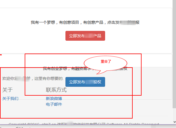
這幾個元素是實現粘頁腳必不可少的。
③ CSS 逐條拆解
html, body { height: 100%; }
#wrap {
  min-height: 100%;
  height: auto !important;
  margin: 0 auto -200px;
}
#push { height: 200px; clear: both; }
.footer {
  border-top: 1px solid #e5e5e5;
  color: #777;
  padding: 19px 0;
  background-color: #f5f5f5;
}
· html, body 高度必須是 100%,也就是撐滿整個視窗。
· #wrap 的 min-height 設為 100%,height 交給 auto 自適應。
· 關鍵在 margin:上邊距為 0,下邊距為 -200px,這個值在理論上等於頁腳高度的相反數(可用 Firebug 反覆調試最佳值)。之所以要為負,是因為 wrap 本來就佔滿了 100% 高度,用負邊距把它「拉回來」200px,才能給頁腳騰出完整顯示的空間;否則頁腳會被擠到滾動條下方。
· #push 在內容充足時幾乎看不出作用,但一旦頁面縮放、內容變少,它就充當了頁腳的「替身」,撐住那 200px 的高度。

用 Firebug 選中 push 這個 div 就能看得很清楚:它恰好覆蓋住頁腳的內容範圍,從而阻止頁腳與 container 中的元素重疊。
三、關鍵點回顧
只要理清 wrap 與 push 這兩個元素的職責,Bootstrap 的粘頁腳其實很好寫。另外提醒兩點:一是頁腳高度若為響應式變化,CSS 中的負邊距和 push 高度也要相應調整;二是如果項目允許使用更現代的方案,直接讓 body 使用 display: flex; flex-direction: column 並給主內容區 flex: 1,可以省掉這套負邊距技巧。
- 上一篇文章: JavaScript 常用本地對象大盤點
- 下一篇文章: 結合 easyUI 與 Bootstrap 打造後台工作站