微信小程序頂部選項卡(TabBar)頁面切換實作
編輯:關於JavaScript
做過 Android 開發的人看到小程序要實作頂部選項卡,一開始容易困惑:沒有 Fragment 可用,該怎麼辦?其實用 swiper 元件搭配自訂的頂部選單列,就能做出類似 ViewPager 的效果。
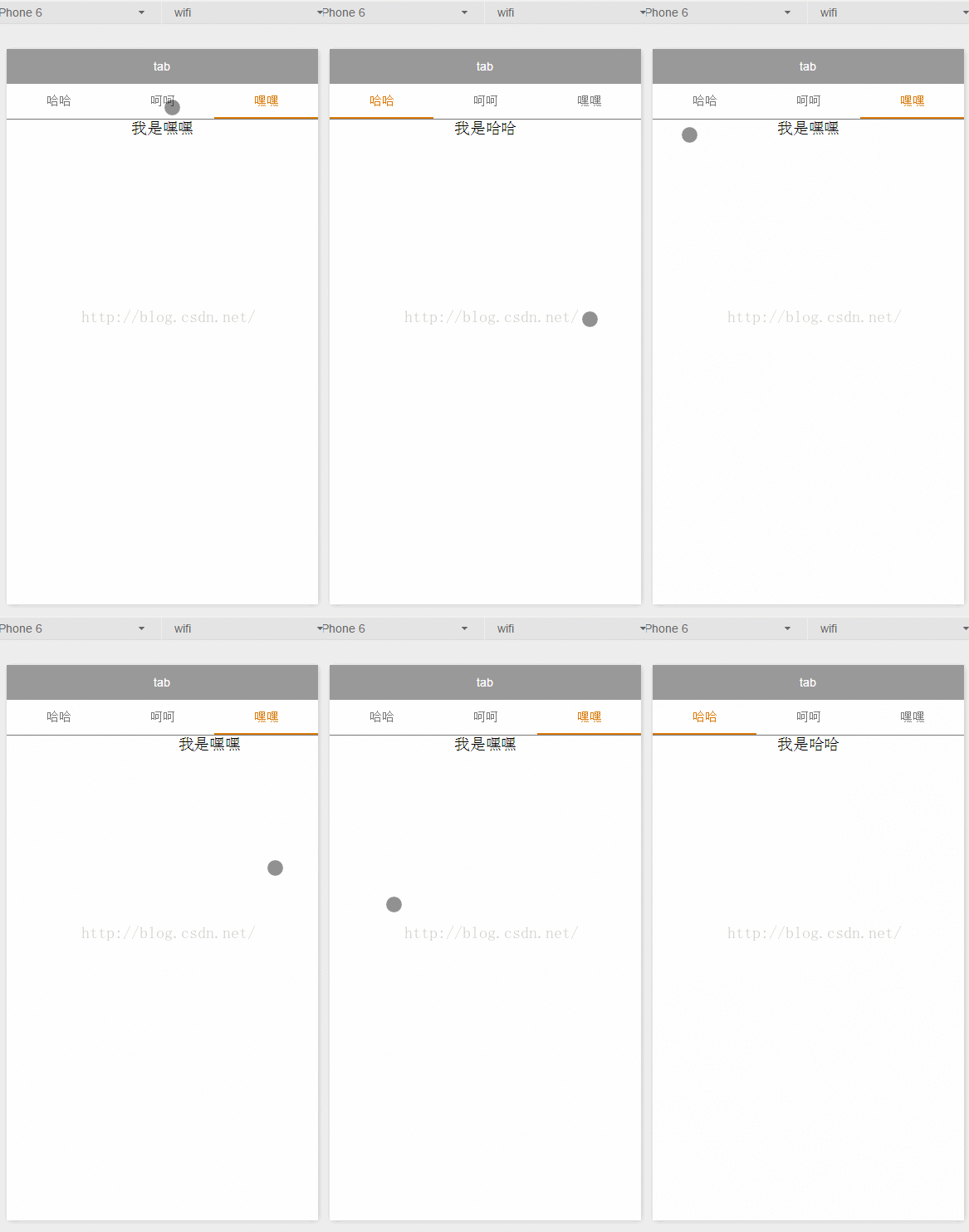
先看效果:
一、index.wxml
頂部是一排自訂的 view 作為切換器,下方則是 swiper 承載各頁內容。currentTab 同時驅動兩邊的高亮與位移,確保選單與內容永遠同步。
<!--index.wxml-->
<view class="swiper-tab">
<view class="swiper-tab-list {{currentTab==0 ? 'on' : ''}}" data-current="0" bindtap="swichNav">哈哈</view>
<view class="swiper-tab-list {{currentTab==1 ? 'on' : ''}}" data-current="1" bindtap="swichNav">呵呵</view>
<view class="swiper-tab-list {{currentTab==2 ? 'on' : ''}}" data-current="2" bindtap="swichNav">嘿嘿</view>
</view>

<swiper current="{{currentTab}}" class="swiper-box" duration="300" style="height:{{winHeight - 31}}px" bindchange="bindChange">
<swiper-item><view>我是哈哈</view></swiper-item>
<swiper-item><view>我是呵呵</view></swiper-item>
<swiper-item><view>我是嘿嘿</view></swiper-item>
</swiper>
二、index.wxss
/**index.wxss**/
.swiper-tab{
  width: 100%;
  border-bottom: 2rpx solid #777777;
  text-align: center;
  line-height: 80rpx;
}
.swiper-tab-list{
  font-size: 30rpx;
  display: inline-block;
  width: 33%;
  color: #777777;
}
.on{
  color: #da7c0c;
  border-bottom: 5rpx solid #da7c0c;
}
.swiper-box{
  display: block;
  height: 100%;
  width: 100%;
  overflow: hidden;
}
.swiper-box view{ text-align: center; }
三、index.js
//index.js
var app = getApp()
Page({
  data: {
    winWidth: 0,
    winHeight: 0,
    // tab 切換
    currentTab: 0,
  },
  onLoad: function() {
    var that = this;
    // 取得系統資訊以計算 swiper 高度
    wx.getSystemInfo({
      success: function(res) {
        that.setData({
          winWidth: res.windowWidth,
          winHeight: res.windowHeight
        });
      }
    });
  },
  // 滑動切換 tab
  bindChange: function(e) {
    var that = this;
    that.setData({ currentTab: e.detail.current });
  },
  // 點擊 tab 切換
  swichNav: function(e) {
    var that = this;
    if (this.data.currentTab === e.target.dataset.current) {
      return false;
    } else {
      that.setData({ currentTab: e.target.dataset.current });
    }
  }
})
運作邏輯說明
整個元件靠一個 currentTab 狀態雙向綁定:
- 使用者點擊頂部選單 →
swichNav更新 currentTab → swiper 因current屬性改變而滑動。 - 使用者左右滑動 → swiper 觸發
bindchange→bindChange更新 currentTab → 頂部高亮跟著移動。
在 swichNav 中先判斷是否為同一個索引,可以避免重複 setData 造成的無效渲染。
進階可加的效果
若希望選單能自動捲動到目前作用中項目、或加上滑動中的漸層底色,可以用 wx.createSelectorQuery 取得各項目位置,再動態計算 transform。另外提醒:這裡的 wx.getSystemInfo 已屬舊介面,新專案建議改用 wx.getWindowInfo 並搭配 onWindowResize 處理尺寸變化,同時留意 iPhone 底部安全區域的高度扣除。
- 上一篇文章: 純 JS 圖片本地預覽外掛:不上傳也能先看效果
- 下一篇文章: 以 jQuery UI 實作框選多元素拖曳效果